
Command Palette
Search for a command to run...
UI Kits(25)
Production-ready component libraries and starter kits.
UI Kits Resources
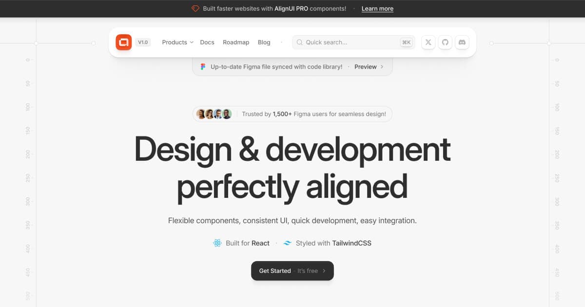
AlignUI: Code-Implemented Design System
Professional design system with 7,800+ components and code-implemented variants. Features 80+ unique widgets, Figma variables support, and dark mode compatibility. Lightning-fast performance designed specifically for enterprise SaaS dashboards and admin interfaces.

Apple iOS 18 UI Kit: Official Apple Design Resources
Apple's official iOS 18 UI kit containing hundreds of components with Auto Layout, Component Properties, variants, and light/dark mode support. Includes system interfaces, widgets, notification templates, and comprehensive typography with accessibility sizes for native iOS development.
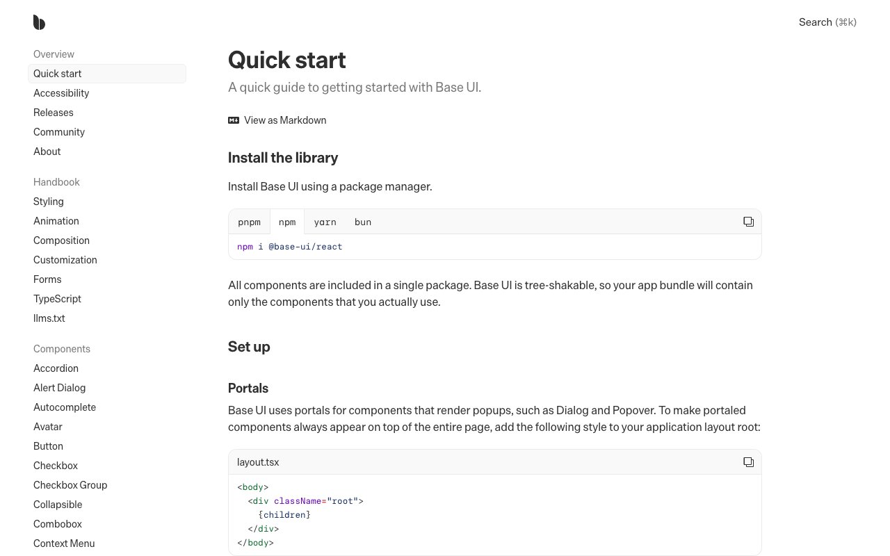
Base UI
newUnstyled React components for accessible interfaces and design systems. Includes composable primitives for forms, overlays, navigation, feedback, and interaction without prescribing visual styling.
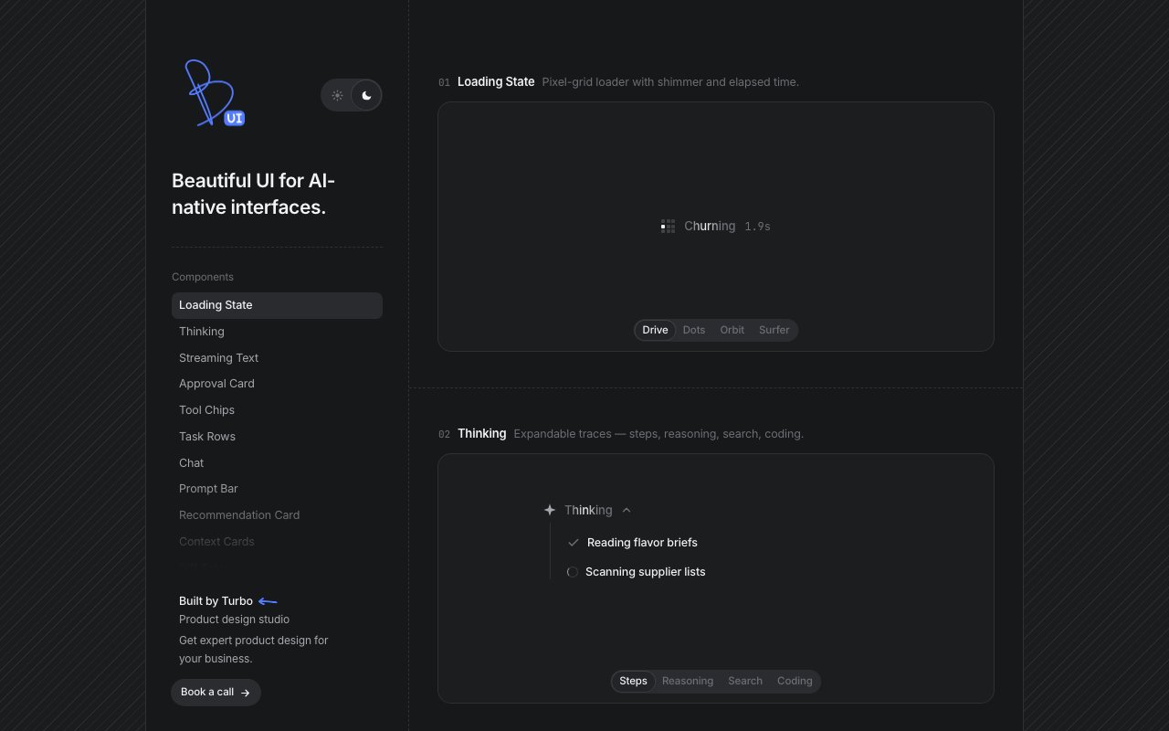
Beautiful UI
newCollection of copyable interface primitives for AI products, including streaming text, approval cards, tool-call states, task progress, retrieved context, and data diffs.
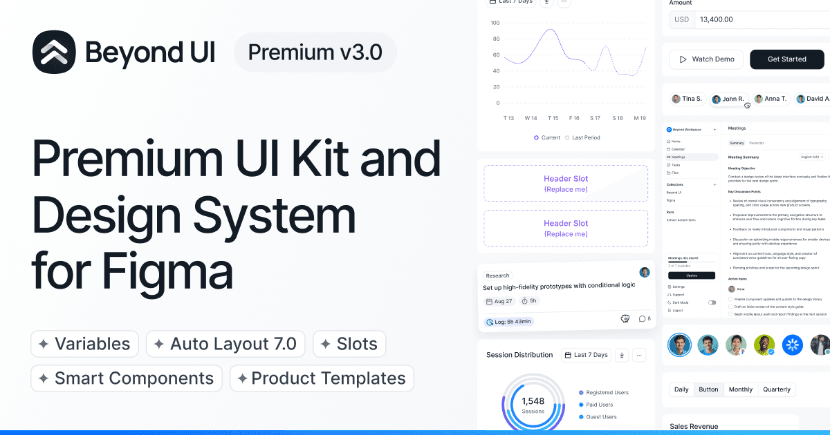
Beyond UI: Advanced Landing Page System
Advanced UI kit using Auto Layout 7.0 with slot-based system for landing pages and websites. Features nested instances, variables for dark mode, and thousands of component instances from master variants. Perfect for modern website builds with easy variant management.
BoardUI
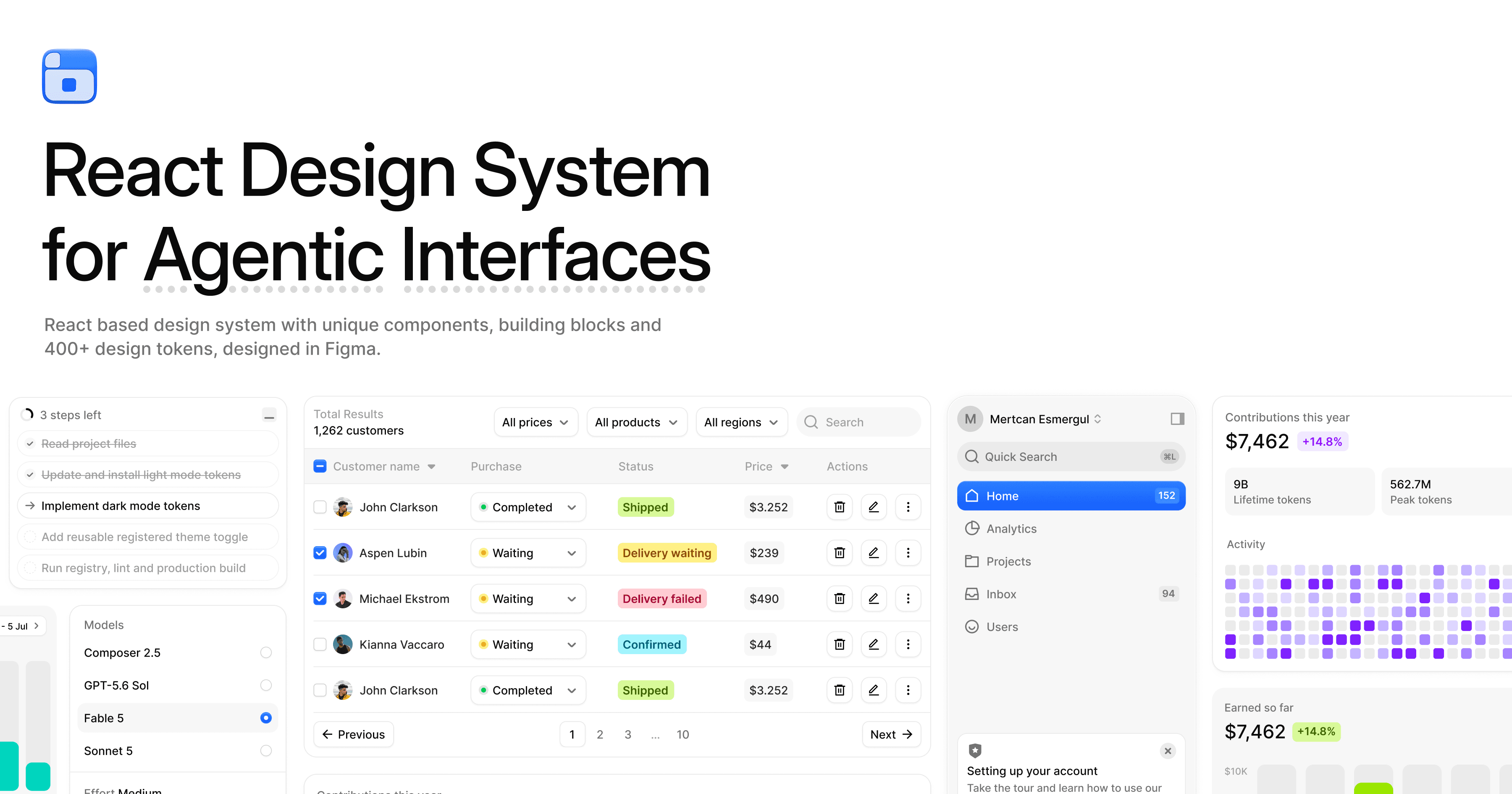
newReact and Tailwind design system for agentic products, with source-installable chat, agent-status, dashboard, chart, and form components plus Figma tokens, CLI tools, and MCP access.
Bootstrap UI Kits: Elevate Your Design Workflow & Efficiency
Bootstrap remains one of the most widely used CSS frameworks, and its UI kit provides responsive grid systems, components, and utility classes that work out of the box. These examples showcase Bootstrap's component library for rapid prototyping and production-ready interfaces.

Elevate Your Designs with Ant Design's UI Kits
Ant Design is a comprehensive React UI framework created by Alibaba, providing 60+ polished enterprise components with TypeScript support, internationalization, and extensive theming. The accompanying Figma kit includes all components, making it a complete design-to-development system.
Figma UI Kits
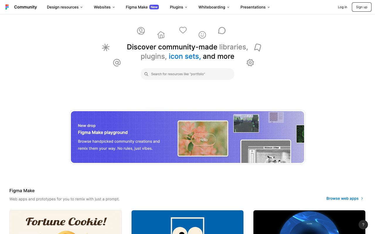
The Figma Community's UI kit collection features hundreds of free and premium design kits — from Material Design and iOS components to custom systems and wireframe kits. A starting point for finding pre-built component libraries to accelerate your Figma projects.
Flowbite: Tailwind CSS Component Library
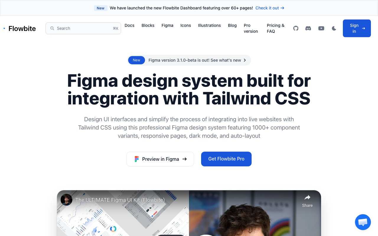
Tailwind CSS-based component library with 27+ pages and responsive examples. Features seamless Tailwind integration with comprehensive documentation and code examples. Perfect for developers building with Tailwind CSS who need design-to-code consistency.

Frames X: Mid-Weight Design System
Well-balanced design system with 5,500+ components featuring Auto Layout, dark mode support, and 420+ building blocks with comprehensive iconography. Ideal for mid-weight web and app designs requiring solid component coverage without overwhelming complexity.
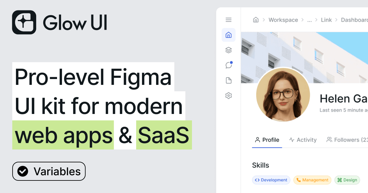
Glow UI: Modern Web App Design System
Complete design system for web applications with 6,500+ components, wireframe mode, multi-theming support, and 440+ icons. Regular updates through Config 2025 with Auto Layout compatibility. Ideal for SaaS platforms, dashboards, and admin panels.
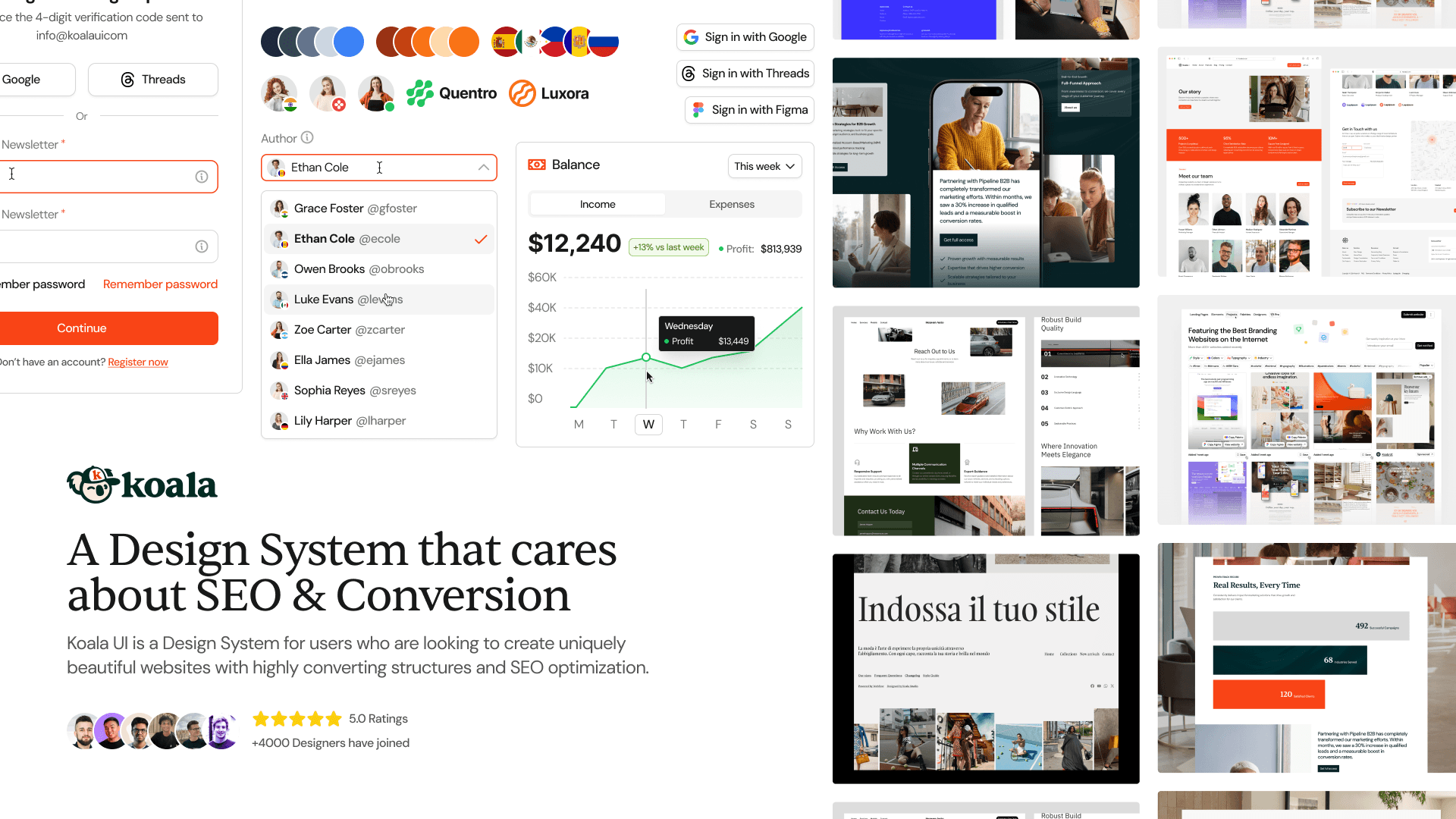
Koala UI: Cross-Platform Mobile Design System
Fully responsive mobile UI kit optimized for both iOS and Android with native components following Apple HIG and Google Material Design. Features pre-built AI app templates and ready-to-use mobile screens for rapid mobile app prototyping.
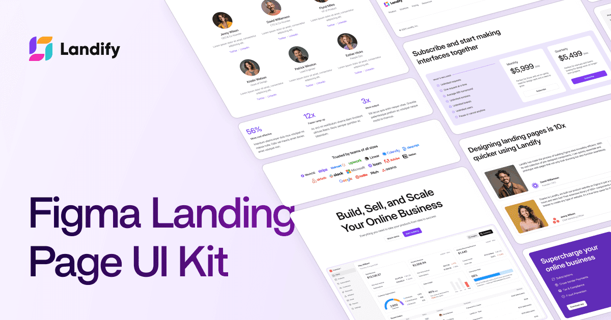
Landify: Landing Page Component Library
Specialized landing page kit with 170+ blocks, 500+ components, and responsive breakpoints for desktop, tablet, and mobile. Modular block system for heroes, features, pricing, testimonials, and CTAs designed for high-converting marketing pages.
Material 3 Design Kit: Google's Official UI System
Google's official Material 3 Design Kit featuring 500+ components and variants with Figma variables support, dark theme compatibility, and responsive design. Includes 300+ variables and styles, perfect for Android app design following Material Design guidelines.
Material Design UI Kit
Google's official Material Design resources provide UI kits, icons, fonts, and implementation guidelines for building interfaces that follow Material Design principles. The comprehensive system covers components, motion, theming, and accessibility across platforms.
Materio: Professional Admin Dashboard Builder
Professional admin dashboard kit with pre-designed elements, widgets, charts, buttons, forms, and navigation components. Reduces design time for data-driven UIs with comprehensive layouts for business intelligence and reporting interfaces.
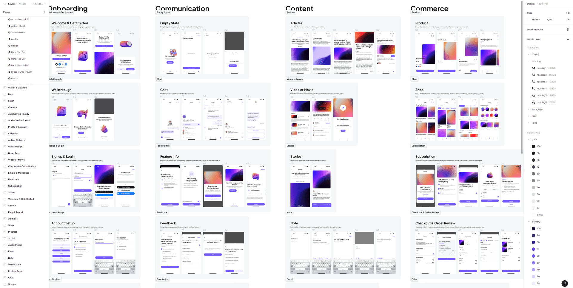
Nucleus UI: Comprehensive Mobile & Web Kit
Versatile UI kit with 1,000+ components and variants, 500+ mobile screens across 9 themes including e-commerce, finance, NFT, and events. Perfect for comprehensive app prototypes with both mobile and web components in a unified design system.
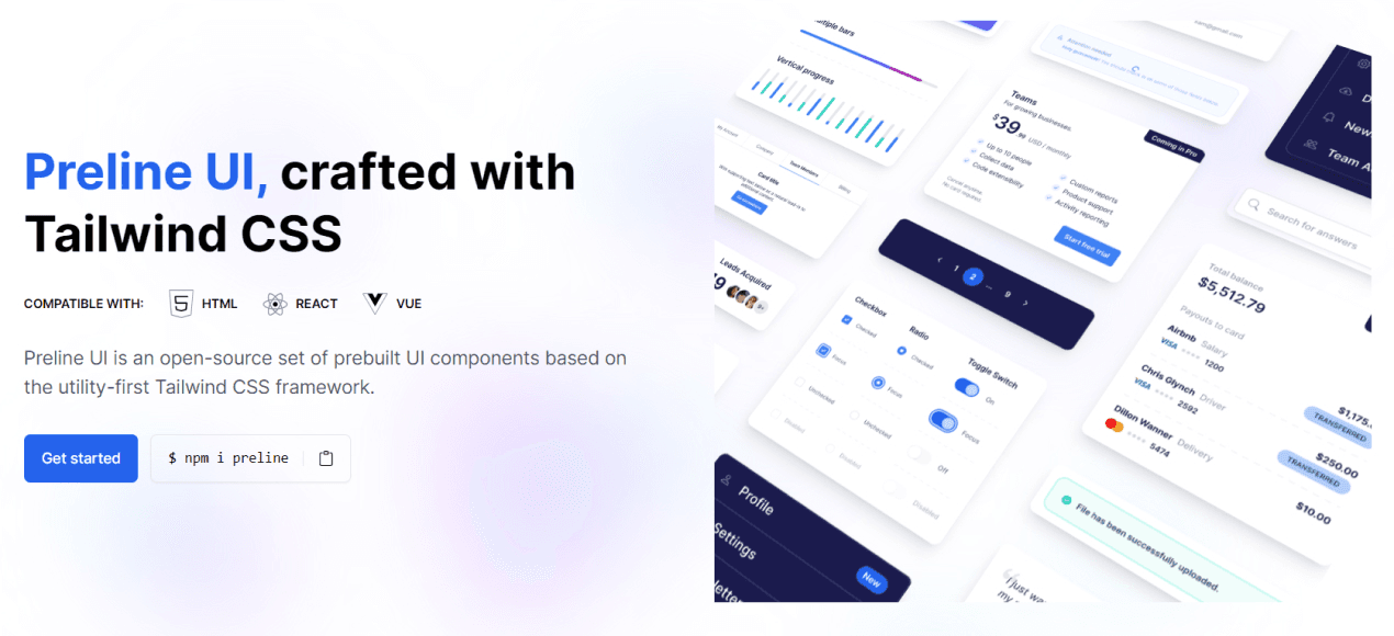
Preline UI: Free Tailwind Component Library
Comprehensive free component library with 5,000+ Tailwind CSS-based components featuring auto-layout and Figma Tokens compatibility. 100% free with extensive component coverage, perfect for Tailwind CSS projects requiring no licensing fees.
ReUI
966+ real-world shadcn/ui patterns and compositions. Filters, data tables, forms, and dashboards. Open source and compatible with all shadcn styles.
Square UI
Open-source shadcn/ui layouts and components. Clean, modern designs ready to use in your Next.js projects.
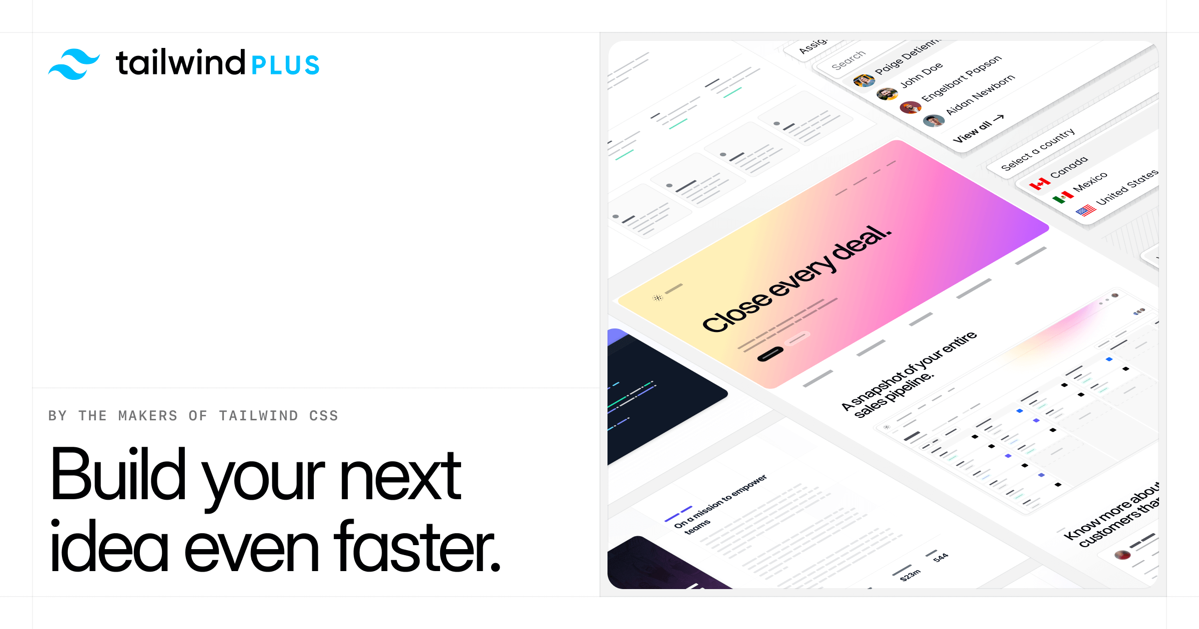
Tailwind CSS UI Kit
Tailwind UI is the official component library from the creators of Tailwind CSS, providing 500+ professionally designed, responsive components and templates. Each component is production-ready HTML with Tailwind classes — paste it into your project and customize.
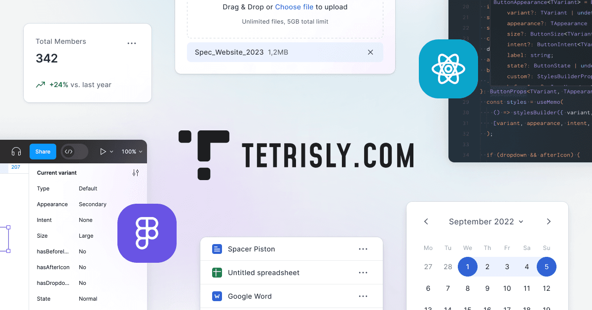
Tetrisly: Multi-Platform UI Starter Kit
Comprehensive UI starter kit with 2,500+ components, 700+ icons, and 55 predefined styles. Available for both Figma and Sketch with cross-platform compatibility. Perfect for teams needing consistent design systems across multiple design tools and platforms.
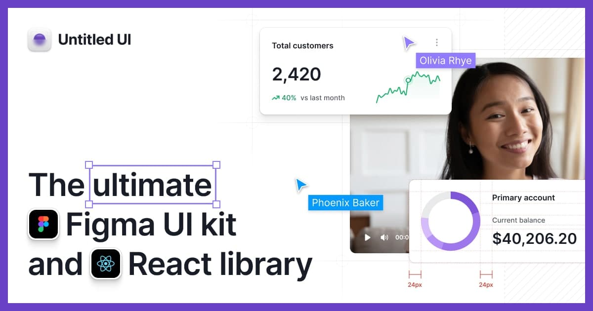
Untitled UI: The World's Largest Figma UI Kit
The world's largest Figma UI kit with 10,000+ components and variants, 900+ global styles, and 420+ page examples. Built with 100% Auto Layout 5.0, smart variants, Figma variables, and accessibility focus. Perfect for rapid prototyping and comprehensive design systems.
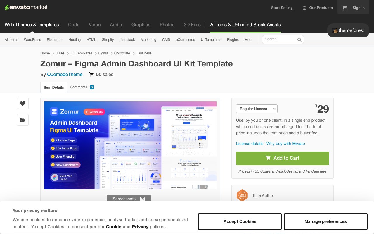
Zomur: Corporate Admin Dashboard UI Kit
Corporate-focused admin dashboard with 4 home pages, 40+ inner pages, vector icons, and light/dark themes. Pixel-perfect and fully customizable design ideal for business, finance, and sales dashboard implementations. Updated October 2024.