
Command Palette
Search for a command to run...
Tetrisly: Multi-Platform UI Starter Kit
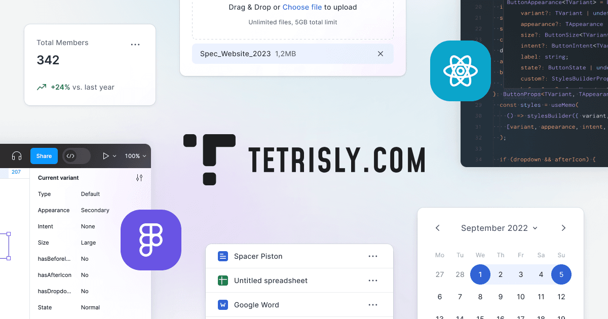
Comprehensive UI starter kit with 2,500+ components, 700+ icons, and 55 predefined styles. Available for both Figma and Sketch with cross-platform compatibility. Perfect for teams needing consistent design systems across multiple design tools and platforms.
More UI Kits(4)
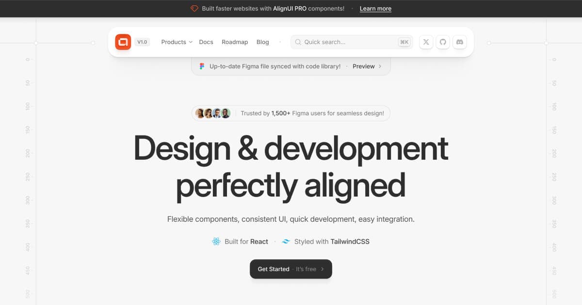
AlignUI: Code-Implemented Design System
Professional design system with 7,800+ components and code-implemented variants. Features 80+ unique widgets, Figma variables support, and dark mode compatibility. Lightning-fast performance designed specifically for enterprise SaaS dashboards and admin interfaces.

Apple iOS 18 UI Kit: Official Apple Design Resources
Apple's official iOS 18 UI kit containing hundreds of components with Auto Layout, Component Properties, variants, and light/dark mode support. Includes system interfaces, widgets, notification templates, and comprehensive typography with accessibility sizes for native iOS development.
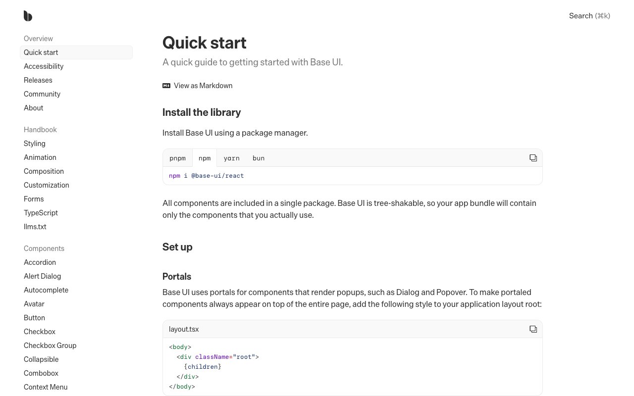
Base UI
newUnstyled React components for accessible interfaces and design systems. Includes composable primitives for forms, overlays, navigation, feedback, and interaction without prescribing visual styling.
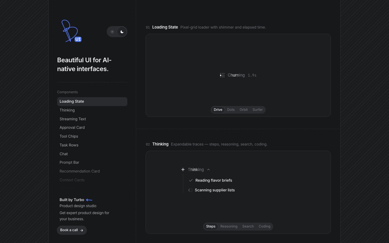
Beautiful UI
newCollection of copyable interface primitives for AI products, including streaming text, approval cards, tool-call states, task progress, retrieved context, and data diffs.