Search for a command to run...
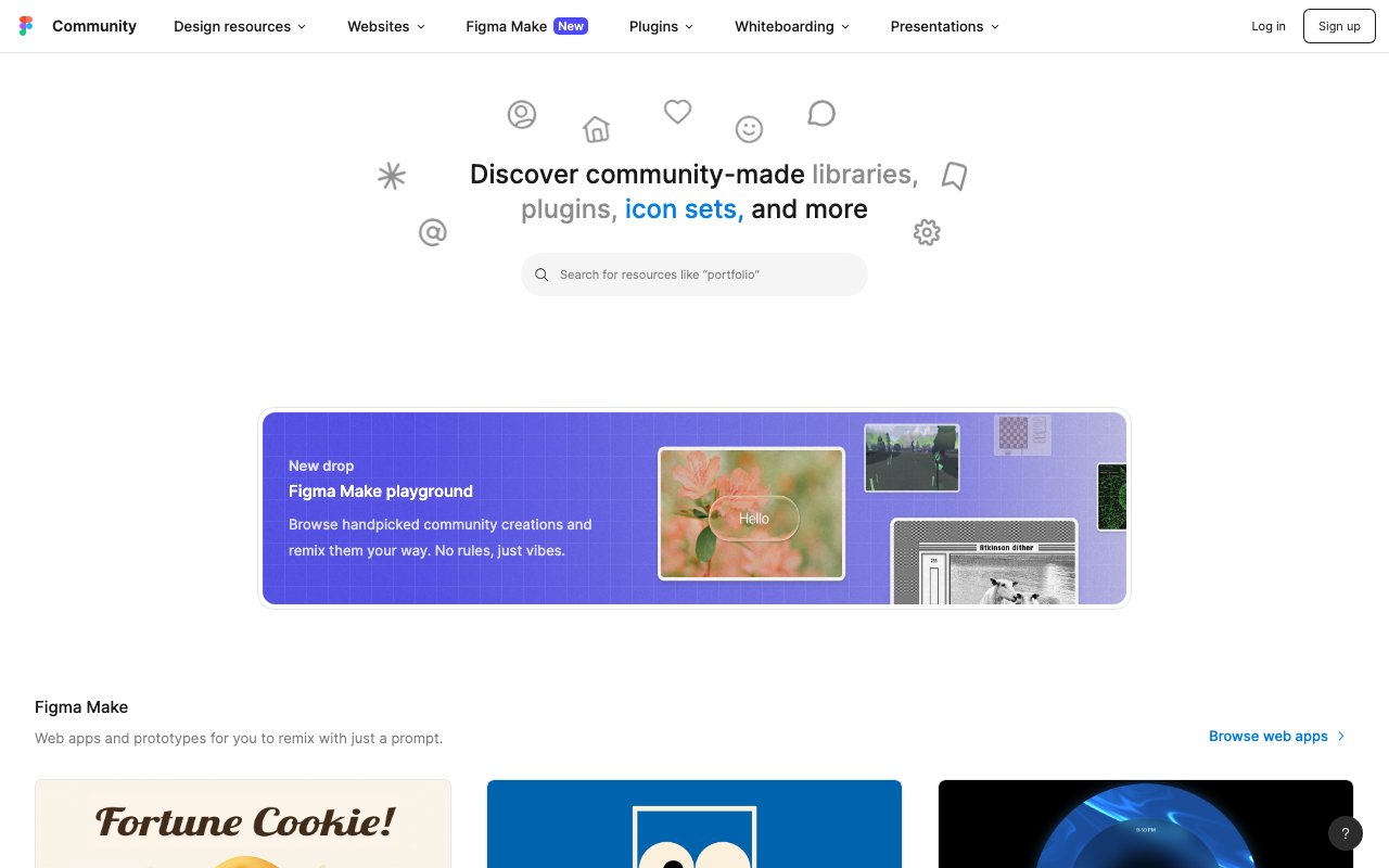
Curated figma resources for designers and developers.
The A11y Annotation Kit is a comprehensive Figma library that provides standardized accessibility annotation components for design handoffs. It helps designers communicate accessibility requirements to developers through clear, consistent annotations that cover focus states, screen reader labels, keyboard navigation, and more.
Added Feb 2026
Able is a Figma plugin that helps designers check color contrast ratios, simulate different types of color blindness, and ensure their designs meet WCAG accessibility standards. It integrates seamlessly into the design workflow, allowing real-time accessibility checking without leaving the design environment.
Professional design system with 7,800+ components and code-implemented variants. Features 80+ unique widgets, Figma variables support, and dark mode compatibility. Lightning-fast performance designed specifically for enterprise SaaS dashboards and admin interfaces.
Apple's official iOS 18 UI kit containing hundreds of components with Auto Layout, Component Properties, variants, and light/dark mode support. Includes system interfaces, widgets, notification templates, and comprehensive typography with accessibility sizes for native iOS development.
Advanced UI kit using Auto Layout 7.0 with slot-based system for landing pages and websites. Features nested instances, variables for dark mode, and thousands of component instances from master variants. Perfect for modern website builds with easy variant management.
Create unique crystal shapes perfect for AI products with one-click copy to Figma
Figma's 2026 web design trends overview — including 3D, AR, and spatial elements rising in design systems, with a core principle: depth should enhance navigation only, not serve as decoration. Covers immersive UI, kinetic typography, and AI-generated personalization.
Added Mar 2026
AI agents can now design directly on the live Figma canvas — read, write, and iterate alongside designers in real-time. The biggest Figma platform shift since auto-layout.
Added Apr 2026
Figma Make is an AI-powered generator that learns from your existing design system to produce team-specific UI patterns. Describe what you want in natural language and it outputs components that already match your brand tokens, spacing, and component conventions.
How to use Figma MCP with Cursor to build an AI-powered design system — shifts designer role from maker to director, freeing engineering bandwidth while keeping design on-brand.
The Figma Community's UI kit collection features hundreds of free and premium design kits — from Material Design and iOS components to custom systems and wireframe kits. A starting point for finding pre-built component libraries to accelerate your Figma projects.
Added Jan 2025
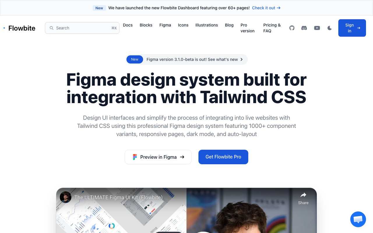
Tailwind CSS-based component library with 27+ pages and responsive examples. Features seamless Tailwind integration with comprehensive documentation and code examples. Perfect for developers building with Tailwind CSS who need design-to-code consistency.
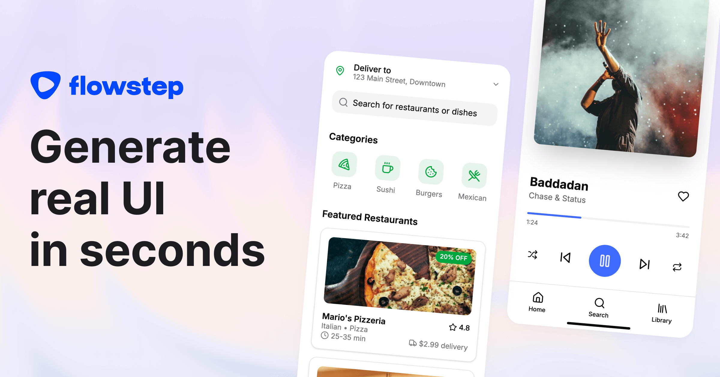
Generates complete 5-15 screen user journeys from a single text prompt. Exports directly to Figma (preserving layers and components) and outputs clean React/TypeScript/Tailwind code. Removes the gap between wireframe ideation and production-ready design.
Well-balanced design system with 5,500+ components featuring Auto Layout, dark mode support, and 420+ building blocks with comprehensive iconography. Ideal for mid-weight web and app designs requiring solid component coverage without overwhelming complexity.
Fusion 1.0 closes the designer-to-developer gap with context-aware AI code generation from Figma designs plus Slack conversations. Understands your team's existing codebase and patterns to generate production-ready components without the usual handoff friction.
Complete design system for web applications with 6,500+ components, wireframe mode, multi-theming support, and 440+ icons. Regular updates through Config 2025 with Auto Layout compatibility. Ideal for SaaS platforms, dashboards, and admin panels.
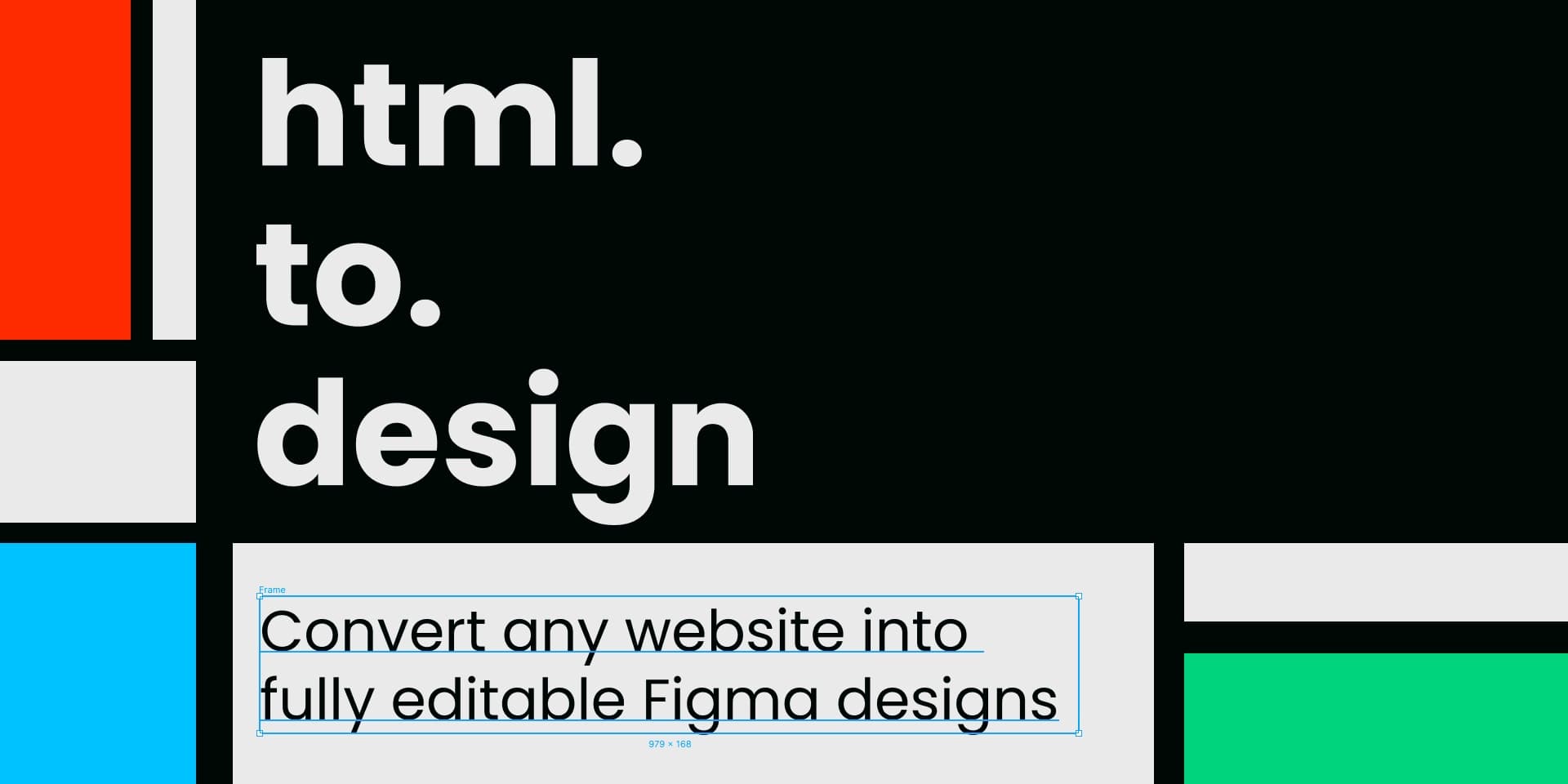
html.to.design converts any website into fully editable Figma designs. Paste a URL, drop in HTML/CSS, or capture private/logged-in pages via the Chrome extension. Outputs real text, images, and proper layer hierarchy with auto layout — ideal for redesigns, competitive audits, and rapid prototyping without building from scratch.
4,000+ icons across 9 distinct styles and 59 categories. Available in Figma, React, Vue, and as SVG. Free and premium options.
1,500+ minimalist open-source SVG icons on a consistent 24x24 grid. Available for React, Flutter, SwiftUI, Figma with customizable stroke width and MIT license — clean, modern, and free.
A YouTube channel delivering in-depth tutorials and talks about building and maintaining design systems. Covers topics from token architecture and component APIs to Figma workflows and developer handoff — practical knowledge from experienced practitioners.
Fully responsive mobile UI kit optimized for both iOS and Android with native components following Apple HIG and Google Material Design. Features pre-built AI app templates and ready-to-use mobile screens for rapid mobile app prototyping.
Specialized landing page kit with 170+ blocks, 500+ components, and responsive breakpoints for desktop, tablet, and mobile. Modular block system for heroes, features, pricing, testimonials, and CTAs designed for high-converting marketing pages.
Google's official Material 3 Design Kit featuring 500+ components and variants with Figma variables support, dark theme compatibility, and responsive design. Includes 300+ variables and styles, perfect for Android app design following Material Design guidelines.
Professional admin dashboard kit with pre-designed elements, widgets, charts, buttons, forms, and navigation components. Reduces design time for data-driven UIs with comprehensive layouts for business intelligence and reporting interfaces.
Versatile UI kit with 1,000+ components and variants, 500+ mobile screens across 9 themes including e-commerce, finance, NFT, and events. Perfect for comprehensive app prototypes with both mobile and web components in a unified design system.
Comprehensive free component library with 5,000+ Tailwind CSS-based components featuring auto-layout and Figma Tokens compatibility. 100% free with extensive component coverage, perfect for Tailwind CSS projects requiring no licensing fees.
Professional UI design training with 85 lessons across 8 modules covering typography, layout, color, and Figma tactics. Live critiques and workshops included — the best course for leveling up visual design craft.
Stark is a comprehensive accessibility suite that integrates with design tools like Figma, Sketch, and Adobe XD to help designers check contrast, simulate vision conditions, and ensure accessible color choices. It provides real-time accessibility feedback during the design process, making it easier to catch and fix issues before they reach development.
Figma2Framer provides a component library that works seamlessly across both Figma and Framer, ensuring design consistency from mockup to published site. It bridges the gap between designing in Figma and building in Framer with matched components.
Comprehensive UI starter kit with 2,500+ components, 700+ icons, and 55 predefined styles. Available for both Figma and Sketch with cross-platform compatibility. Perfect for teams needing consistent design systems across multiple design tools and platforms.
Graph-powered multi-brand token architecture with contextual awareness, dynamic inheritance, and multi-mode theming. The infrastructure layer for scalable design systems that span multiple brands without losing coherence.
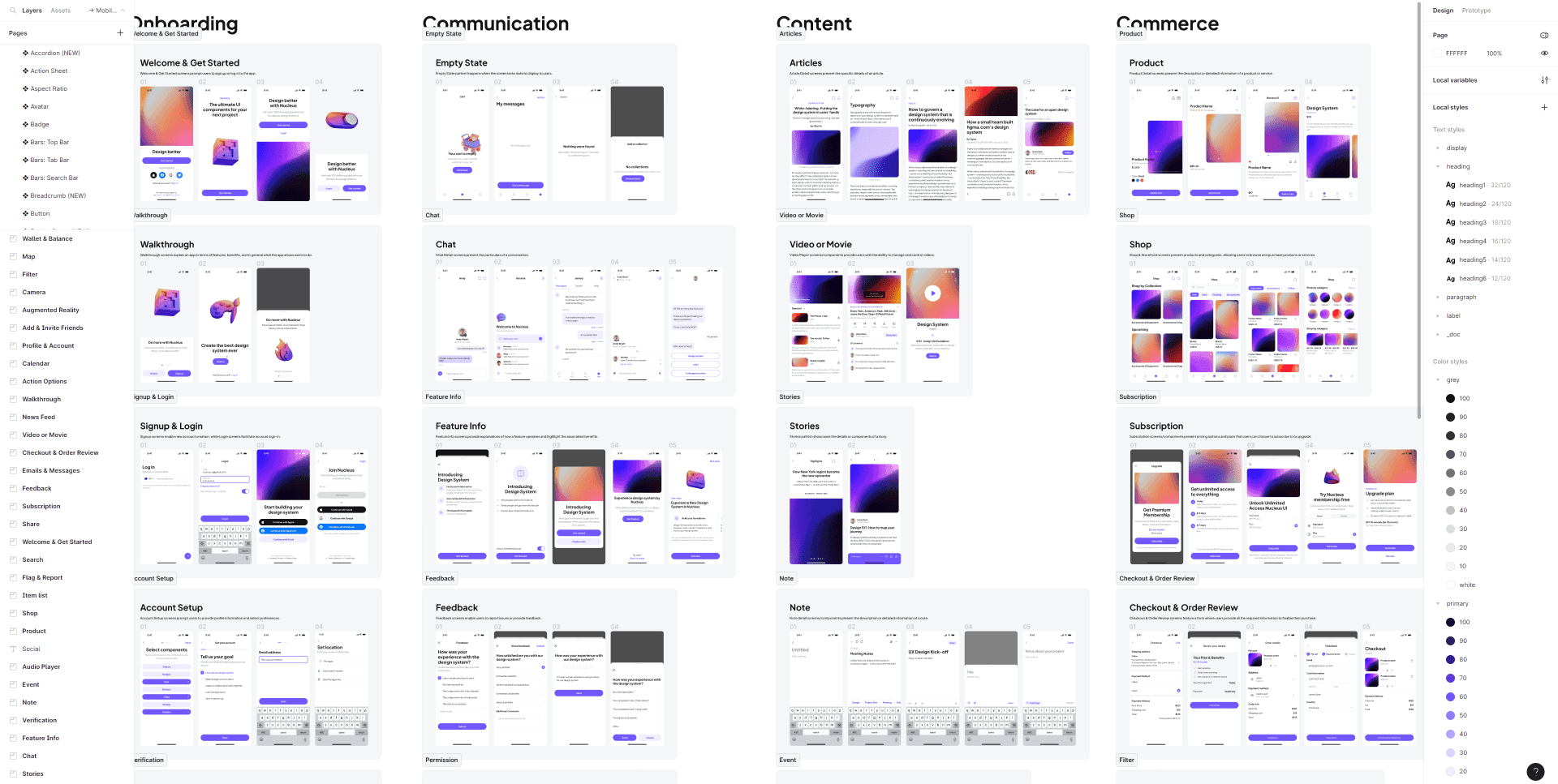
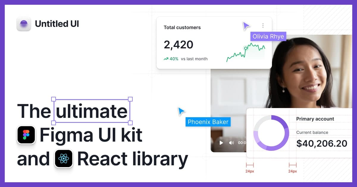
The world's largest Figma UI kit with 10,000+ components and variants, 900+ global styles, and 420+ page examples. Built with 100% Auto Layout 5.0, smart variants, Figma variables, and accessibility focus. Perfect for rapid prototyping and comprehensive design systems.
Converts app screenshots into editable design files, digitizes hand-drawn wireframes, and generates custom color themes via conversation. Operates in Standard and Pro modes with Figma/HTML/CSS exports. Design reverse-engineering automated—screenshot to design system in a single operation.
Flowbase is the world's largest library of Webflow, Figma, and Framer components with 3,500+ ready-to-use elements — navbars, headers, content sections, dashboards, and more. Copy-paste components directly into your projects to accelerate design and development.
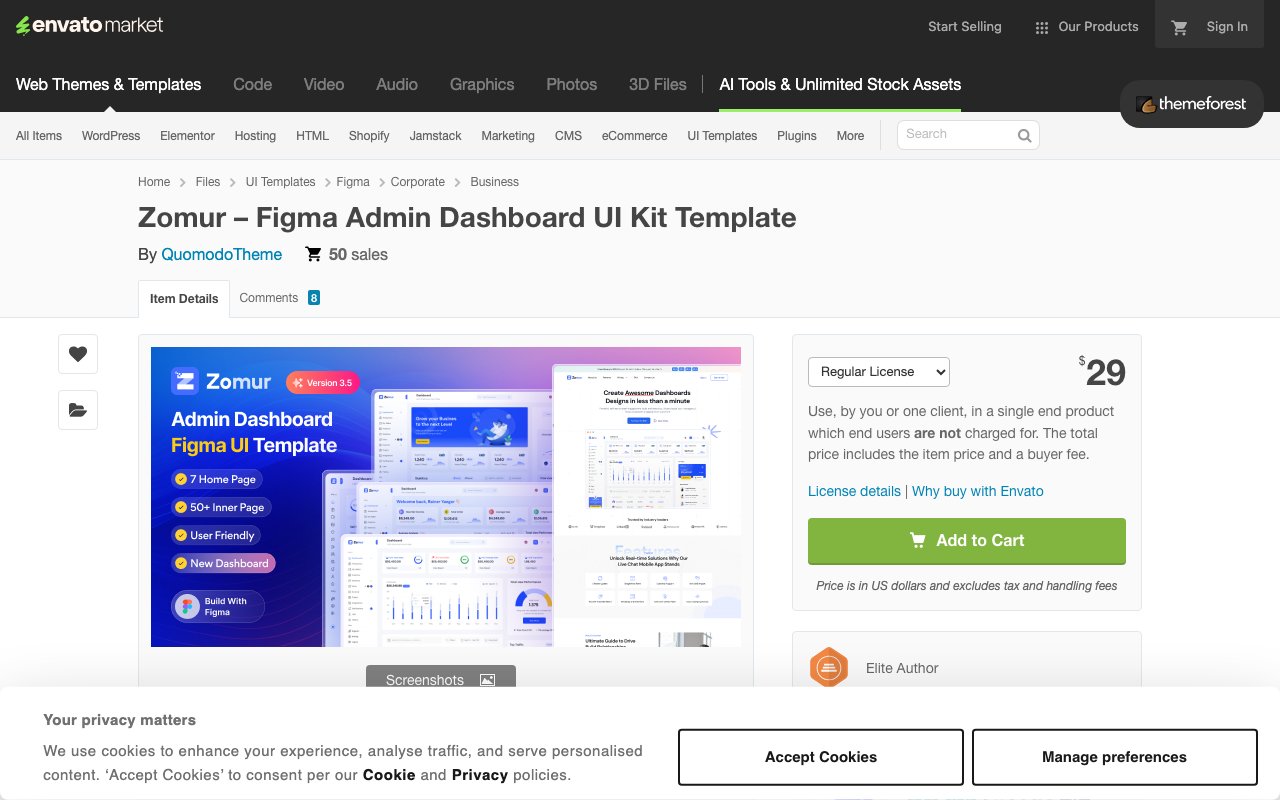
Corporate-focused admin dashboard with 4 home pages, 40+ inner pages, vector icons, and light/dark themes. Pixel-perfect and fully customizable design ideal for business, finance, and sales dashboard implementations. Updated October 2024.