
Command Palette
Search for a command to run...
design systems(62)
tagged resources
design systems Resources
@shadcn/lint
newAgent-focused linter for Tailwind v4 design systems. Enforces component, token, color, and class rules through ESLint or Oxlint, with fix guidance drawn from the project's own components and theme.
AI Design Trends 2026 That Actually Matter
A signal-to-noise breakdown of which 2026 design trends are genuinely reshaping the discipline. Covers the shift from static design libraries to AI-driven intent-based systems, and what it means for designers to evolve from pixel-pushers to quality-control strategists.
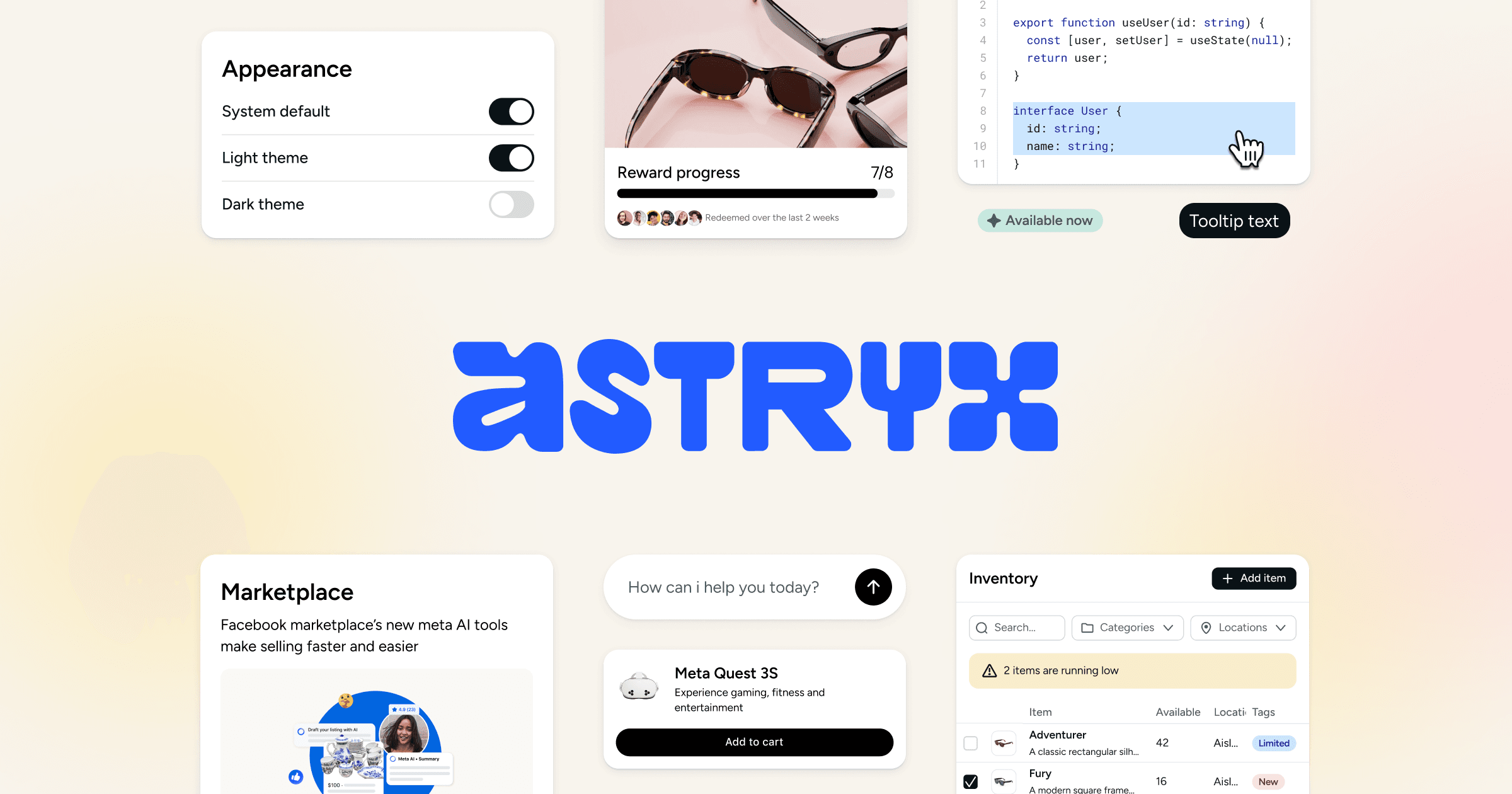
Astryx
Open-source React 19 design system from Meta with 150+ accessible components, seven themes, templates, and a CLI. Shared conventions and documentation support people and coding agents.
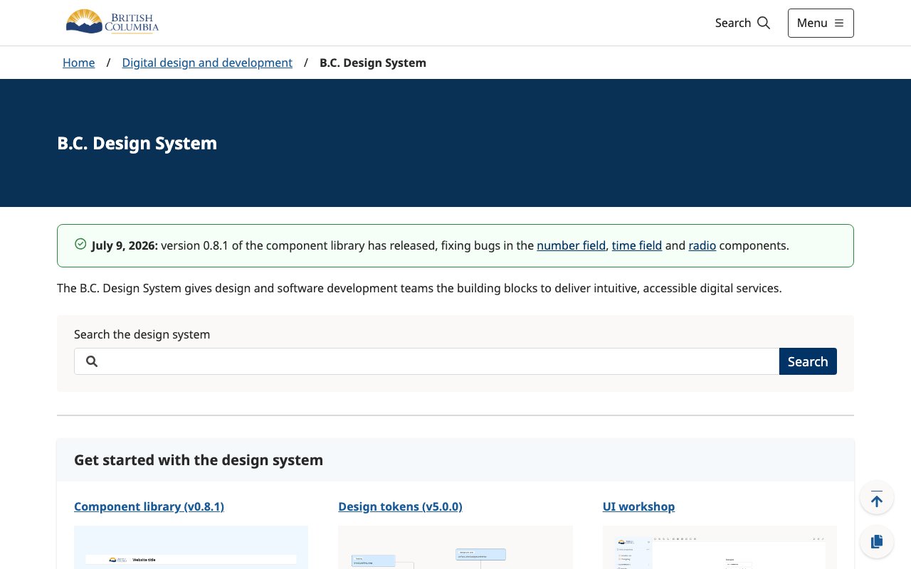
B.C. Design System
Province of British Columbia design system with Figma tokens, CSS and JavaScript variables, and React components for consistent government service interfaces.
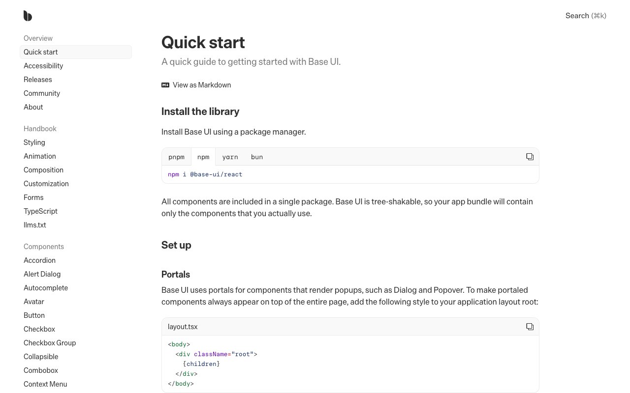
Base UI
newUnstyled React components for accessible interfaces and design systems. Includes composable primitives for forms, overlays, navigation, feedback, and interaction without prescribing visual styling.
Best Design System Documentation Sites: Top Picks
A curated roundup of the best design system documentation sites in the industry, from Shopify Polaris to IBM Carbon. Great reference for teams building their own design system docs — each example is analyzed for what makes it effective.
Better Design
Design MCP server and shadcn/ui registry that gives coding agents design tokens, UI principles, component code, icon direction, and accessibility review rules.
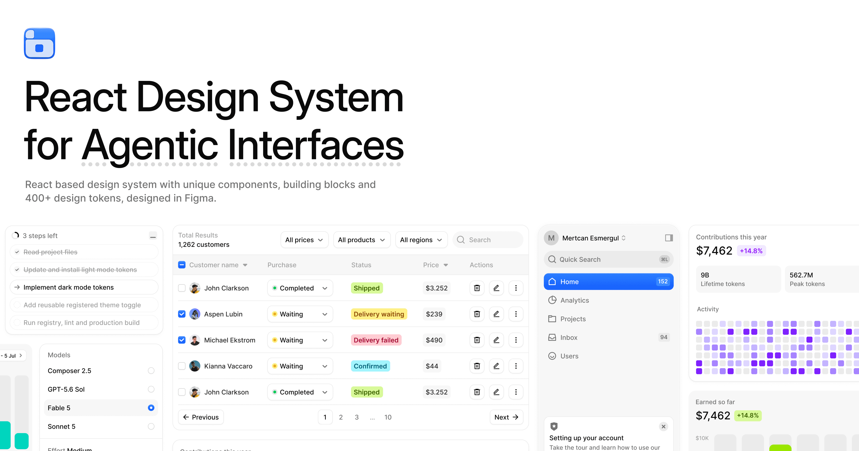
BoardUI
newReact and Tailwind design system for agentic products, with source-installable chat, agent-status, dashboard, chart, and form components plus Figma tokens, CLI tools, and MCP access.
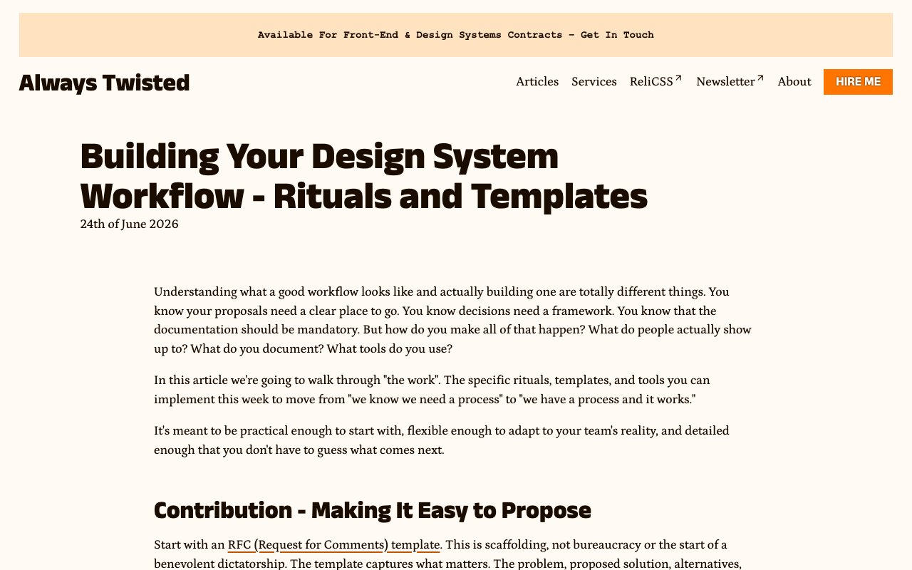
Building Your Design System Workflow — Rituals and Templates
Practical playbook for running a design-system contribution workflow. Covers RFCs, communication rituals, reusable templates, phased adoption, and the maintenance work that keeps the system healthy.
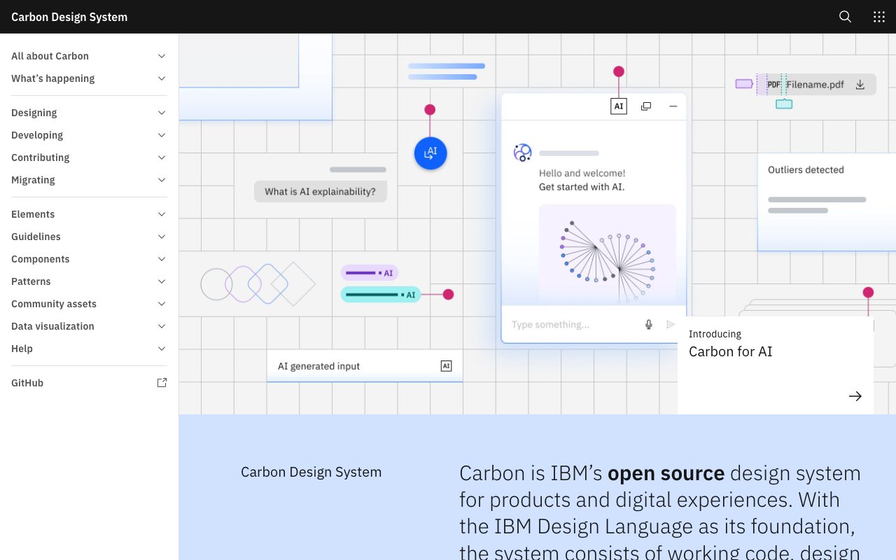
Carbon Design System: Elevate Your Design Workflow for Free
Carbon is IBM's open-source design system providing production-ready React and Web Components, Figma kits, design tokens, and comprehensive guidelines. Built on the IBM Design Language, it's a mature, well-documented system ideal for enterprise applications.

ColorBox
Advanced palette builder from Lyft Design using perceptually uniform color scales (HSLuv/LCH). Creates accessible, predictable color systems for design systems — the tool behind thoughtful ramp generation.
CopilotKit
Open-source framework for building Generative UI — AI-generated interfaces that adapt in real-time based on user context and intent. Supports static (AI selects components), declarative (structured JSON specs), and open-ended (full surface generation) patterns. The infrastructure layer for GenUI design systems.

Defensive Design for Motion-Sensitive Users
Practical framework for designing motion that stops safely when timing, state, or performance fails. Covers duration limits, circuit breakers, static fallbacks, monitoring, and user controls.
Design Engineers: The Emerging Role Bridging Design and Code
Market validation for professionals who bridge visual authority, systems thinking, and code. Manage component libraries, prototype, reduce design debt — the structural solution to taste at scale.
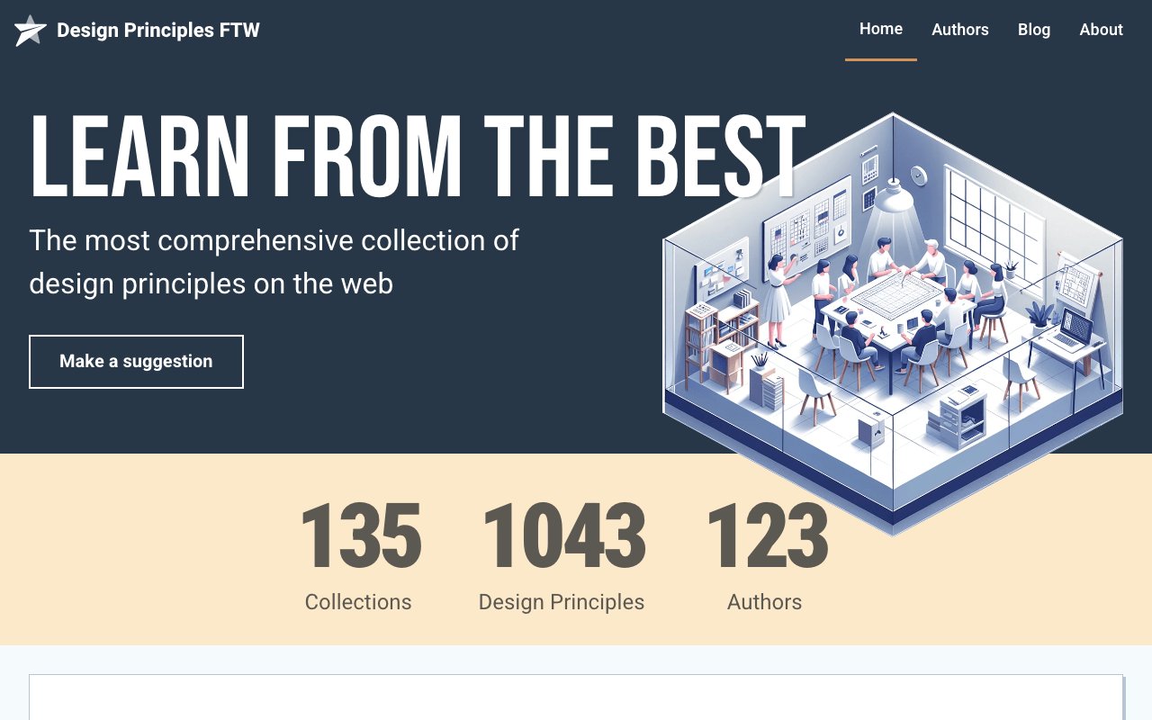
Design Principles FTW: Comprehensive Collection of Design Principles
A curated archive of design principles from teams across the industry — Apple, Google, GOV.UK, and hundreds more. Browse by company or principle type to find inspiration for establishing your own team's design values and decision-making framework.

Design System Office Hours: Podcast for Design Enthusiasts
A podcast dedicated to the practical side of design systems — featuring real conversations with practitioners about governance, adoption challenges, component APIs, and scaling design systems across organizations.

Design System University: Mastering Design Systems at Scale
Design System University offers structured courses on building, scaling, and governing design systems. Covers everything from token architecture and component APIs to organizational strategy and adoption — taught by experienced design system practitioners.
Design Systems in 2026: The Infrastructure Is Here
April 2026 checkpoint: AI-powered generative design, 60% cycle reduction, cloud collaboration, and spatial/3D UX are production-ready. Most teams still lag. The insight: competitive advantage goes to design orgs adopting agent-first and spatial design NOW — the tools are no longer the bottleneck.
Design Systems MCP Server
MCP server that lets AI assistants search curated design system knowledge, including WCAG, ARIA, W3C standards, and major public design systems.
Design Systems Podcast: Industry Insights and Best Practices
A long-running podcast featuring interviews with design system leaders from companies like Shopify, Figma, GitHub, and Salesforce. Deep conversations about strategy, tooling, and the organizational dynamics behind successful design systems.
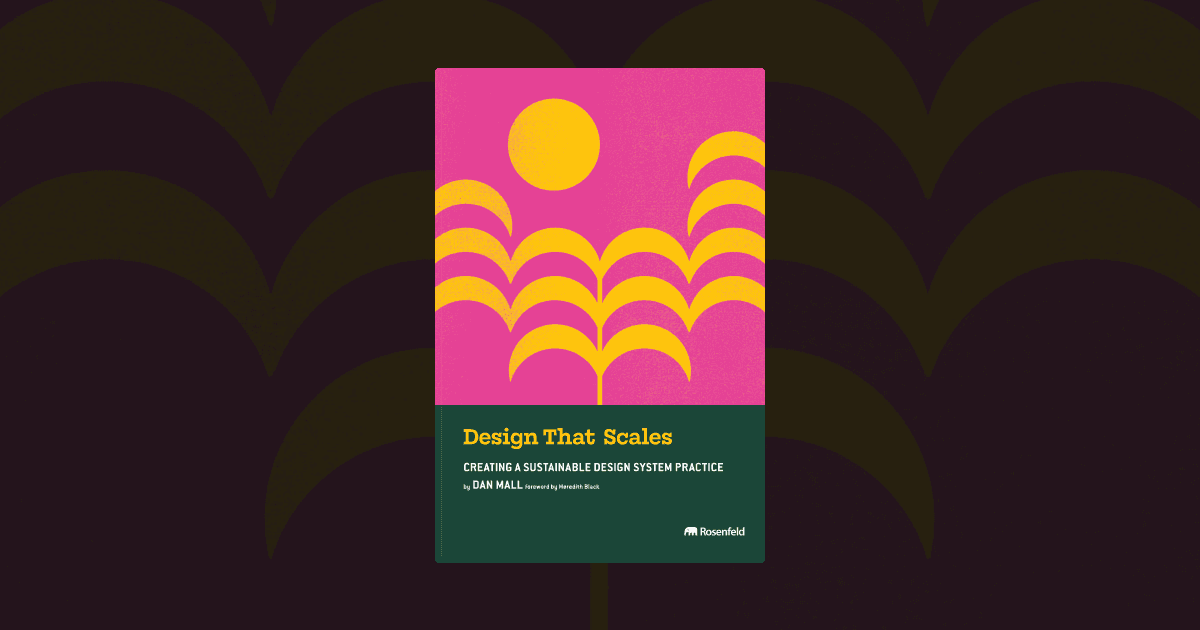
Design That Scales: A Guide to Sustainable Design Systems
A practical guide to building design systems that grow with your organization. Covers component architecture, governance, contribution models, and the organizational dynamics that determine whether a design system thrives or withers.
Design Tokens 2.0: Motion, Layout Logic, and AI-Driven Adaptation
Tokens evolve from static values (colors, spacing) to behavioral ones: motion curves, layout logic, and adaptive personalization rules. Enables AI agents to generate UI within system constraints — the infrastructure layer that keeps generative design on-brand.
DESIGN.md: design system format for coding agents
Open-source format from Google Labs that describes a design system to coding agents. Combines YAML design tokens with markdown rationale in one file, plus a CLI to lint, diff, and export tokens to Tailwind or DTCG.
DesignSystems.media: All-In-One Hub for Design System Insights
DesignSystems.media aggregates articles, talks, tools, and resources about design systems from across the web. A one-stop hub for staying current with best practices, new tools, and community discussions in the design systems space.

Dialtone
newOpen-source design system from Dialpad with Vue components, tokens, icons, utilities, UI kits, and accessibility guidance. Version 10 adds composition primitives, theming, MCP tooling, and migration guides.
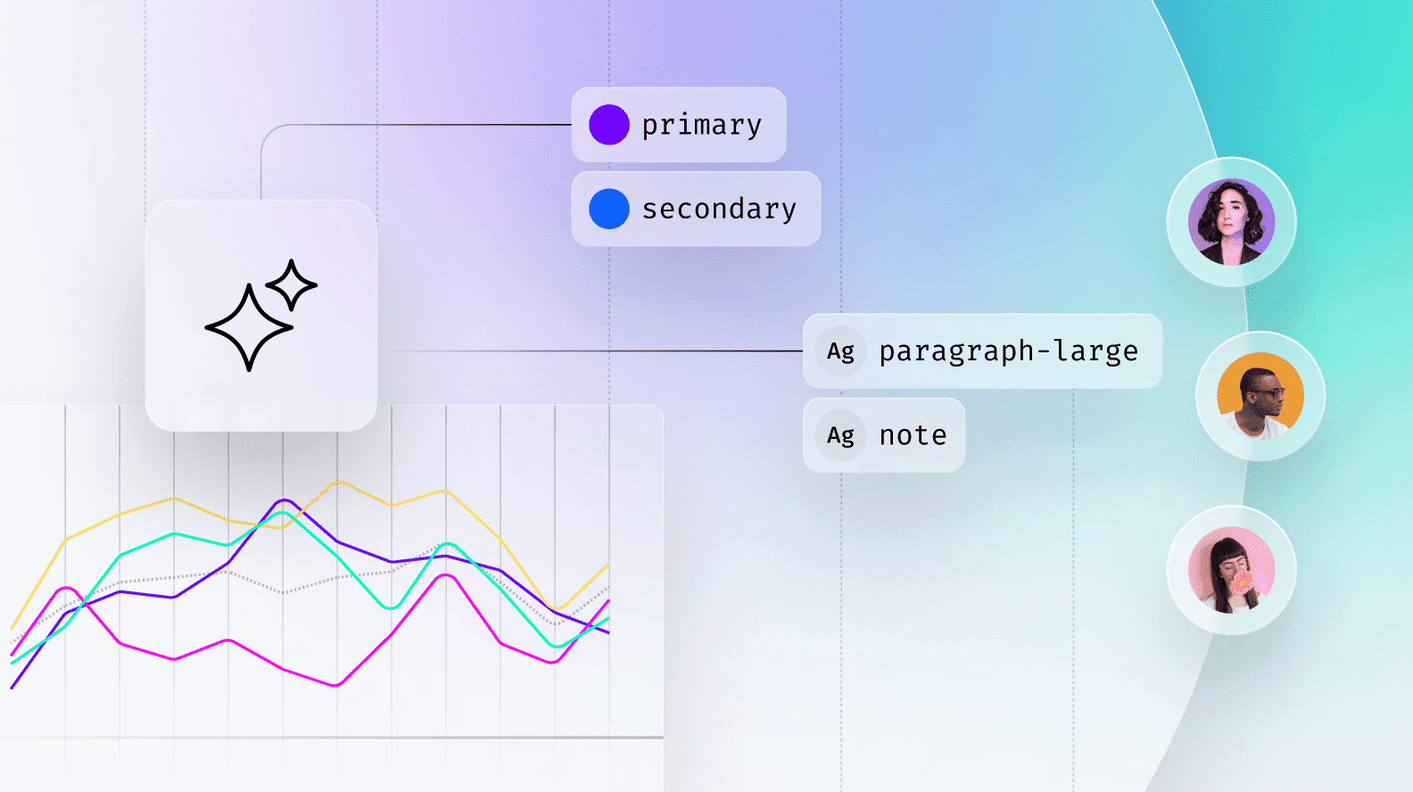
Enterprise Design Systems 2026: Agents as Governance Layer
Autonomous agents now span Figma → Jira → GitHub — detecting design drift, enforcing brand principles, and flagging accessibility failures in code. This is the governance-beyond-humans model: agents become the system's immune system. Unified collaboration hubs replace handoff lag with real-time spec access in editors and tickets.

Figma Make
Figma Make is an AI-powered generator that learns from your existing design system to produce team-specific UI patterns. Describe what you want in natural language and it outputs components that already match your brand tokens, spacing, and component conventions.

Figma Motion
Timeline-based animation inside Figma with keyframes, animated components, motion variables, and time-based comments. Dev Mode exports motion as CSS, JSON, React, or Motion.dev code.

Figma Web Design Trends 2026: Depth with Variables
Figma's guide to 2026 web design trends — framework-specific design system kits now mandate Variables for AI-driven theme switching and executable design tokens. Shows where design-to-code infrastructure is heading.
Figma: Streamline Design Collaboration and Boost Productivity
Design Lint scans your Figma file for inconsistencies — missing styles, detached components, incorrect spacing, and other common issues. Like a linter for code, it catches design debt before it ships, making it invaluable for design system maintenance.

Fluent 2: Microsoft's Advanced Design System
Fluent 2 is Microsoft's cross-platform design system providing components, design tokens, and guidelines for building apps across Windows, web, iOS, and Android. Its adaptive design language ensures consistency while respecting each platform's conventions.
From Products to Systems: The Agentic AI Shift
The philosophical foundation for design in the agentic era: the discipline moves from designing fixed UIs to designing generative, adaptive systems that agents produce. AX (Agent Experience) becomes the core design discipline — designers now design the systems that design the outputs.
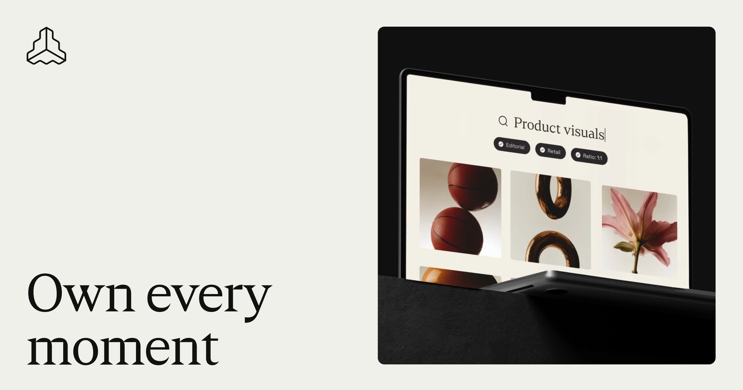
Frontify: Where Brands Live
Frontify is a brand management platform that helps teams create, maintain, and share brand guidelines, digital asset libraries, and design system documentation in one centralized hub. Used by companies like Uber and Lufthansa to keep brand consistency at scale.
How to Structure Your Design System for AI
Step-by-step guide to structuring design systems for coding agents with semantic tokens, W3C token files, readable component docs, MCP access, and CI rules that prevent drift.

Into Design Systems: YouTube Channel for Design Systems
A YouTube channel delivering in-depth tutorials and talks about building and maintaining design systems. Covers topics from token architecture and component APIs to Figma workflows and developer handoff — practical knowledge from experienced practitioners.
Machine Experience (MX) Design
Emerging discipline: optimize products not just for human visual hierarchy but for AI agent readability and discoverability. Machine-readable structures, semantic markup, and intent-based hierarchies are now first-class design concerns. AI discoverability is the new accessibility — a design constraint that reveals intentional architecture.
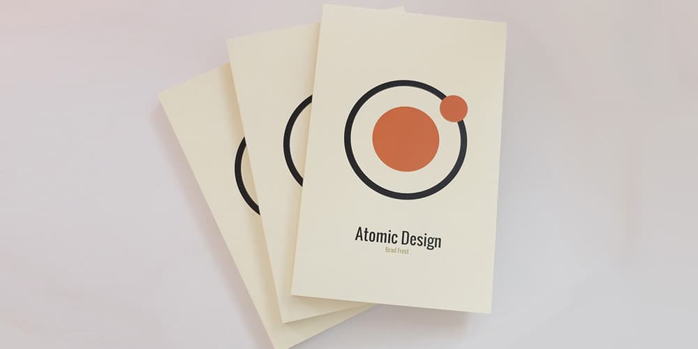
Maintaining Design Systems
Brad Frost's chapter on maintaining design systems from his book Atomic Design tackles the hardest part of design systems — keeping them alive. Covers governance models, regular check-ins, handling updates, and building a culture of contribution.
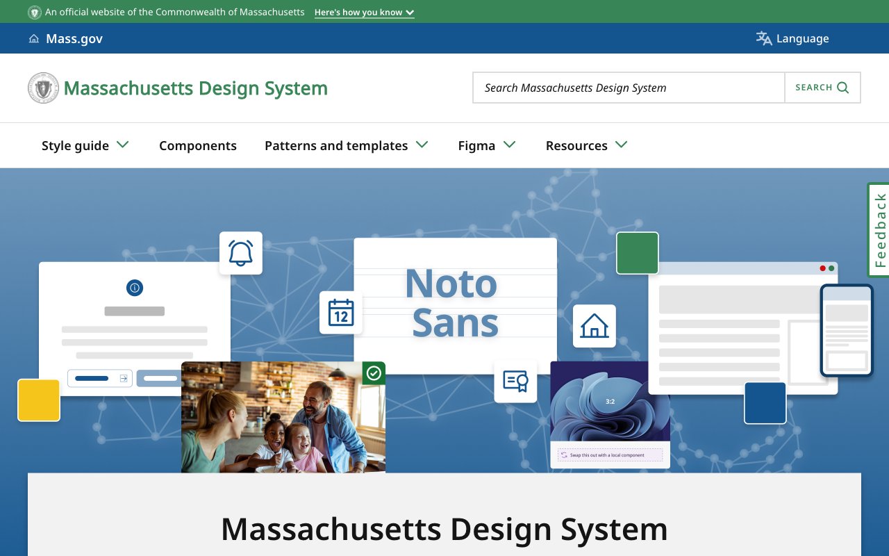
Massachusetts Design System
Public state design system with Figma components, accessible style guidance, design tokens, and icon packages. A practical reference for teams building clear, consistent government services.
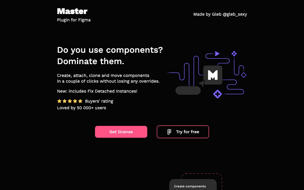
Master Plugin for Figma: Dominate Components with Ease
Master is a Figma plugin from Dominate Design that supercharges component management — batch edit properties, sync instances across files, and manage variants at scale. A power tool for design system maintainers working with large component libraries.

Measure Component Success with Omlet
Omlet analyzes your codebase to show exactly how design system components are being used — adoption rates, prop usage patterns, and which teams are (or aren't) using the system. Data-driven insights for proving design system ROI and identifying gaps.
Modeinspect
newVisual design canvas connected to a React codebase, using its components, tokens, live data, and responsive states. Teams can prototype against the product and hand engineering a scoped pull request.
Modulor: Comprehensive Open-Source Design System
Modulor is an open-source design system providing a comprehensive set of accessible web components, design tokens, and documentation. Built for flexibility, it offers a solid foundation for teams who want a customizable starting point rather than building from scratch.

Nord Design System
Public documentation for Nordhealth's production design system, covering 57 web components, 300 icons, tokens, accessibility guidance, Figma tooling, and patterns for dense clinical software.
NYS Design System
Public design system for New York State services with web components, CSS utilities, design tokens, accessibility guidance, and a Figma library for agency teams.
Open Design System Bench
newOpen-source harness that runs coding agents against a React design system and grades component use, API fidelity, tokens, accessibility, and compilation. Compares results across models and context levels.
Penpot
Open-source interface design and prototyping platform with CSS Grid and Flex layouts, design tokens, shared libraries, and an open file format. Teams can use its cloud service or self-host.
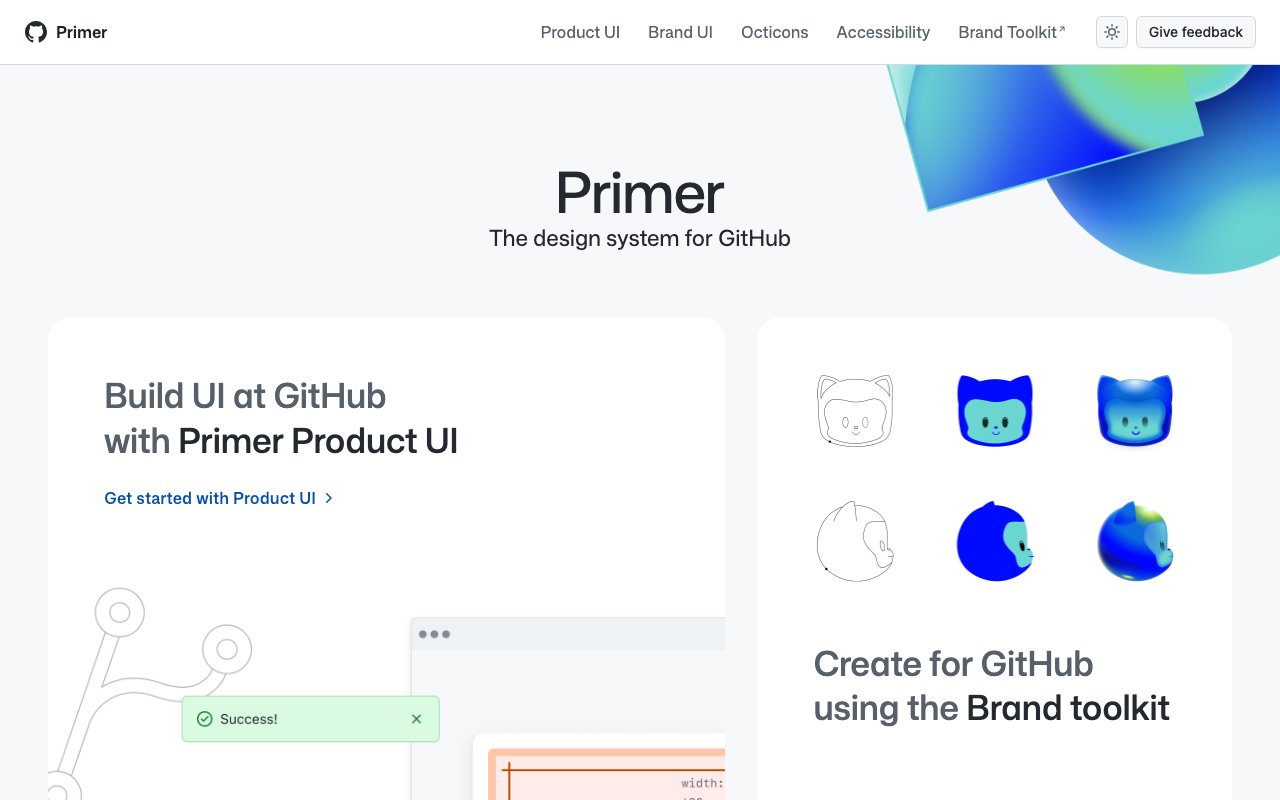
Primer Design System: GitHub's UI Framework
Primer is GitHub's open-source design system featuring React components, CSS utilities, Figma kits, and detailed documentation. Its thoughtful approach to accessibility, color modes, and responsive design makes it an excellent reference for building modern design systems.
Propstar: Essential Figma Plugin for Streamlined Design
Propstar automatically generates visual property tables for Figma components, documenting all variants, props, and states. It creates clean, shareable component specs that help teams understand and correctly use design system components.
Rechroma
Web-based color-system builder that starts from an image or single color, generates Oklch scales, checks contrast, and exports palettes to Figma variables, CSS, SCSS, or PDF.
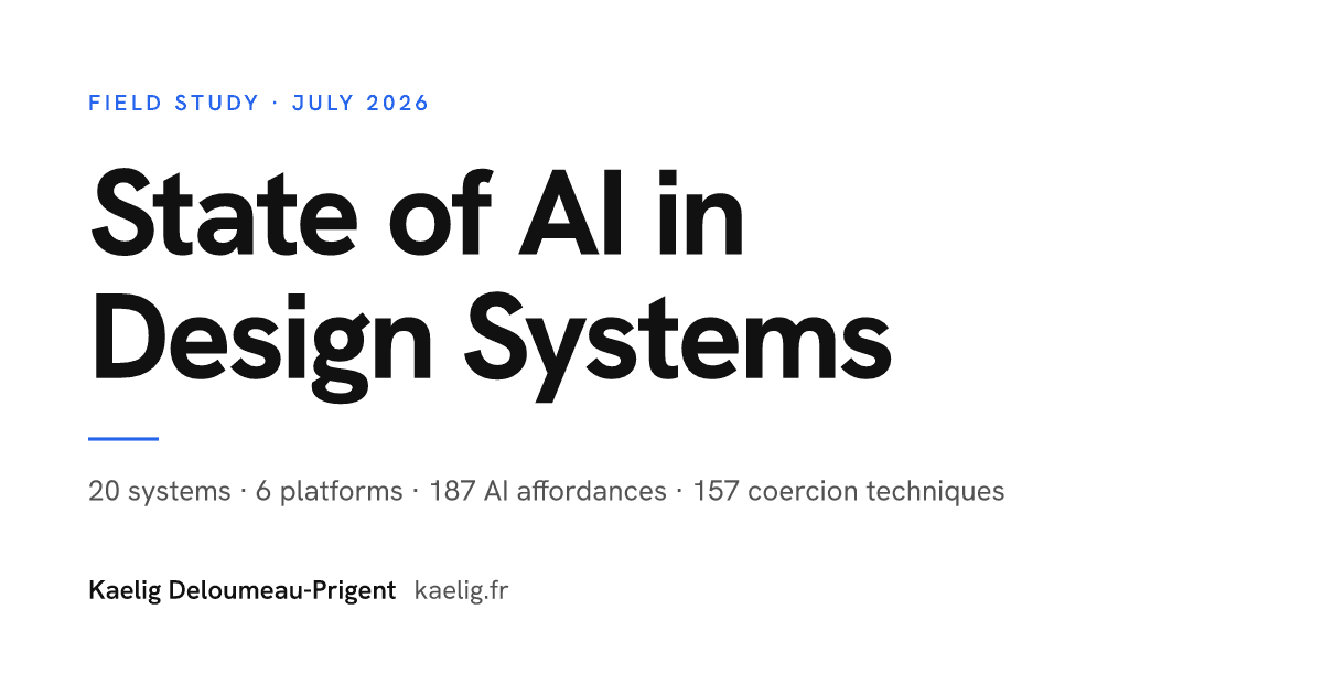
State of AI in Design Systems
newSource-linked field study of how 20 maintained design systems expose MCP servers, agent skills, llms.txt, editor rules, registries, and other machine-readable interfaces.

Surviving Day Zero
newOperating-model guide for enterprise design systems covering ownership, federated governance, adoption, legacy migration, vendor controls, and metrics. Useful for teams planning the work that follows launch.
The Component Gallery: UI Component Reference
The Component Gallery collects and compares UI components across real design systems — see how different companies implement buttons, modals, navigation, and more. An invaluable research tool when designing components for your own system.
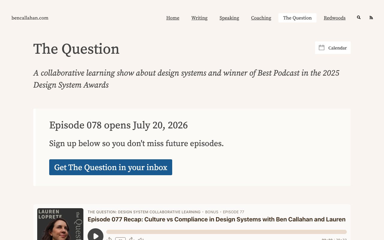
The Question
Weekly design-systems podcast and participatory discussion: answer the prompt, review the aggregated FigJam, then join or watch practitioner conversations on the results.
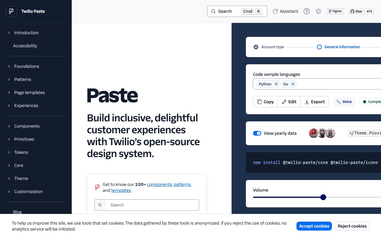
Twilio Paste: Comprehensive Design System for Customer Experiences
Paste is Twilio's design system built for creating consistent customer engagement experiences. It provides a rich set of accessible React components, design tokens, and detailed usage guidelines — one of the most thorough open-source design systems available.
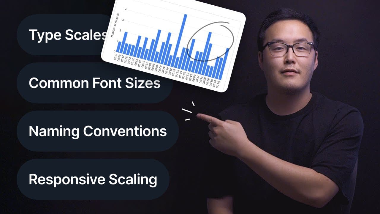
Typography: Ultimate Design System Breakdown
A detailed video breakdown of how to build a typography system within your design system — covering type scales, responsive sizing, line heights, font pairing, and token naming conventions. Practical walkthrough with real implementation examples.
UI Color Palette
UI Color Palette generates complete, balanced color palettes from a single color — creating tints, shades, and semantic color roles ready for design system use. It outputs palettes directly as Figma styles or variables, saving hours of manual color scale creation.
UXPin: Advanced UI Design and Prototyping Tool
UXPin is a design tool that bridges the gap between design and code by letting you build prototypes with real React, Storybook, or npm components. Its merge technology means designers work with production components directly, eliminating design-development drift.
Variable Visualizer
Figma plugin to manage variable tables in an interactive canvas - add modes in seconds with visual workflow
Vercel JSON-Render: Generative UI with Guardrails
Zod schema constraints + shadcn/ui components for AI-generated interfaces with taste. Components inherit good design; AI generation stays within brand bounds. Open-sourced Apache 2.0.
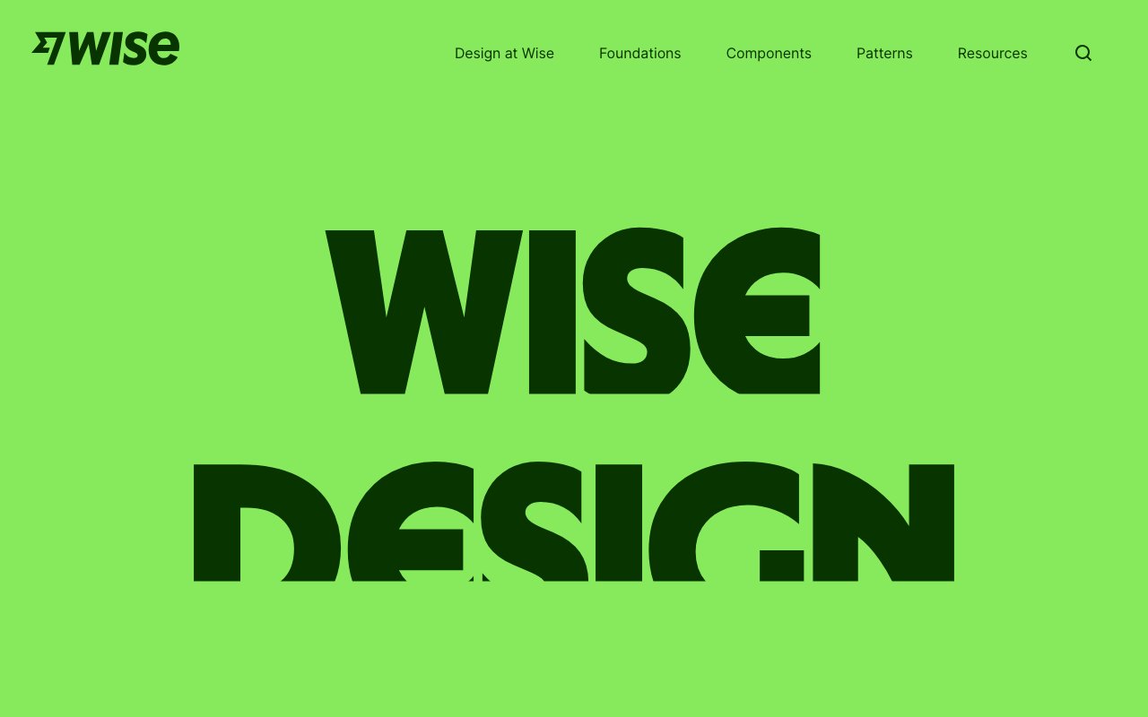
Wise Design: Global Money Transfer UI Excellence
Wise's design system showcases how a global fintech company creates consistent, trustworthy interfaces across 80+ countries. A great case study in designing for internationalization, clarity in financial interfaces, and multi-platform consistency.
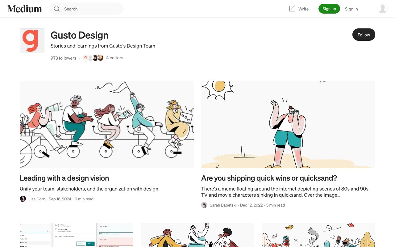
Workbench by Gusto: Streamlined Design System
Workbench is Gusto's open design system providing components and patterns specifically built for complex business applications — payroll, HR, and benefits interfaces. A valuable reference for teams designing dense, data-heavy admin UIs.
Zeroheight 2026 Design Systems Report
Annual practitioner survey: Web Components gaining over React, AI unstalling stalled adoption, accessibility gap narrowed from 46% to 10%. Real benchmark data, no hype.