
Command Palette
Search for a command to run...
Measure Component Success with Omlet

Omlet analyzes your codebase to show exactly how design system components are being used — adoption rates, prop usage patterns, and which teams are (or aren't) using the system. Data-driven insights for proving design system ROI and identifying gaps.
More Design Systems(4)
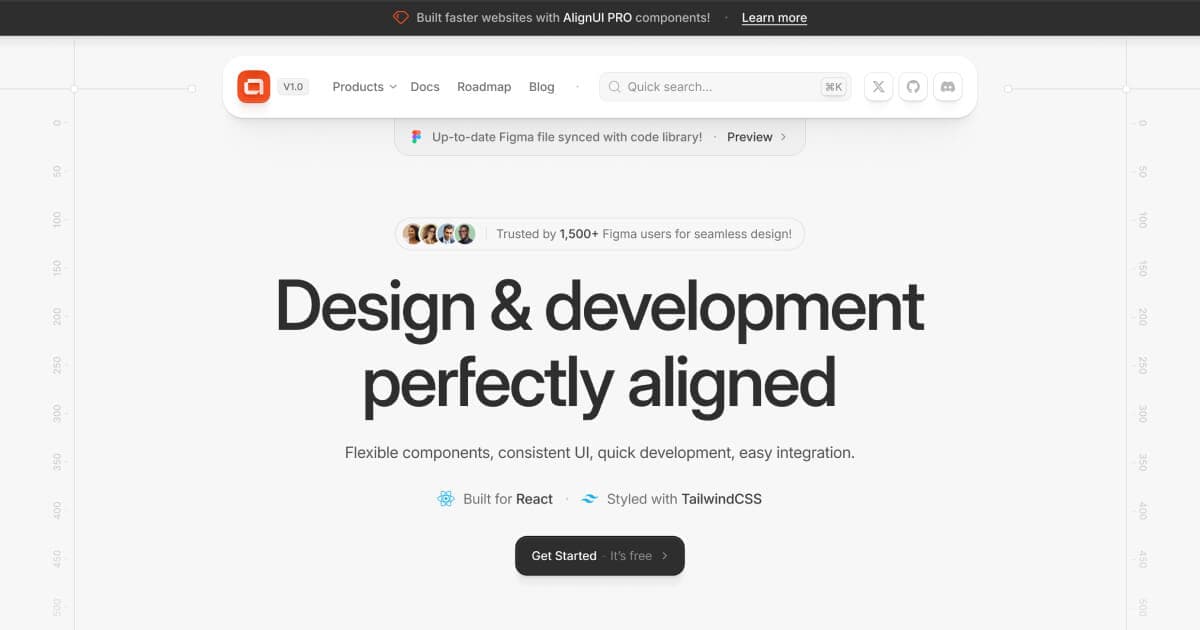
AlignUI: Code-Implemented Design System
Professional design system with 7,800+ components and code-implemented variants. Features 80+ unique widgets, Figma variables support, and dark mode compatibility. Lightning-fast performance designed specifically for enterprise SaaS dashboards and admin interfaces.

Apple iOS 18 UI Kit: Official Apple Design Resources
Apple's official iOS 18 UI kit containing hundreds of components with Auto Layout, Component Properties, variants, and light/dark mode support. Includes system interfaces, widgets, notification templates, and comprehensive typography with accessibility sizes for native iOS development.

Arc
newReact 19 component and block library with source-owned shadcn installs, semantic design and motion tokens, keyboard support, and reduced-motion paths. Includes live previews for 105 free components and 22 blocks.
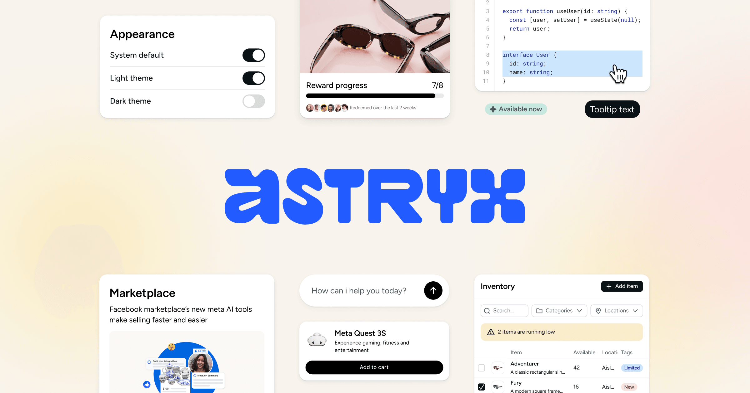
Astryx
Open-source React 19 design system from Meta with 150+ accessible components, seven themes, templates, and a CLI. Shared conventions and documentation support people and coding agents.