Search for a command to run...
Curated react resources for designers and developers.
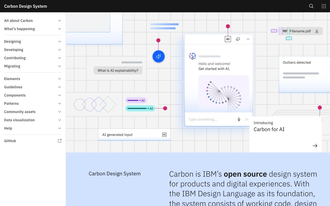
Carbon is IBM's open-source design system providing production-ready React and Web Components, Figma kits, design tokens, and comprehensive guidelines. Built on the IBM Design Language, it's a mature, well-documented system ideal for enterprise applications.
Added Jan 2025
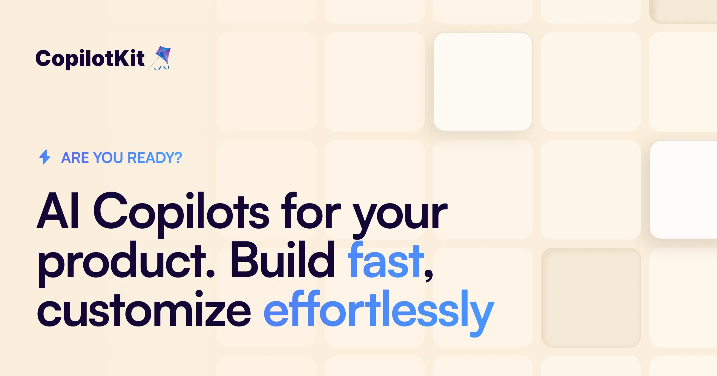
Open-source framework for building Generative UI — AI-generated interfaces that adapt in real-time based on user context and intent. Supports static (AI selects components), declarative (structured JSON specs), and open-ended (full surface generation) patterns. The infrastructure layer for GenUI design systems.
Added Mar 2026
Ant Design is a comprehensive React UI framework created by Alibaba, providing 60+ polished enterprise components with TypeScript support, internationalization, and extensive theming. The accompanying Figma kit includes all components, making it a complete design-to-development system.
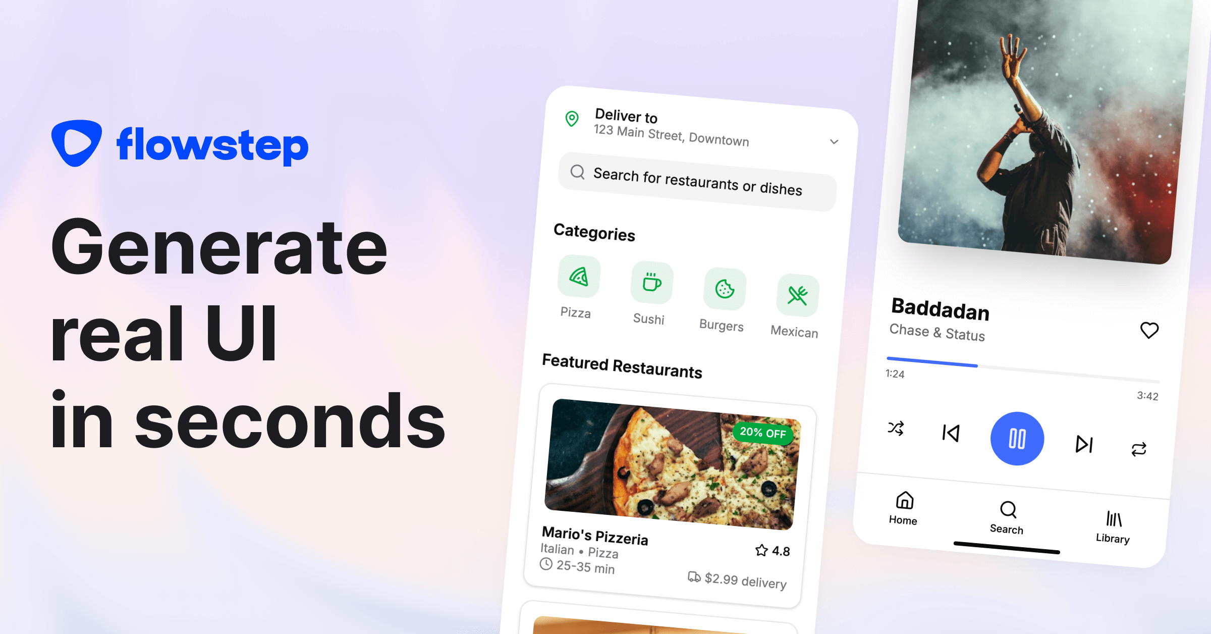
Generates complete 5-15 screen user journeys from a single text prompt. Exports directly to Figma (preserving layers and components) and outputs clean React/TypeScript/Tailwind code. Removes the gap between wireframe ideation and production-ready design.
4,000+ icons across 9 distinct styles and 59 categories. Available in Figma, React, Vue, and as SVG. Free and premium options.
Added Feb 2026
Lucide is a community fork of Feather Icons that has grown into a comprehensive open-source icon library with 1,500+ icons. It maintains Feather's clean aesthetic while adding hundreds of new icons, and provides packages for React, Vue, Svelte, and more.
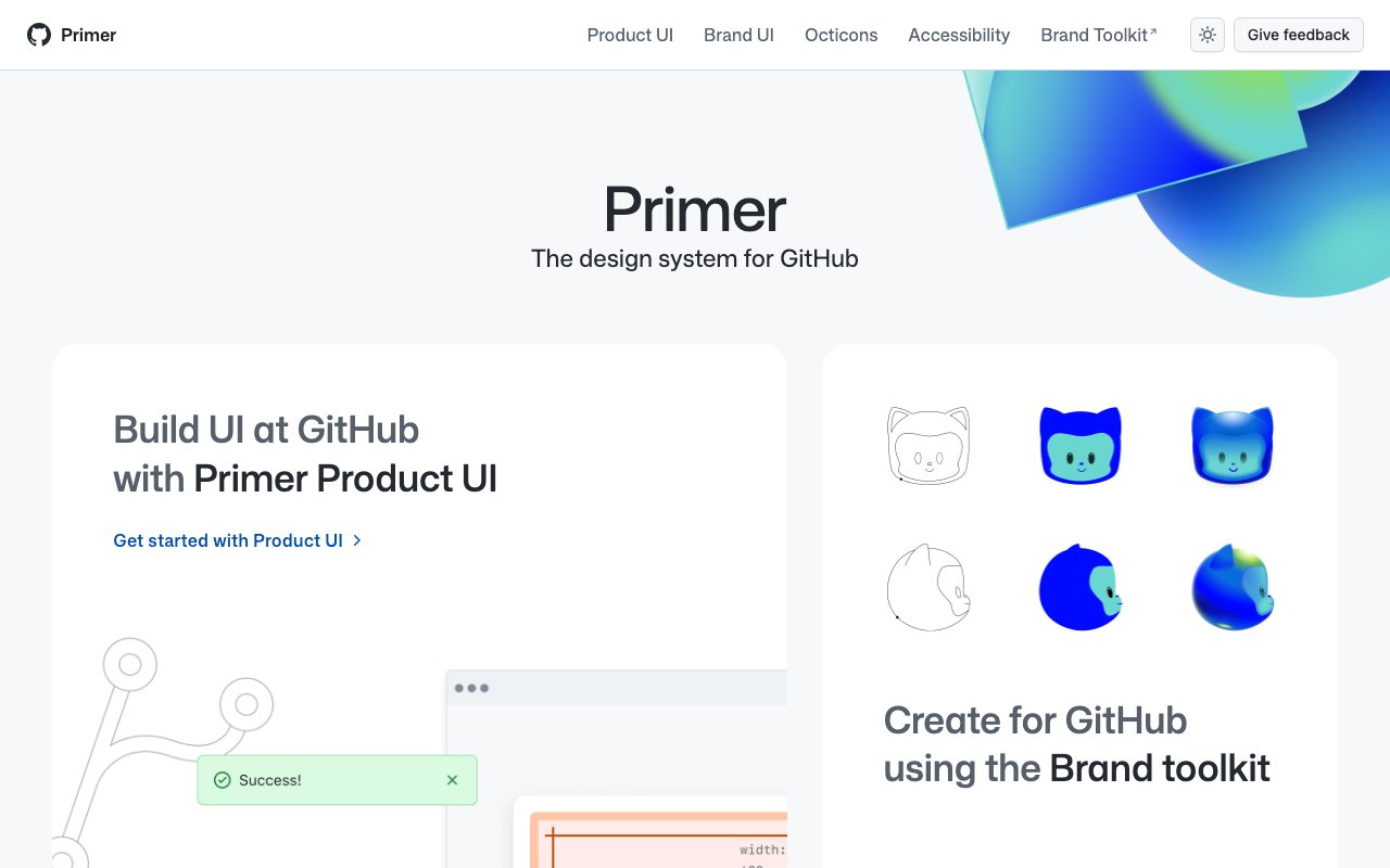
Primer is GitHub's open-source design system featuring React components, CSS utilities, Figma kits, and detailed documentation. Its thoughtful approach to accessibility, color modes, and responsive design makes it an excellent reference for building modern design systems.
Crisp 15x15 icon set designed for UI primitives and radix components. Clean, modern SVGs available as React components — perfectly sized for compact UI density.
React Grab is an interactive demo and component library showcasing advanced React interactions and animations. Praised for some of the most polished interactive demos in the React ecosystem — great for inspiration and copying proven interaction patterns.
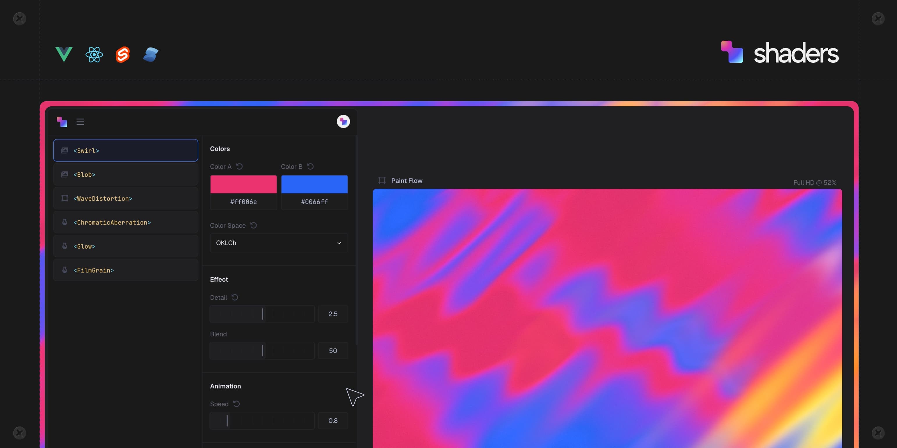
Component-based WebGPU shaders for React, Vue, and Svelte. Visual editor generates production-ready shader code for landing pages, dashboards, and hero sections.
AI Agents workflows powered by Anthropic, xyflow, and AI SDK with one-click installable examples via shadcn CLI
Open-source shadcn/ui layouts and components. Clean, modern designs ready to use in your Next.js projects.
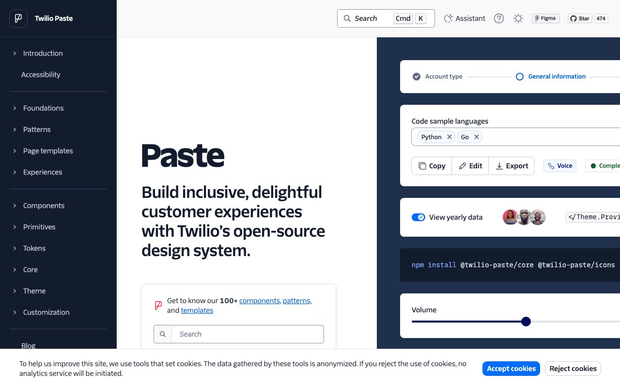
Paste is Twilio's design system built for creating consistent customer engagement experiences. It provides a rich set of accessible React components, design tokens, and detailed usage guidelines — one of the most thorough open-source design systems available.
UXPin is a design tool that bridges the gap between design and code by letting you build prototypes with real React, Storybook, or npm components. Its merge technology means designers work with production components directly, eliminating design-development drift.
v0 converts Figma designs and screenshots into polished React components for Next.js with iterative chat refinement. Essential for UI/UX designers who want to bridge the design-to-code gap, offering production-ready components that maintain design fidelity while integrating seamlessly with development workflows.