
Command Palette
Search for a command to run...
free(196)
tagged resources
free Resources
@shadcn/lint
newAgent-focused linter for Tailwind v4 design systems. Enforces component, token, color, and class rules through ESLint or Oxlint, with fix guidance drawn from the project's own components and theme.
3D Jelly Icon Prompt
JSON prompt template for generating Airbnb-style 3D jelly icons with ChatGPT-4o. Produces soft, rounded, premium-looking icons from any logo.
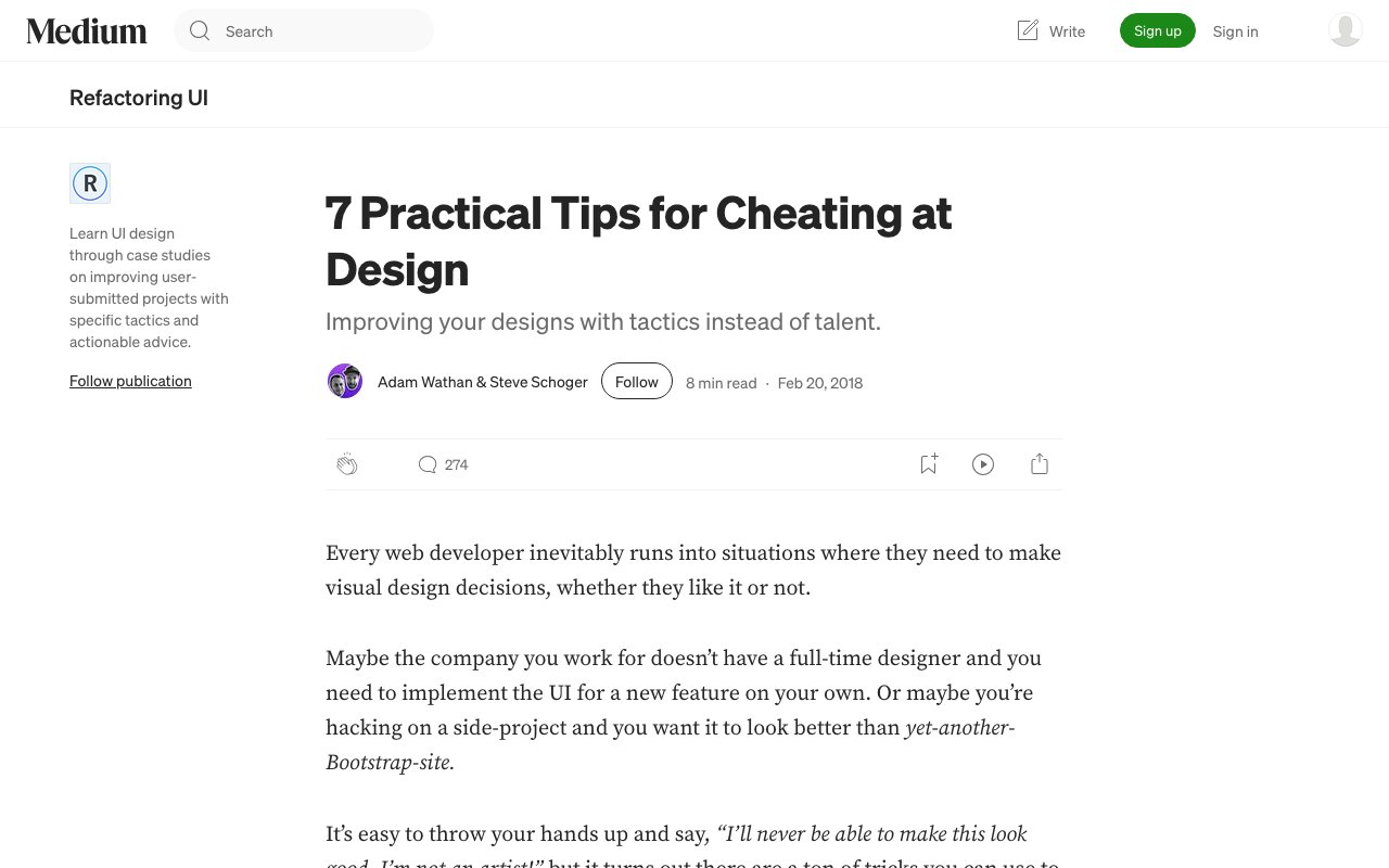
7 Practical Tips for Designers: Boost Your Workflow Today
From the creators of Refactoring UI, this article shares seven concrete techniques for making designs look polished without being a design expert. Covers practical tips like using color and weight instead of font size, borrowing design decisions, and overlapping elements for depth.
99% Invisible Podcast
99% Invisible is one of the most beloved design podcasts, exploring the hidden design decisions behind everyday objects, buildings, and systems. Hosted by Roman Mars, each episode reveals the fascinating stories behind things most people never notice.
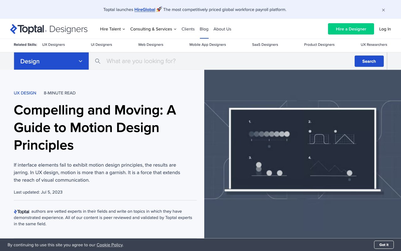
A Guide to Motion Design Principles
A comprehensive guide covering essential motion design principles adapted for UX — easing, anticipation, follow-through, continuity, and narrative. Practical examples show how applying animation principles from film and game design creates more intuitive digital interfaces.

A11y Annotation Kit: Figma accessibility annotations
The A11y Annotation Kit is a comprehensive Figma library that provides standardized accessibility annotation components for design handoffs. It helps designers communicate accessibility requirements to developers through clear, consistent annotations that cover focus states, screen reader labels, keyboard navigation, and more.
A11y Project: Community-driven accessibility resource
The A11y Project is a community-driven effort to make digital accessibility easier through practical, digestible resources and guides. It provides straightforward explanations of accessibility concepts, code examples, and actionable advice that helps designers and developers understand and implement accessibility best practices in their work.
Able: Figma accessibility plugin
Able is a Figma plugin that helps designers check color contrast ratios, simulate different types of color blindness, and ensure their designs meet WCAG accessibility standards. It integrates seamlessly into the design workflow, allowing real-time accessibility checking without leaving the design environment.
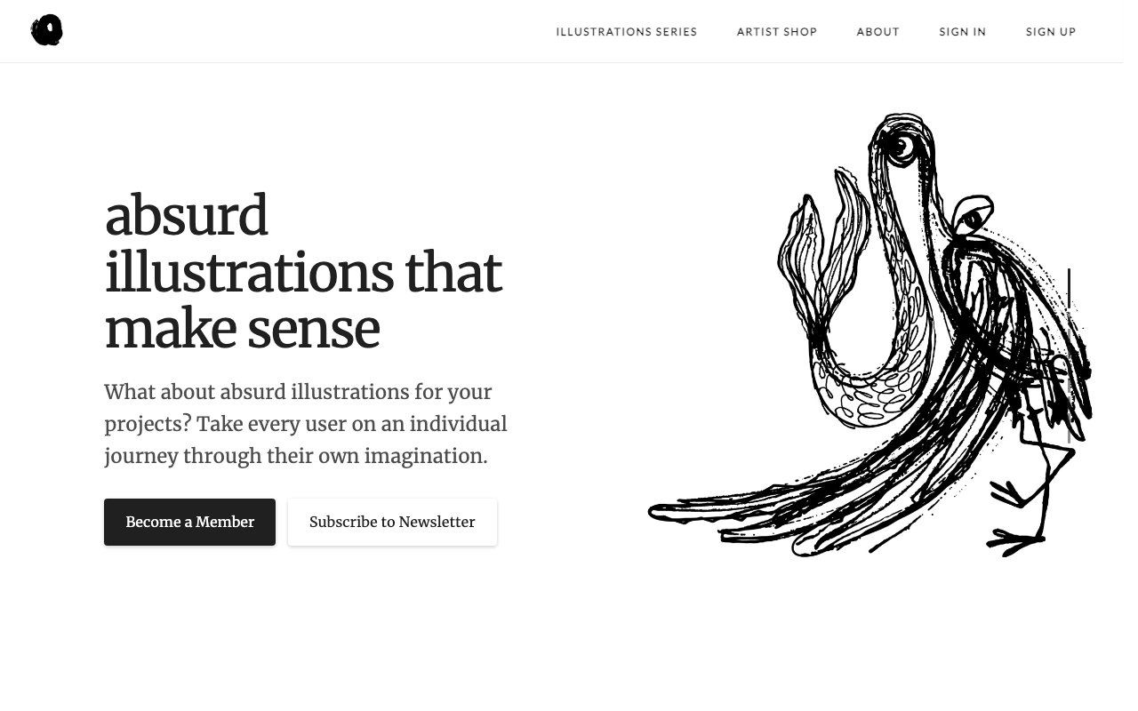
Absurd Design: Surreal illustrations
A collection of surreal, colorful illustrations that add personality and whimsy to digital products. Features bold, imaginative designs perfect for creating memorable user experiences.
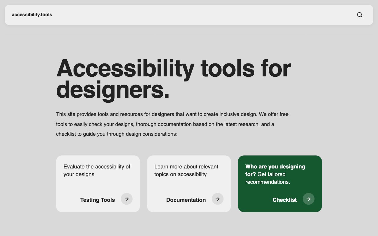
Accessibility Tools for Designers
Free browser toolkit for checking design screenshots with contrast analysis, vision simulation, attention heat maps, and alt text support. Includes research-based guidance and a design checklist.
AI in Design Report 2026
Second annual report from Designer Fund and Foundation Capital on how design teams are adapting to AI. Draws on 900+ designers across 60+ countries and 20+ leader interviews, split into Tools, Craft, and Teams chapters.
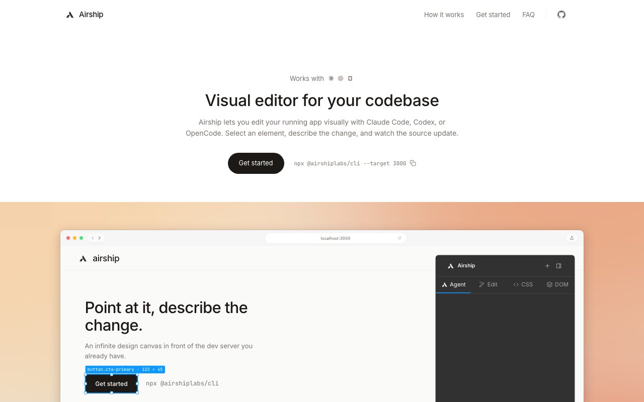
Airship
newOpen-source visual editor that wraps a running web app in a Figma-like canvas, maps selected elements to source files, and lets Codex, Claude Code, or OpenCode apply reviewable edits.
AmbientCG
Free CC0 PBR materials, HDRIs, and procedural textures with Substance and Blender-ready files. Covers concrete, stone, fabric, wood, terrain — comprehensive for realistic rendering.
An Introduction to Shaders
Finally understand what shaders are. A beginner-friendly explainer for designers who've seen cool shader effects but never knew where to start.

Apple iOS 18 UI Kit: Official Apple Design Resources
Apple's official iOS 18 UI kit containing hundreds of components with Auto Layout, Component Properties, variants, and light/dark mode support. Includes system interfaces, widgets, notification templates, and comprehensive typography with accessibility sizes for native iOS development.
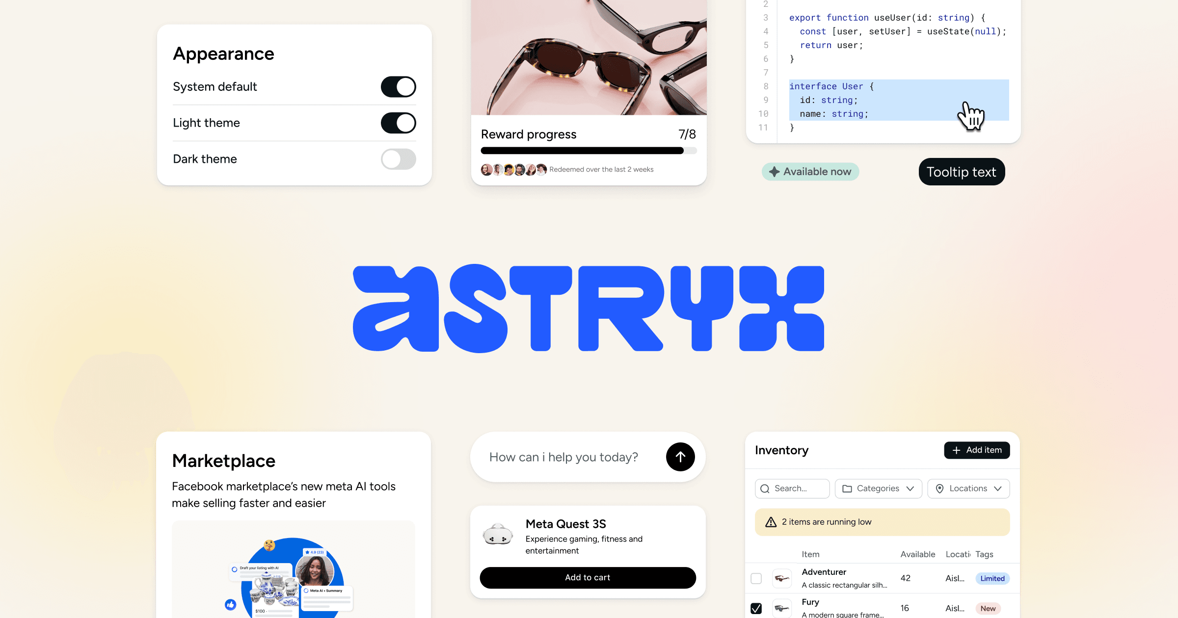
Astryx
Open-source React 19 design system from Meta with 150+ accessible components, seven themes, templates, and a CLI. Shared conventions and documentation support people and coding agents.

AudioBox by Meta: AI-Enhanced Audio Editing Tool
AudioBox is Meta's AI research tool for generating and transforming audio using natural language prompts and voice inputs. It can create speech, sound effects, and ambient audio — useful for designers building interactive prototypes or multimedia experiences.
Avataaars: Avatar generator
A free avatar generator based on Sketch App library. Create unique, customizable avatars with various clothing, hairstyles, and accessories for user profiles and interfaces.
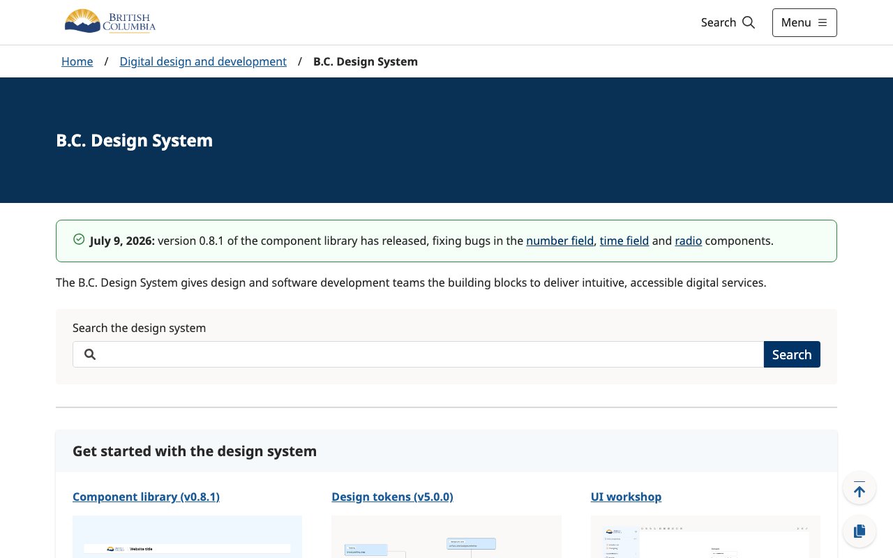
B.C. Design System
Province of British Columbia design system with Figma tokens, CSS and JavaScript variables, and React components for consistent government service interfaces.
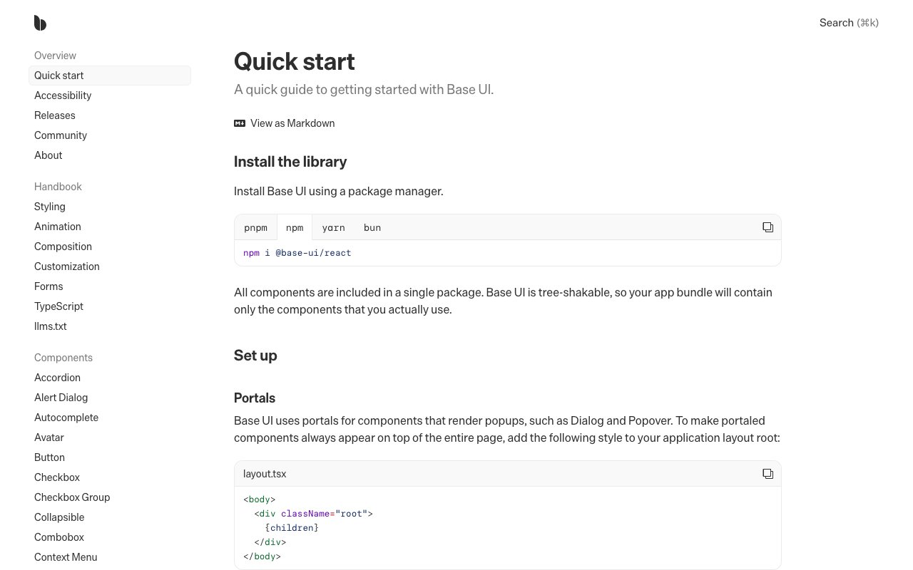
Base UI
newUnstyled React components for accessible interfaces and design systems. Includes composable primitives for forms, overlays, navigation, feedback, and interaction without prescribing visual styling.
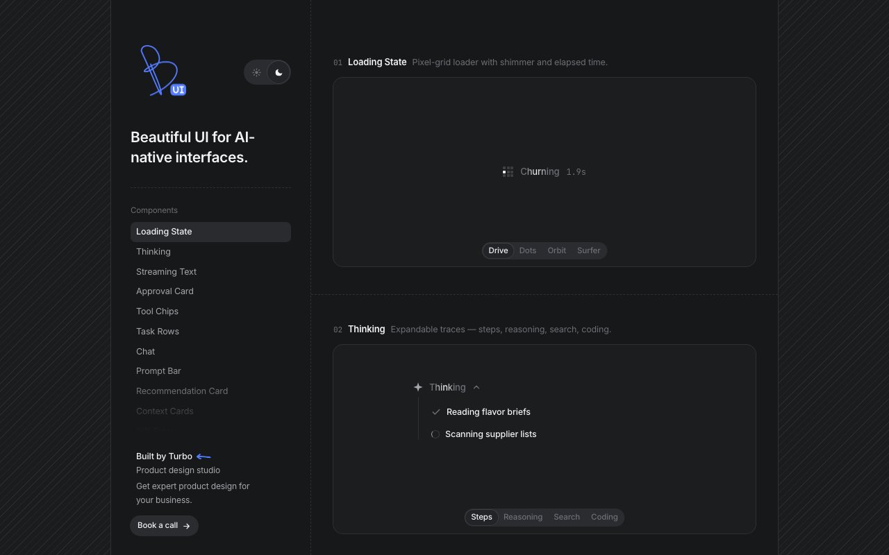
Beautiful UI
newCollection of copyable interface primitives for AI products, including streaming text, approval cards, tool-call states, task progress, retrieved context, and data diffs.
Best Design System Documentation Sites: Top Picks
A curated roundup of the best design system documentation sites in the industry, from Shopify Polaris to IBM Carbon. Great reference for teams building their own design system docs — each example is analyzed for what makes it effective.
Better Design
Design MCP server and shadcn/ui registry that gives coding agents design tokens, UI principles, component code, icon direction, and accessibility review rules.

Blender Artists Community
Blender Artists is the largest community forum for Blender users — featuring work-in-progress galleries, tutorials, technical discussions, and job postings. A vibrant hub where 3D artists share work, get feedback, and learn from each other.

Blender: Empower Your 3D Creativity for Free
Blender is a free, open-source 3D creation suite that covers the entire pipeline — modeling, sculpting, animation, VFX, compositing, and video editing. Backed by a massive community and regular updates, it's become a serious alternative to expensive commercial 3D software.
Bootstrap UI Kits: Elevate Your Design Workflow & Efficiency
Bootstrap remains one of the most widely used CSS frameworks, and its UI kit provides responsive grid systems, components, and utility classes that work out of the box. These examples showcase Bootstrap's component library for rapid prototyping and production-ready interfaces.

Building accessibility into a canvas-based product
Figma’s technical case study on making a canvas-based editor accessible through an internal accessibility tree, Mirror DOM, selection sync, and screen-reader announcements.
Building Tactile UX with Lottie
newCase study on building a tactile web interaction with deterministic Lottie frame control, DOM coordinate mapping, and distance-based input. Covers responsive behavior, mobile performance, and asset loading.
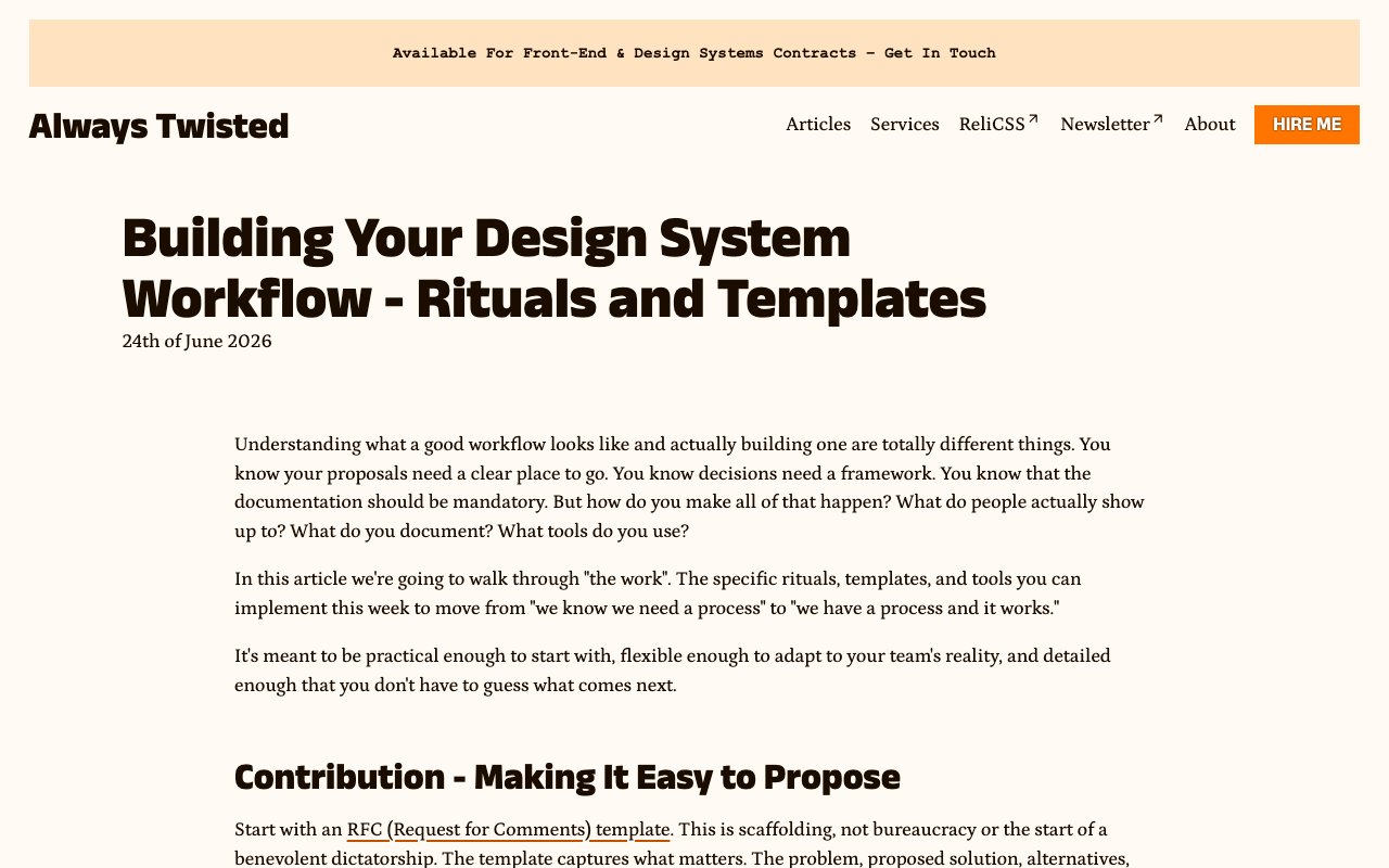
Building Your Design System Workflow — Rituals and Templates
Practical playbook for running a design-system contribution workflow. Covers RFCs, communication rituals, reusable templates, phased adoption, and the maintenance work that keeps the system healthy.
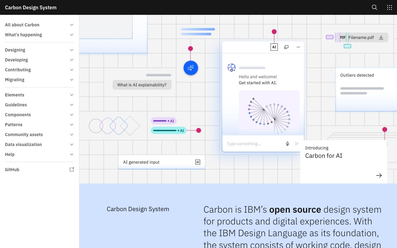
Carbon Design System: Elevate Your Design Workflow for Free
Carbon is IBM's open-source design system providing production-ready React and Web Components, Figma kits, design tokens, and comprehensive guidelines. Built on the IBM Design Language, it's a mature, well-documented system ideal for enterprise applications.

Charco: Handcrafted illustrations
A handcrafted set of 16 illustrations featuring minimal, elegant designs. Perfect for creating clean, sophisticated interfaces with subtle personality and charm.
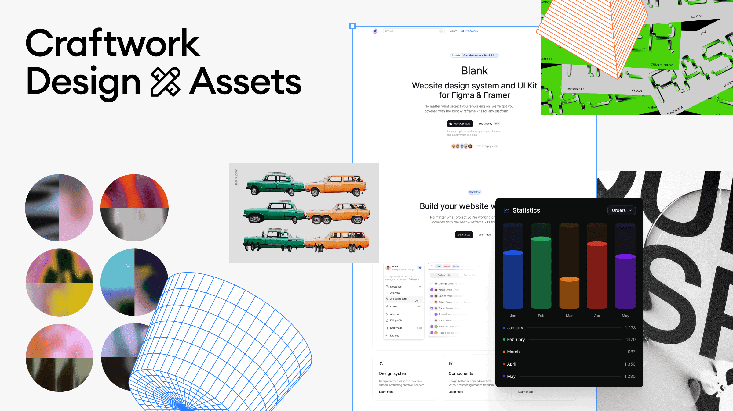
Clickons: 500 Open Source Icons for Designers
Clickons is a free, open-source set of 500 minimal line icons designed by Craftwork. The consistent stroke weight and clean geometry make them a solid choice for UI projects that need a simple, modern icon set without the overhead of a massive library.

Codrops – Fueling web creativity since 2009
Codrops is a web design and development blog publishing articles, tutorials, and demos focused on creative front-end techniques. From WebGL experiments to CSS animations and interactive UI patterns — it's been a reference for web craftsmanship for over 15 years.
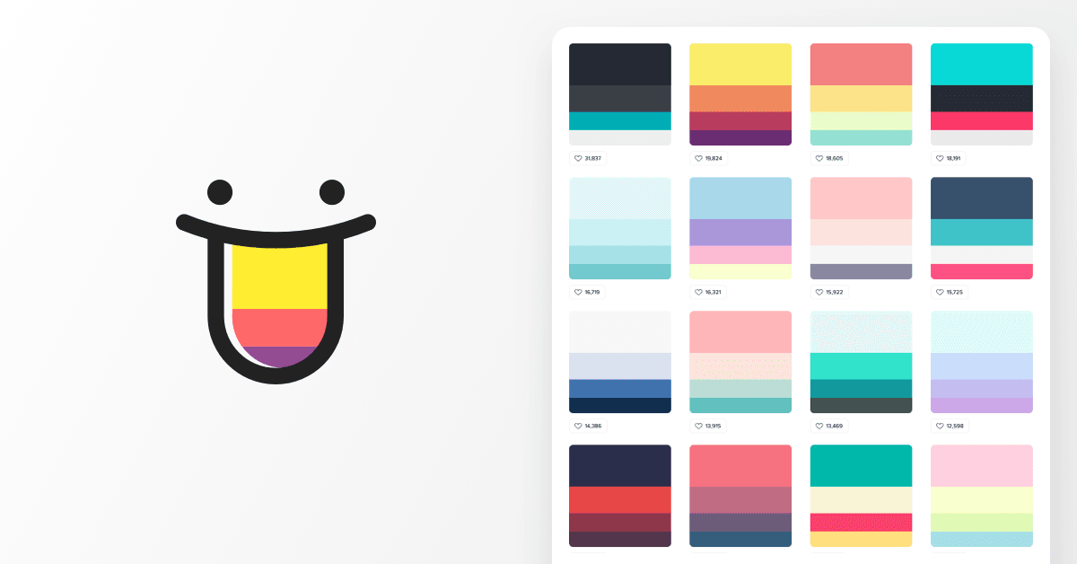
Color Hunt: Inspiring Color Palettes for Designers
Color Hunt is a curated collection of beautiful color palettes updated daily by a community of designers. Browse by popularity, trending, or random — each palette is four colors you can copy with a click. Simple, fast, and endlessly browsable.
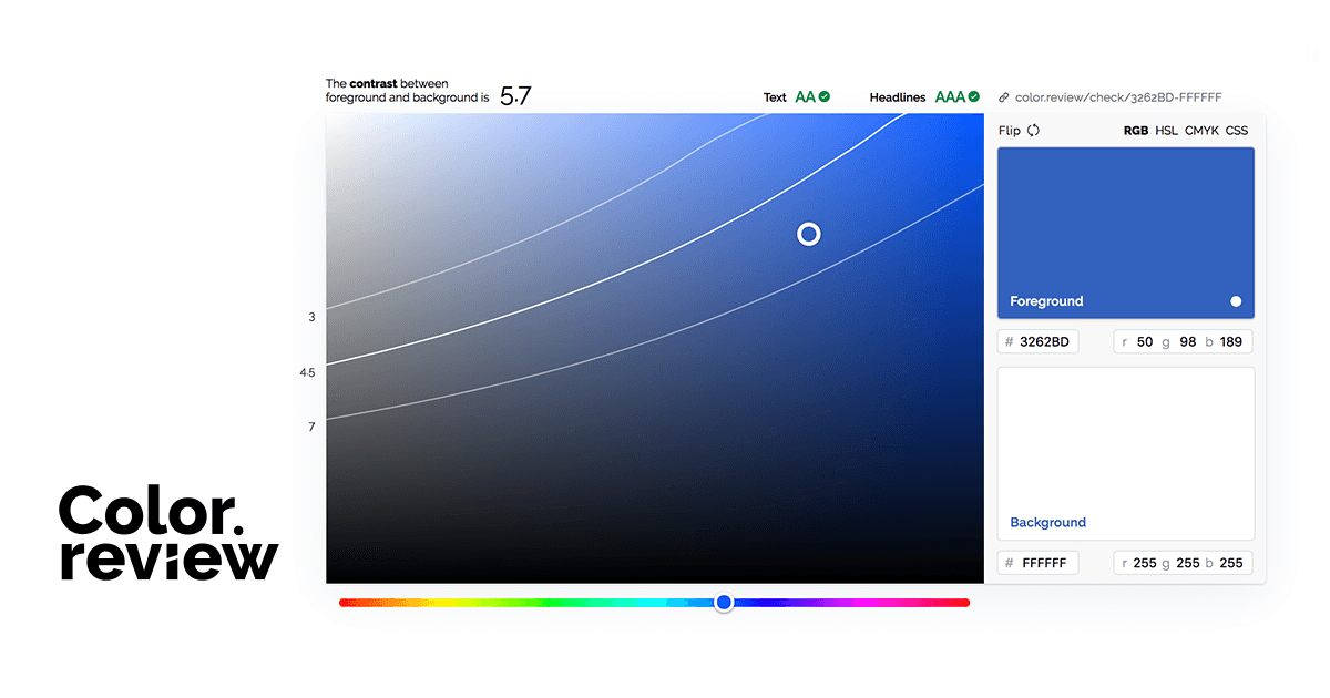
Color Review: Visual contrast checker
Color Review provides an intuitive visual interface for checking color contrast ratios between foreground and background colors. It shows real-time WCAG compliance ratings and offers an easy way to adjust colors until they meet accessibility standards, perfect for quick design decisions.
Color Safe: Accessible color palette generator
Color Safe is a web-based tool that generates accessible color palettes by ensuring all color combinations meet WCAG contrast requirements. It allows designers to input a base color and automatically suggests complementary colors that maintain proper contrast ratios for text and backgrounds.
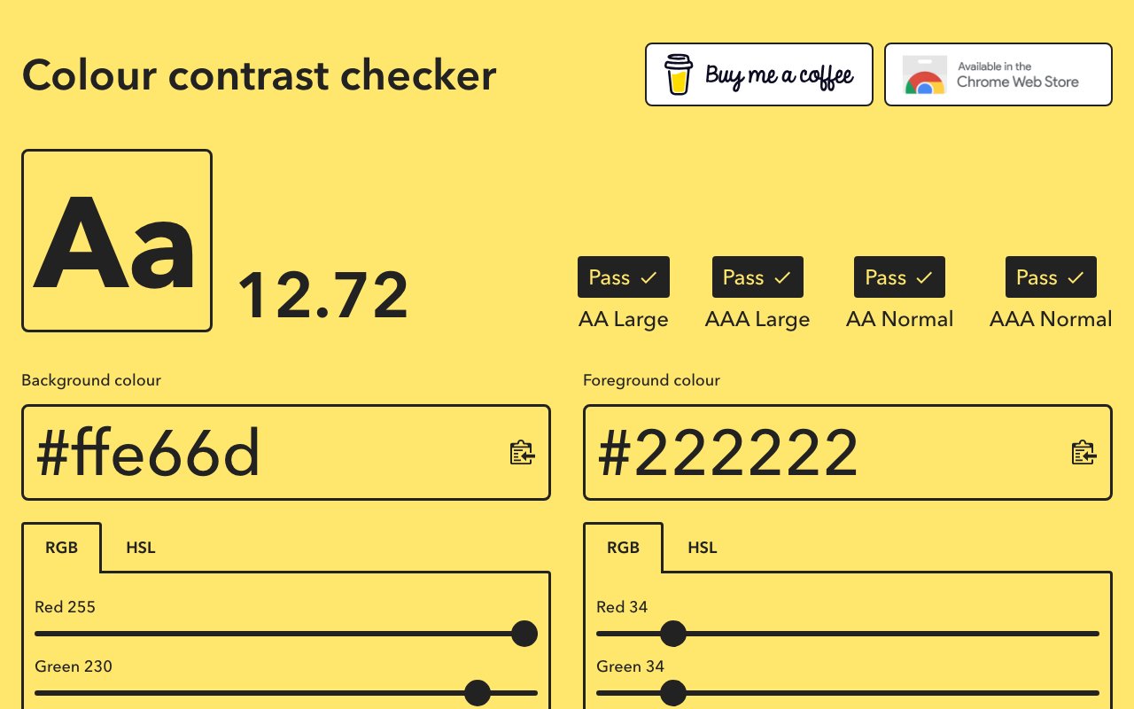
Colour Contrast Checker: Web-based WCAG checker
Colour Contrast Checker is a straightforward web tool that evaluates color combinations against WCAG 2.1 guidelines for normal and large text. It provides clear pass/fail indicators for AA and AAA compliance levels, making it easy for designers to ensure their color choices meet accessibility requirements.
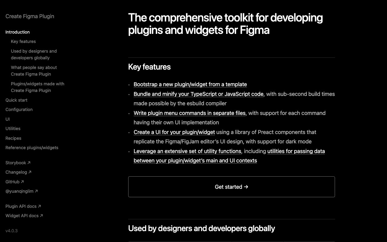
Comprehensive Toolkit for Developing Figma Plugins and Widgets
create-figma-plugin is an open-source toolkit for building Figma plugins and widgets with TypeScript. It provides project scaffolding, Preact UI components matching Figma's design, bundling with esbuild, and utilities for the plugin API — the most complete development environment for Figma plugin authors.
Control: Customizable illustrations
A collection of customizable illustrations with a clean, geometric style. Perfect for tech products and modern interfaces with easily adjustable colors and elements.
CSS GG: 700+ Customizable Icons for Developers
CSS.gg provides 700+ minimalist icons built entirely with pure CSS — no SVG, no fonts, no images. They're lightweight, easily customizable via CSS custom properties, and available as npm packages. Ideal for developers who want tiny, performant icons.
Daily Design Inspo: Curated Dribbble Shots for Designers.
Another entry point to Collect UI's daily design inspiration drawn from Dribbble and beyond. Browse curated examples organized by design pattern to quickly find reference material for any UI component or screen type you're working on.

Daily Mac Design Inspiration: Tools, Articles & More | iOSUp
UpLabs (formerly iOSUp) is a design inspiration platform featuring daily curated iOS, Android, and web UI designs. Designers upload their work and share resources like UI kits, icons, and templates — a community-driven source of mobile design patterns.

Defensive Design for Motion-Sensitive Users
Practical framework for designing motion that stops safely when timing, state, or performance fails. Covers duration limits, circuit breakers, static fallbacks, monitoring, and user controls.

Design Details: Elevate Your Design Skills with Latest Industry Insights in Design
Design Details is a weekly podcast about the craft of product design, covering everything from design tools and techniques to career advice and industry trends. Hosted by Brian Lovin and Marshall Bock with a conversational, accessible style.
Design Matters
Design Matters with Debbie Millman is one of the longest-running design podcasts, featuring intimate interviews with creative luminaries — designers, artists, writers, and cultural figures. Over 400 episodes of deep, personal conversations about creativity and life.
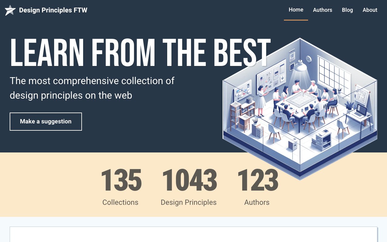
Design Principles FTW: Comprehensive Collection of Design Principles
A curated archive of design principles from teams across the industry — Apple, Google, GOV.UK, and hundreds more. Browse by company or principle type to find inspiration for establishing your own team's design values and decision-making framework.

Design System Office Hours: Podcast for Design Enthusiasts
A podcast dedicated to the practical side of design systems — featuring real conversations with practitioners about governance, adoption challenges, component APIs, and scaling design systems across organizations.
Design Systems MCP Server
MCP server that lets AI assistants search curated design system knowledge, including WCAG, ARIA, W3C standards, and major public design systems.
Design Systems Podcast: Industry Insights and Best Practices
A long-running podcast featuring interviews with design system leaders from companies like Shopify, Figma, GitHub, and Salesforce. Deep conversations about strategy, tooling, and the organizational dynamics behind successful design systems.
DESIGN.md: design system format for coding agents
Open-source format from Google Labs that describes a design system to coding agents. Combines YAML design tokens with markdown rationale in one file, plus a CLI to lint, diff, and export tokens to Tailwind or DTCG.
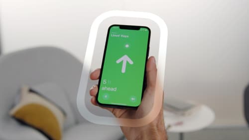
Designing Immersive User Experiences: Spatial Interaction Principles & Strategies
Apple's WWDC session on designing for spatial interaction covers principles for building immersive AR/VR experiences — spatial awareness, comfort zones, gaze-based interaction, and 3D UI patterns. Essential viewing for designers entering the spatial computing space.
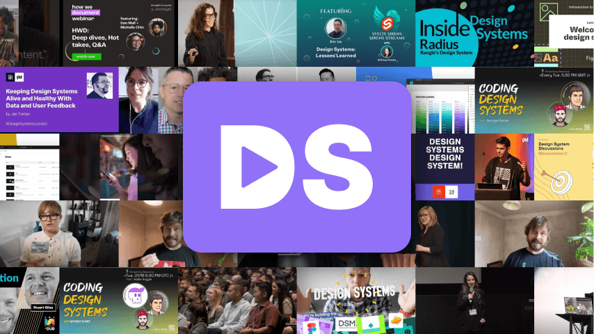
DesignSystems.media: All-In-One Hub for Design System Insights
DesignSystems.media aggregates articles, talks, tools, and resources about design systems from across the web. A one-stop hub for staying current with best practices, new tools, and community discussions in the design systems space.
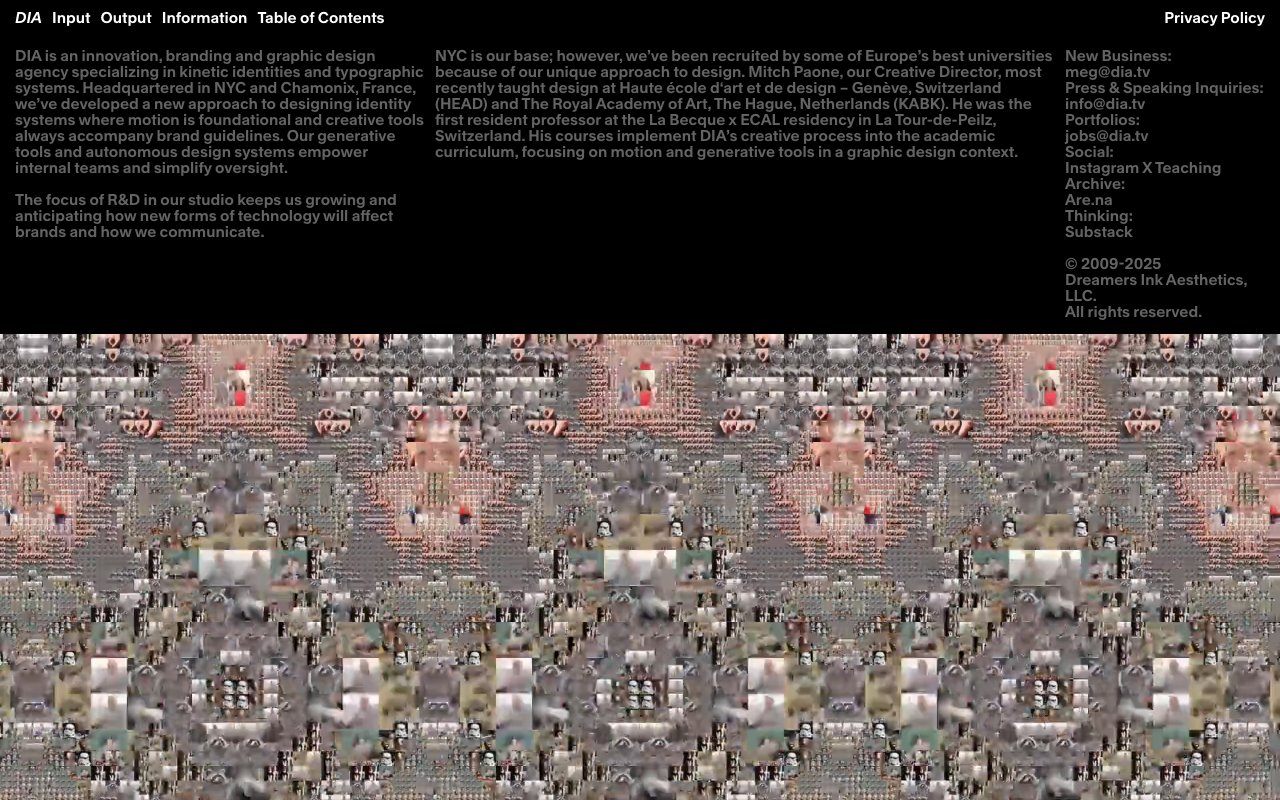
DIA - Branding and graphic design studio
DIA is a multidisciplinary design studio known for bold, experimental branding and identity work. Their portfolio showcases dynamic visual systems, generative design, and distinctive typographic work — a constant source of inspiration for pushing creative boundaries.
Dialtone
newOpen-source design system from Dialpad with Vue components, tokens, icons, utilities, UI kits, and accessibility guidance. Version 10 adds composition primitives, theming, MCP tooling, and migration guides.
Discover Design Inspiration Daily at Collect UI: Your Creative Oasis
Collect UI curates daily UI design inspiration organized by component type — login forms, pricing pages, dashboards, onboarding flows, and 100+ other categories. A focused resource for finding real-world UI patterns when you're designing specific screens.
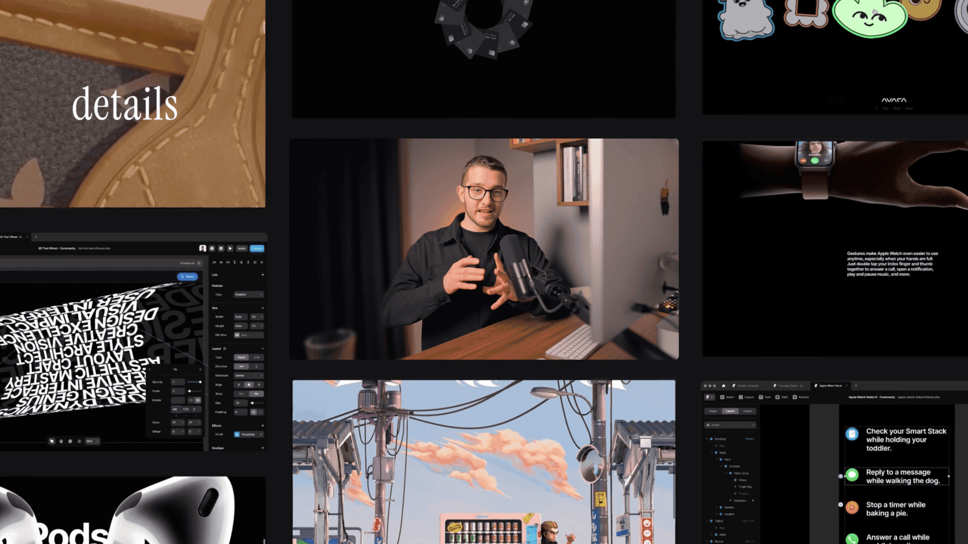
Discover Framer University: Master Design and Prototyping
Framer University is a structured learning platform with courses and tutorials for mastering Framer — from basic layout and animation to advanced CMS integration and custom code components. Great for designers leveling up their Framer skills systematically.

Discover Trendsetting Web Design Inspiration at Godly Hub
Godly is a curated gallery of the best web design on the internet, showcasing astronomically creative websites with cutting-edge interactions, animations, and visual storytelling. Updated daily, it's where designers go to see what's pushing the boundaries of web design.
Dive Club: Where Designers Never Stop Learning
Dive Club is a design podcast that combines book club-style discussions with practical design topics. Each episode digs into a specific design subject or resource, making it feel like a continuing education program for working designers.
Dynamic Variables Plugin: Automate Variable Updates in Figma
Dynamic Variables lets you write JavaScript expressions in Figma variable descriptions that automatically compute values based on other variables. Create color scales with darken/lighten functions, calculate spacing tokens mathematically, and build dynamic string templates.
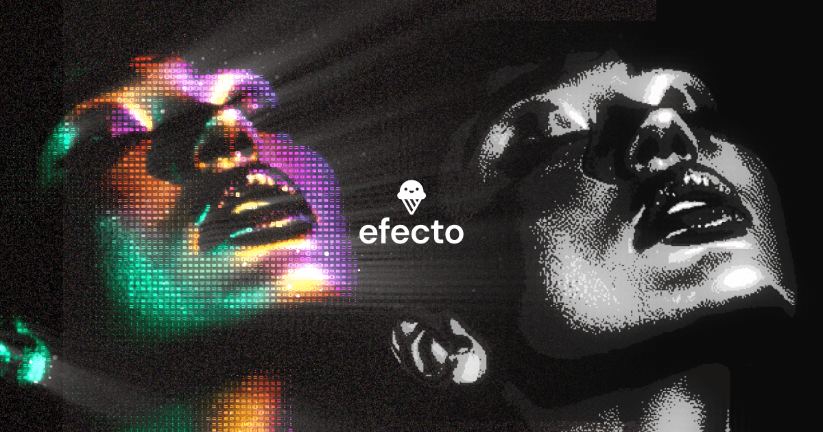
Efecto - Interactive Shader Playground
Efecto is a browser-based interactive shader effects tool for designers and developers. Play with generative shaders like the Pulsar, experiment with parameters in real-time, and use the outputs as backgrounds, textures, or hero visuals for your projects.
Elevate Design Collaboration with Figma
The community version of Convertify enables importing Sketch, Adobe XD, and Google design files directly into Figma. It parses layers, styles, and components to create editable Figma files — critical for teams migrating from other design tools.
Elevate Your Design Workflow with Framer Today Resources
Framer Today Resources is a curated directory of the best Framer templates, components, plugins, and tutorials aggregated in one place. It's regularly updated and helps designers discover new resources for their Framer projects.

Elevate Your Designs with Ant Design's UI Kits
Ant Design is a comprehensive React UI framework created by Alibaba, providing 60+ polished enterprise components with TypeScript support, internationalization, and extensive theming. The accompanying Figma kit includes all components, making it a complete design-to-development system.

Engaging Design Insights: Deeply Graphic DesignCast Podcast
The Deeply Graphic DesignCast explores graphic design culture, history, and practice with thoughtful, in-depth conversations. It covers design philosophy, creative process, and the intersection of graphic design with broader cultural movements.
Enhance Your Design Usability: Explore Essential Principles for Designers
Jakob Nielsen's 10 Usability Heuristics are the foundational principles every UI designer should know by heart. This seminal article from the Nielsen Norman Group explains each heuristic with clear examples — from system visibility to error prevention — and remains the gold standard for usability evaluation.
Enhance Your Figma Workflow with Generista Plugin
Generista is a Figma plugin for creating generative art and patterns using noise, randomness, and rotation algorithms. Design unique visual compositions, posters, and backgrounds directly in Figma without needing separate creative coding tools.
Enhance Your Online Store with Framer eCommerce Support
The Framer Community's eCommerce support hub provides guides, templates, and community help for building online stores with Framer. Covers Shopify integration, product pages, cart functionality, and checkout flows.
Everything Framer: Comprehensive Resource Hub
Everything Framer is an all-in-one resource directory cataloging templates, components, tutorials, plugins, and inspiration specifically for Framer. A comprehensive hub for finding whatever you need for your next Framer project.
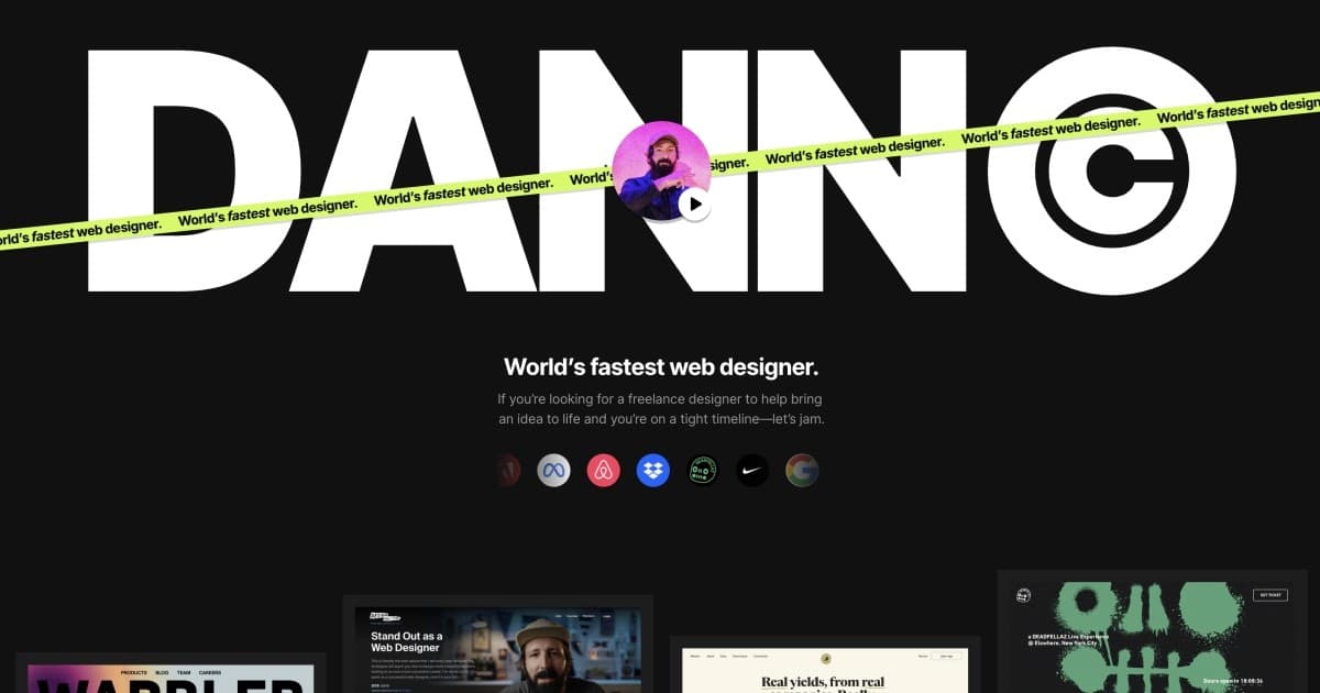
Expert Design Tips and Trends with Dan Petty
Dann Petty's website showcases the work of one of the web's most creative freelance designers — known for stunning one-page websites, the Epicurrence design conference, and rapid design execution. His portfolio and resources inspire designers to push creative boundaries.
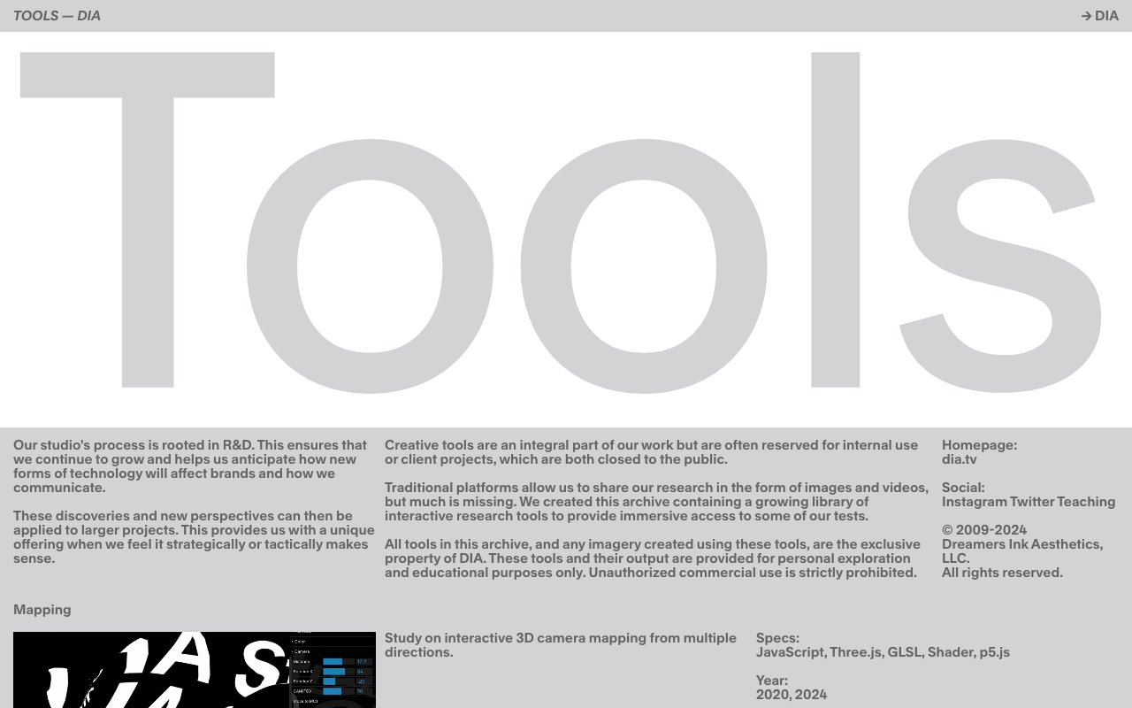
Explore DIA's Creative Tools Archive
DIA's Tools Archive is a curated collection of creative software, utilities, and experiments from the DIA design studio. It surfaces lesser-known tools alongside industry staples, helping designers discover new additions to their creative toolkit.
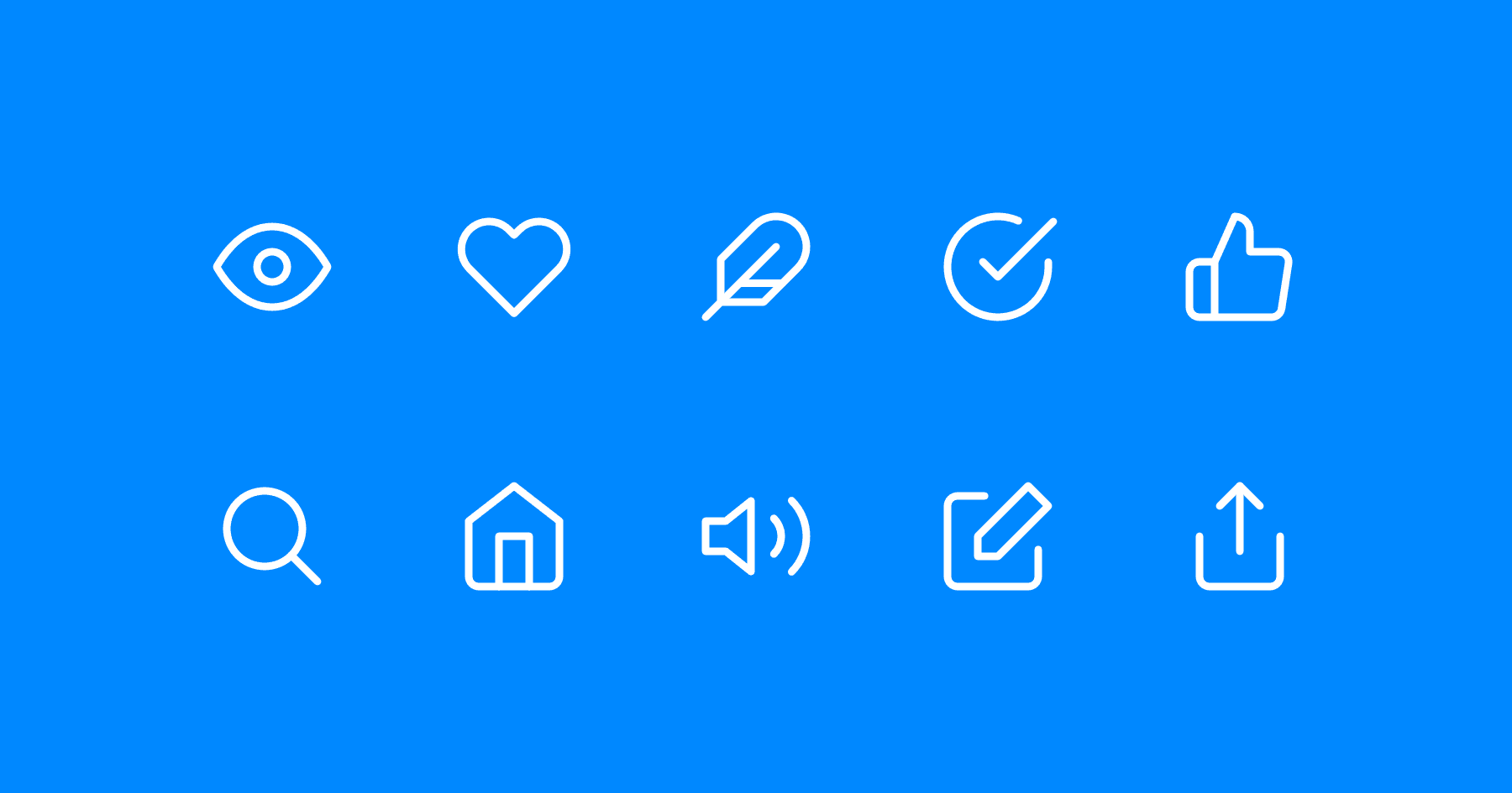
Feather Icons
Feather is a beautifully simple open-source icon set with 280+ clean, consistent icons at 24x24. Each icon is designed on a grid with a 2px stroke, making them feel cohesive and modern. Available as SVG, React components, and more.
Figlet: Interactive Figma API Sandbox Plugin
Figlet provides an interactive sandbox environment inside Figma where you can experiment with the Figma Plugin API in real-time. Write, test, and share code snippets — ideal for learning plugin development or quickly testing API calls without setting up a full project.
Figma Community Resources
Official open-source index of Figma plugins, widgets, agent skills, and developer references. Useful for finding working examples and source code for extending Figma and its MCP workflows.
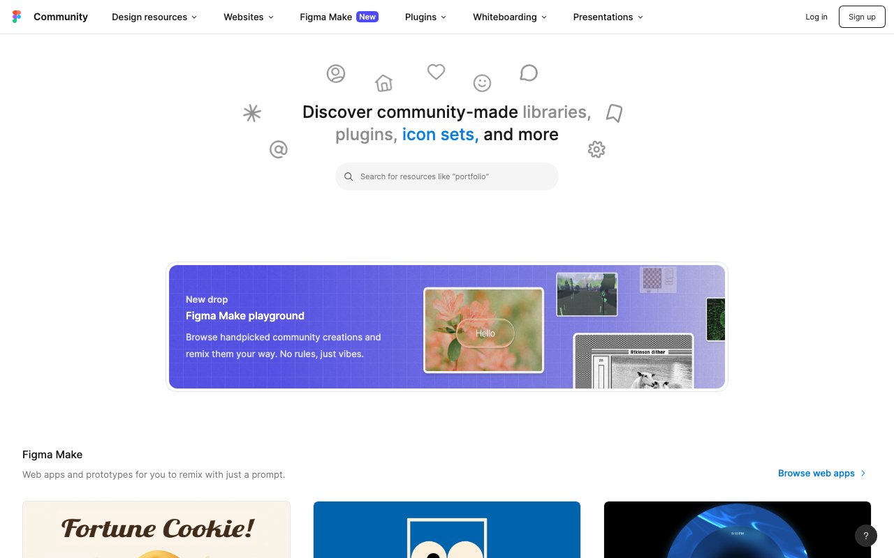
Figma UI Kits
The Figma Community's UI kit collection features hundreds of free and premium design kits — from Material Design and iOS components to custom systems and wireframe kits. A starting point for finding pre-built component libraries to accelerate your Figma projects.
Figma: Empower Your Design Team with Seamless Collaboration
Colorator is a Figma plugin that generates color variations and harmonies from selected elements in your design. It helps you quickly explore alternative color schemes by applying color theory rules directly to your existing components.
Figma: Streamline Design Collaboration and Boost Productivity
Design Lint scans your Figma file for inconsistencies — missing styles, detached components, incorrect spacing, and other common issues. Like a linter for code, it catches design debt before it ships, making it invaluable for design system maintenance.
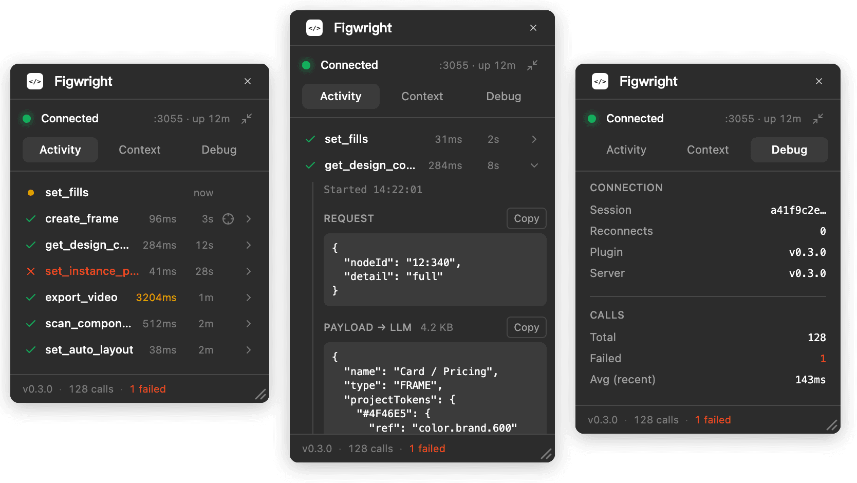
Figwright
newOpen-source bridge between AI agents and Figma that reads selections into framework-aware code and writes changes back to the canvas through a local MCP server and Figma plugin.

Fluent 2: Microsoft's Advanced Design System
Fluent 2 is Microsoft's cross-platform design system providing components, design tokens, and guidelines for building apps across Windows, web, iOS, and Android. Its adaptive design language ensures consistency while respecting each platform's conventions.
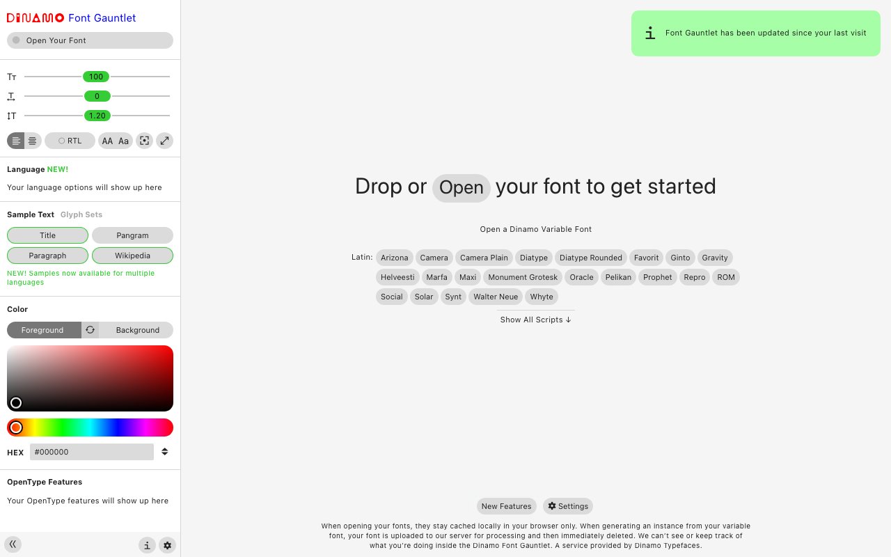
Font Gauntlet by Dinamo: Test Variable Fonts Instantly
Font Gauntlet by Dinamo—proof, generate, and animate variable fonts in your browser. Free tool for designers to test typography before you buy. Try now.

Font Squirrel
Font Squirrel curates free, commercially-licensed fonts that are safe to use in any project. Its Webfont Generator is a go-to tool for converting fonts to web-optimized formats, and the font identifier helps you match fonts from images.
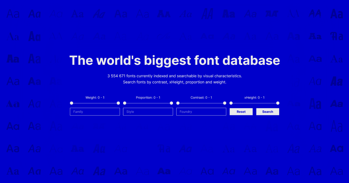
Fontalog
newSearchable database of more than 3.5 million fonts indexed by weight, contrast, proportion, and x-height. Useful for finding visually similar typefaces across foundries without relying on category labels.
Fontshare
High-quality free fonts from Indian Type Foundry — professional-grade typefaces with no license restrictions, optimized for web use. Consistently one of the best sources for free fonts that don't look free.
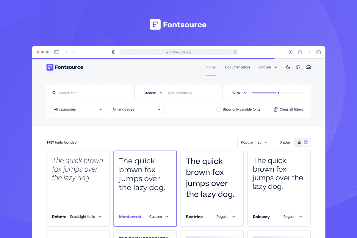
Fontsource
newRegistry of open-source typefaces packaged for self-hosting through npm. Browse variable and static families, then install versioned font files and CSS without relying on a third-party font CDN.
Framer Community: Essential Resources for Designers
The official Framer Community resource section where designers share free templates, components, and code overrides. A community-driven knowledge base for learning techniques, troubleshooting, and finding reusable design assets.
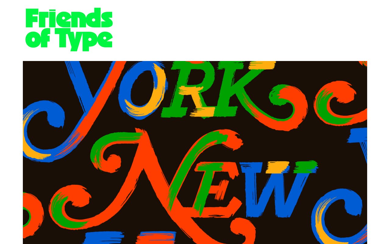
Friends of Type
Friends of Type is a collaborative typographic project showcasing original letterforms, type experiments, and lettering art. It celebrates type as an expressive art form beyond functional communication — pure inspiration for typography enthusiasts.
GitHub Accessibility Scanner
GitHub Action that scans sites and repositories for accessibility barriers, files trackable issues, and can assign findings to Copilot for proposed fixes with human review.
Glyph Neue: 1,500+ Free Icons for Designers (2024)
Glyph Neue icon library—1,500+ versatile, free icons for web and app design. Multiple formats (SVG, PNG), customizable, and ready to use. Download today.
Goldie
newOpen-source CLI and browser studio for producing App Store and Google Play screenshots and preview videos from simulator flows. Frames captures, applies copy and layouts, and checks store upload rules.
Google Fonts
Google Fonts is the largest free, open-source font library with 1,500+ families optimized for web performance. The API serves fonts via global CDN, and the directory helps you browse, pair, and test fonts with live previews before adding them to your project.
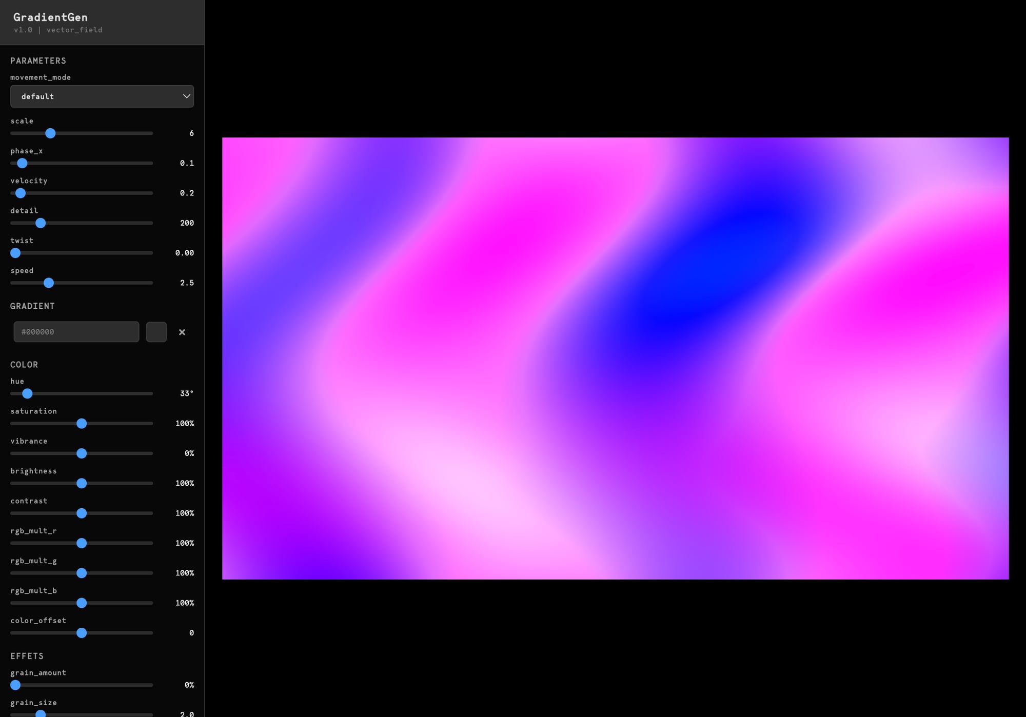
GradientGen
8 gradient modes, 20+ customizable variables, export up to 8000px. Free browser-based gradient generator with unlimited use.
Graphic Design Trends 2024: Cutting-Edge Insights for Designers
An analysis of emerging graphic design trends covering AI-generated art, retro maximalism, 3D typography, sustainable design aesthetics, and more. Useful for designers staying current with visual directions and client expectations.
How to Structure Your Design System for AI
Step-by-step guide to structuring design systems for coding agents with semantic tokens, W3C token files, readable component docs, MCP access, and CI rules that prevent drift.
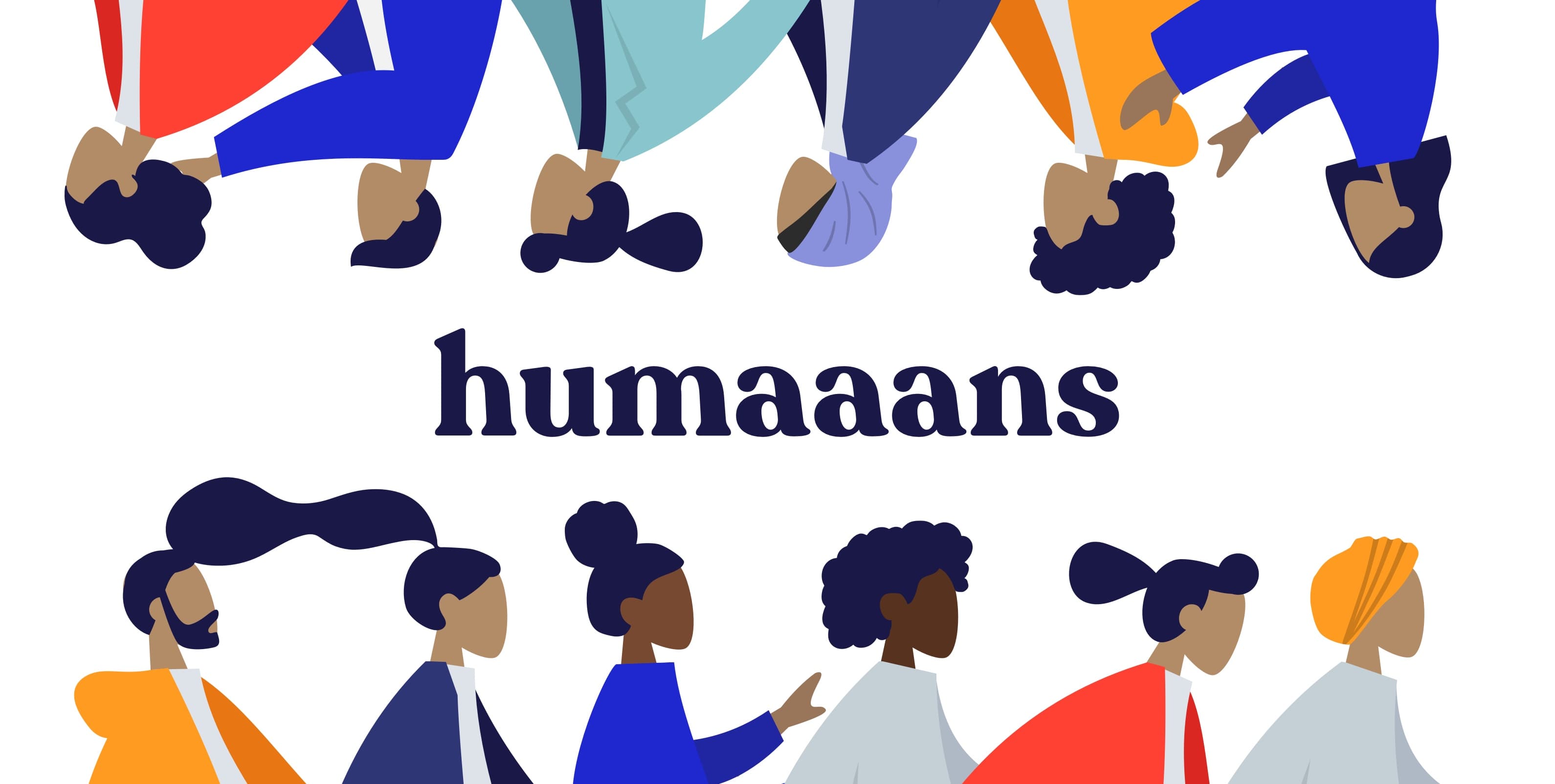
Humaaans: Mix-&-Match illustration library
A mix-and-match illustration library featuring customizable people illustrations. Perfect for adding life to empty states, error pages, and landing pages with a playful, modern design system.
Iconimate
Open-source animated React icon set built on the Phosphor grid, with object-specific motion and hover, focus, and touch controls. Individual icons install through a shadcn-style registry.
IconMind
newOpen-source icon system for AI-era software, covering agents, MCP, RAG, DevOps, security, and data workflows. Includes SVG files, framework packages, six visual variants, and a searchable MCP server.
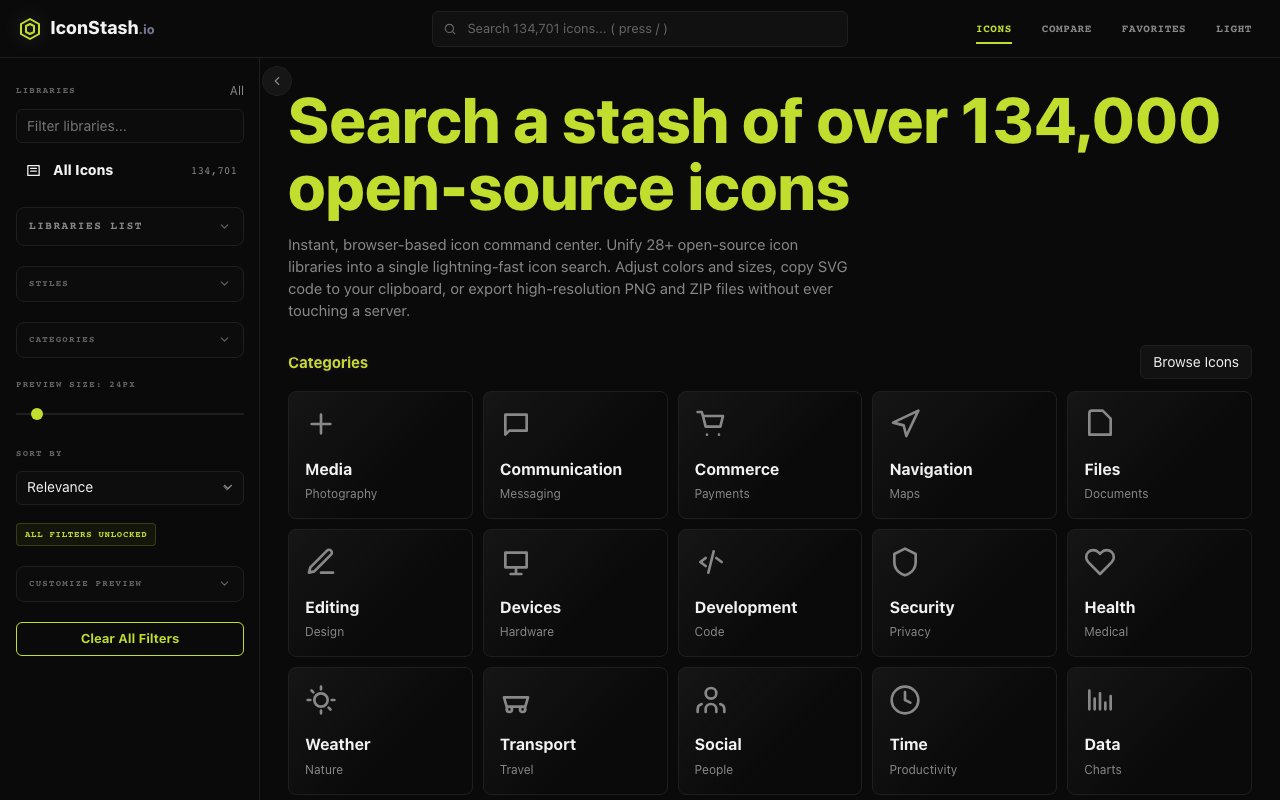
IconStash
Browser-based search and comparison tool for 134,000+ icons across 28 open-source libraries. Adjust color and stroke, then copy SVG or framework code or export PNG and ZIP files.
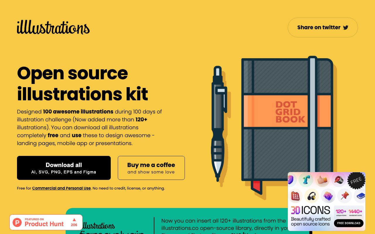
illlustrations: Open source illustrations kit
120+ awesome illustrations designed during a 100-day illustration challenge. Available for free download and includes a Figma plugin for direct insertion into your design files.
Include—Accessibility Annotations
Include is a Figma plugin for adding accessibility annotations to your designs — landmarks, headings, tab order, alt text, and ARIA labels. It generates a clear annotation layer that communicates accessibility intent to developers during handoff.
Inclusive Components: Accessible design patterns
Inclusive Components by Heydon Pickering provides detailed, practical examples of how to build common UI components with accessibility built-in from the start. Each post breaks down the design and development considerations needed to create truly inclusive interfaces, making complex accessibility concepts approachable and actionable.
Inside Apple: Insights from Employees on Real Work Experiences
A candid collection of insights from Apple employees about what it's really like to work at the company — covering design culture, collaboration challenges, and the reality behind the polished exterior. Eye-opening for designers curious about big tech design teams.

Into Design Systems: YouTube Channel for Design Systems
A YouTube channel delivering in-depth tutorials and talks about building and maintaining design systems. Covers topics from token architecture and component APIs to Figma workflows and developer handoff — practical knowledge from experienced practitioners.
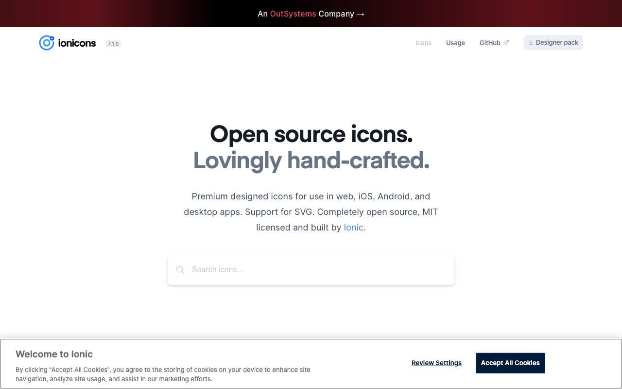
Ionicons
Ionicons is the premium icon set from the Ionic framework team, offering 1,300+ beautifully crafted icons in outline, filled, and sharp variants. Designed for mobile and web interfaces, each icon is a crisp SVG with consistent sizing and padding.

Jerry-Lee Bosmans: Vibrant Visual Art and Design
Jerry-Lee Bosmans is a digital artist known for vibrant, colorful 3D illustrations and visual experiments. His portfolio showcases bold compositions that blend abstract and figurative elements — inspiring for anyone exploring expressive digital art and illustration.
Keyline Icons
newFree set of 1,000 icons on a shared 24-pixel grid, each available in four styles with rounded or sharp corners. Includes SVG, React, Iconify, CLI, and Figma workflows under an MIT license.

Kitbitz
newLibrary of more than 2,000 hand-drawn illustrations across themed kits, downloadable as SVG or PNG and available as Figma files. Assets are free for commercial use under CC0.

Kyle T. Webster: Illustrator and Brush Wizard
Kyle T. Webster is a world-renowned illustrator and the creator of the most popular Photoshop brushes (now included free with Adobe CC). His portfolio showcases editorial and commercial illustration with distinctive character and texture.
Lapa Ninja
Free collection of 6,800+ landing page examples from real startups, organized by industry and style. One of the most comprehensive landing page libraries for design inspiration.

LDRS: Free Open-Source Loaders and Spinners
LDRS provides a collection of beautiful, lightweight loading animations as web components. Each loader is customizable via attributes (size, color, speed), zero-dependency, and works with any framework — perfect for adding polished loading states to any project.
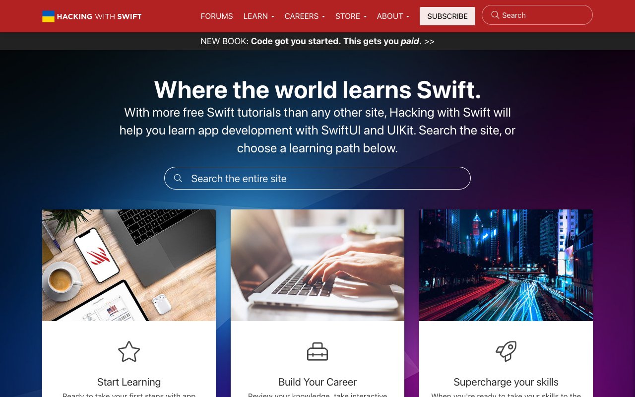
Learn iOS App Development with Free 'Hacking with Swift' Tutorials
Hacking with Swift is the most popular free resource for learning iOS development with Swift and SwiftUI. Paul Hudson's project-based tutorials take you from beginner to advanced with practical, hands-on lessons that build real apps.

Lighthouse: Built-in Chrome accessibility audits
Lighthouse is built directly into Chrome DevTools and provides comprehensive accessibility audits alongside performance and SEO analysis. It automatically scans pages for common accessibility issues and provides actionable recommendations, making it an essential tool that's always available to developers and designers.

Liquid Glass CSS
Apple's iOS/macOS Liquid Glass effect recreated in pure CSS and SVG filters. Open-source implementation you can use in your web projects.
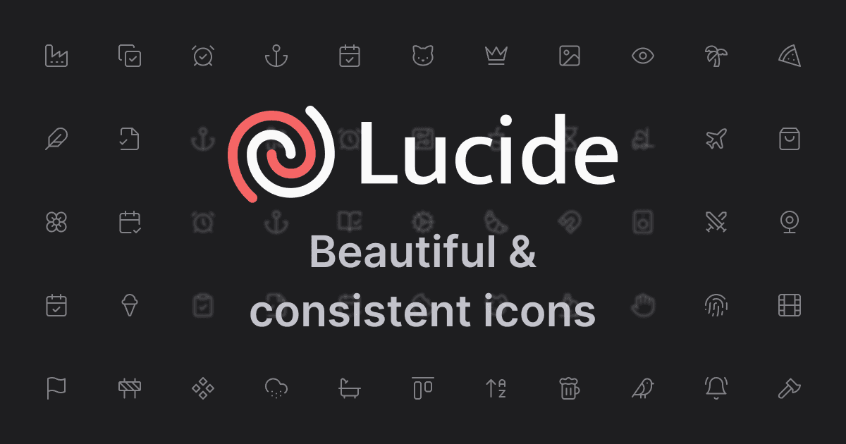
Lucide: Extensive Icon Library for Developers
Lucide is a community fork of Feather Icons that has grown into a comprehensive open-source icon library with 1,500+ icons. It maintains Feather's clean aesthetic while adding hundreds of new icons, and provides packages for React, Vue, Svelte, and more.
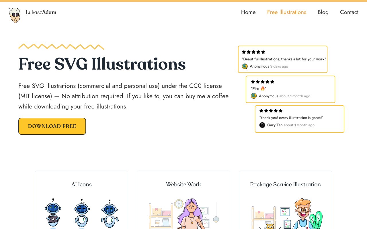
Lukasz Adam: MIT licensed illustrations
A collection of beautiful, minimal illustrations released under MIT license. Perfect for commercial and personal projects with their clean, professional aesthetic and liberal licensing.
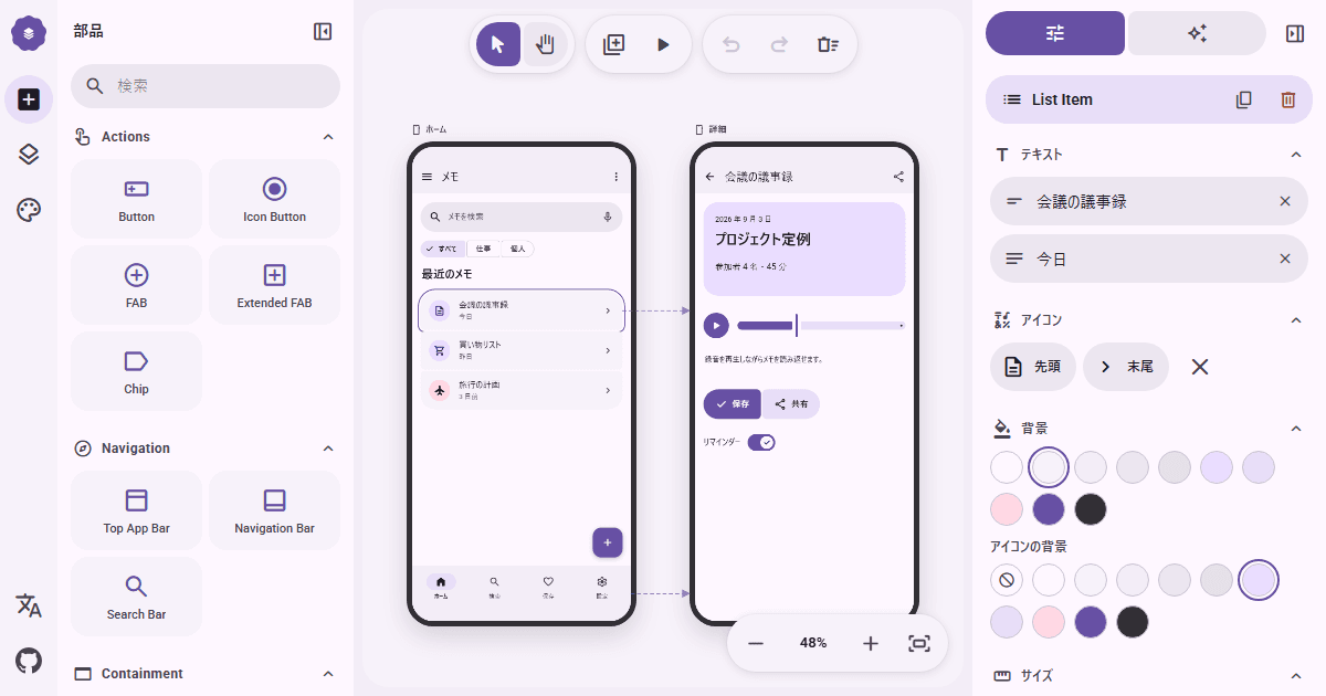
M3E Canvas
newBrowser-based Material 3 Expressive canvas for arranging responsive screens, linking tap and swipe flows, previewing interactions, and exporting a structured prompt for AI coding tools.
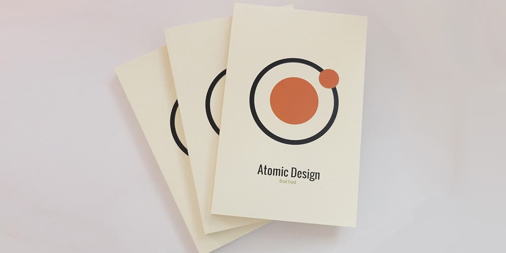
Maintaining Design Systems
Brad Frost's chapter on maintaining design systems from his book Atomic Design tackles the hardest part of design systems — keeping them alive. Covers governance models, regular check-ins, handling updates, and building a culture of contribution.
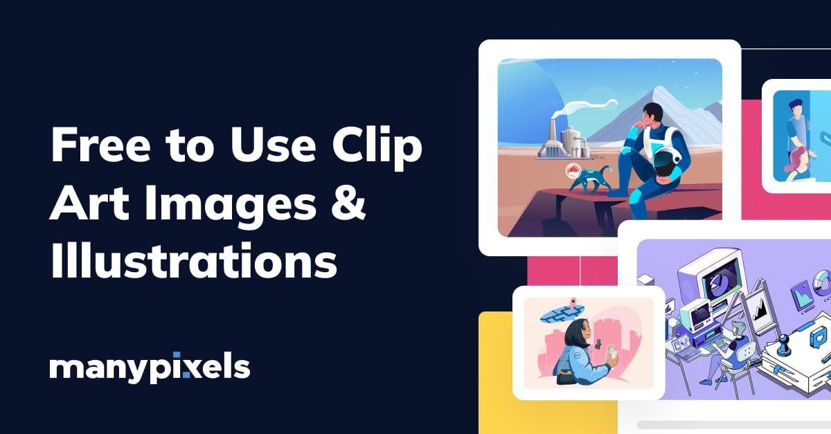
ManyPixels: Free illustration gallery
A curated gallery of modern, professional illustrations perfect for business and technology projects. Features clean, minimalist designs with a focus on digital products and services.
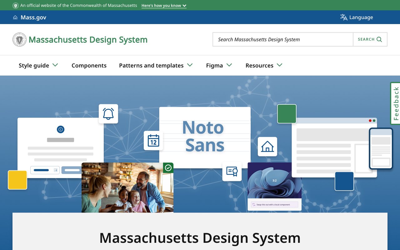
Massachusetts Design System
Public state design system with Figma components, accessible style guidance, design tokens, and icon packages. A practical reference for teams building clear, consistent government services.
Matching AI Modality to User Intent
Long-form framework for matching an AI product's input and output modes to user intent, cognitive load, and environment. Includes a task audit, alignment matrix, and field template.
Material 3 Design Kit: Google's Official UI System
Google's official Material 3 Design Kit featuring 500+ components and variants with Figma variables support, dark theme compatibility, and responsive design. Includes 300+ variables and styles, perfect for Android app design following Material Design guidelines.

Material Design UI Kit
Google's official Material Design resources provide UI kits, icons, fonts, and implementation guidelines for building interfaces that follow Material Design principles. The comprehensive system covers components, motion, theming, and accessibility across platforms.
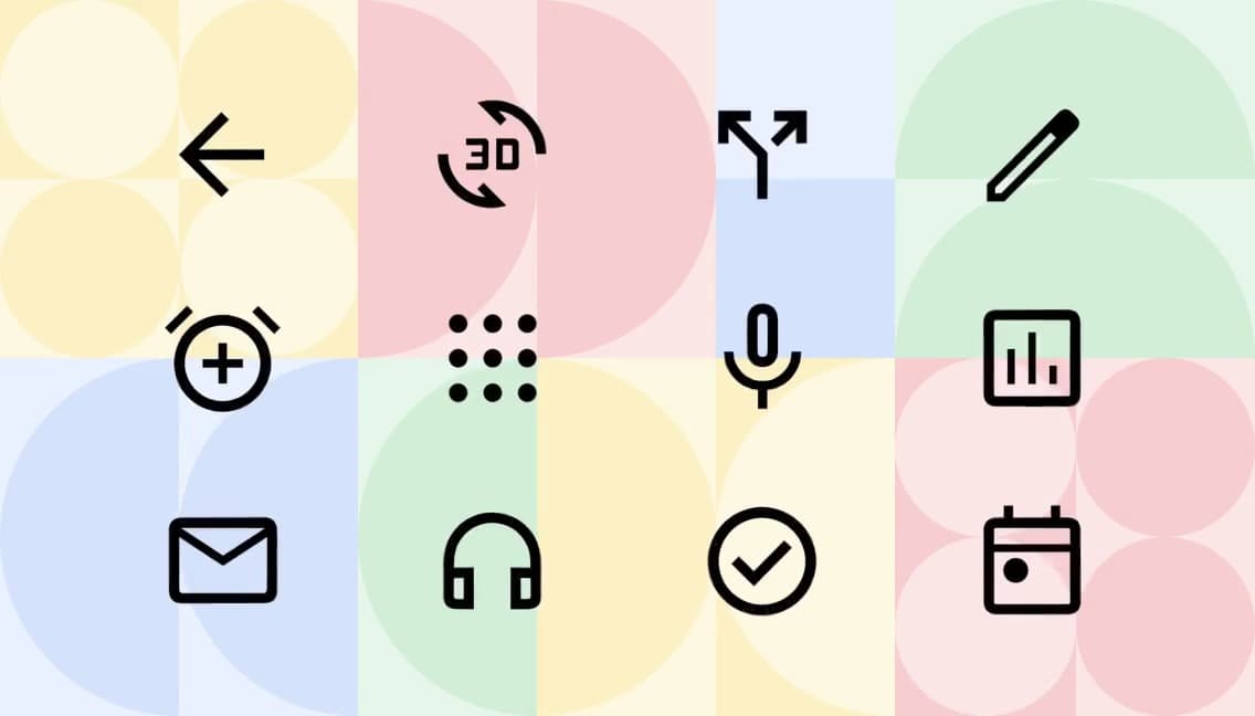
Material Icons
Google's Material Icons provide 2,500+ icons following Material Design guidelines, available in five styles: outlined, filled, rounded, sharp, and two-tone. They're the standard choice for Android apps and Material Design projects, with broad framework support.
Modulor: Comprehensive Open-Source Design System
Modulor is an open-source design system providing a comprehensive set of accessible web components, design tokens, and documentation. Built for flexibility, it offers a solid foundation for teams who want a customizable starting point rather than building from scratch.
Motion
Open-source animation library for React, JavaScript, and Vue with gestures, spring physics, layout and scroll animation, timeline sequencing, and a free View Transition API wrapper.
No Code
NoCode.tech is a curated directory and learning resource for no-code tools, featuring tool comparisons, tutorials, and discount codes. It helps designers and entrepreneurs discover the right no-code platforms for building products without traditional programming.
NYS Design System
Public design system for New York State services with web components, CSS utilities, design tokens, accessibility guidance, and a Figma library for agency teams.
Open Design System Bench
newOpen-source harness that runs coding agents against a React design system and grades component use, API fidelity, tokens, accessibility, and compilation. Compares results across models and context levels.
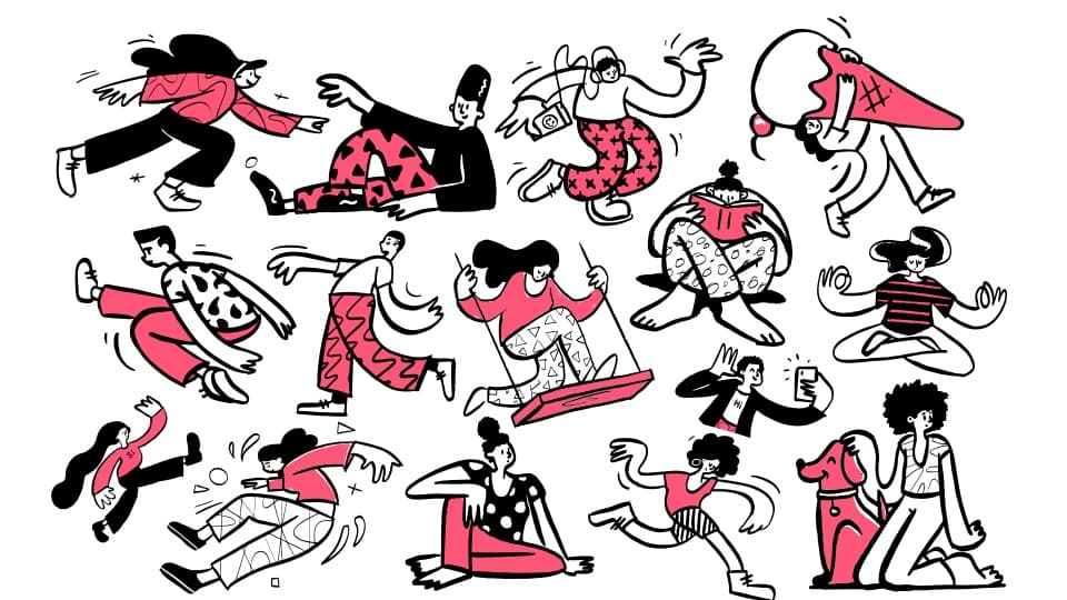
Open Doodles: Free sketchy illustrations
A collection of free sketchy illustrations with a playful, hand-drawn aesthetic. Perfect for adding personality and warmth to digital products with their distinctive doodle style.
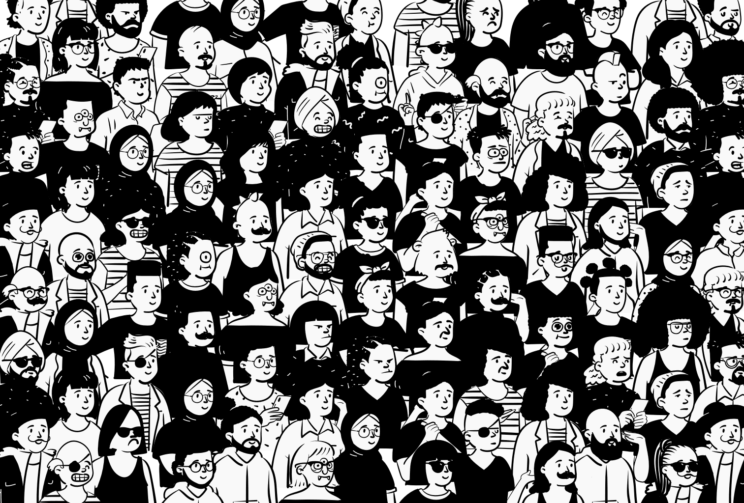
Open Peeps: Hand-drawn people library
A hand-drawn illustration library featuring diverse people in various poses and situations. Perfect for creating inclusive, human-centered designs with a friendly, approachable style.

OpenFig
newOpen-source CLI and browser tools for parsing and rendering Figma .fig and .deck files. Converts HTML decks to editable Figma Slides while preserving text, vectors, layouts, fonts, and speaker notes.
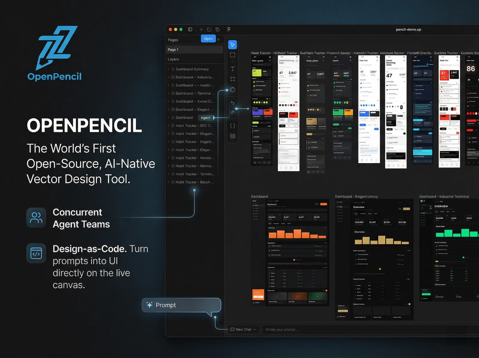
OpenPencil
Open-source, AI-native vector design canvas with prompt editing, diffable JSON files, MCP access, and code export for React, SwiftUI, Flutter, and other frameworks.
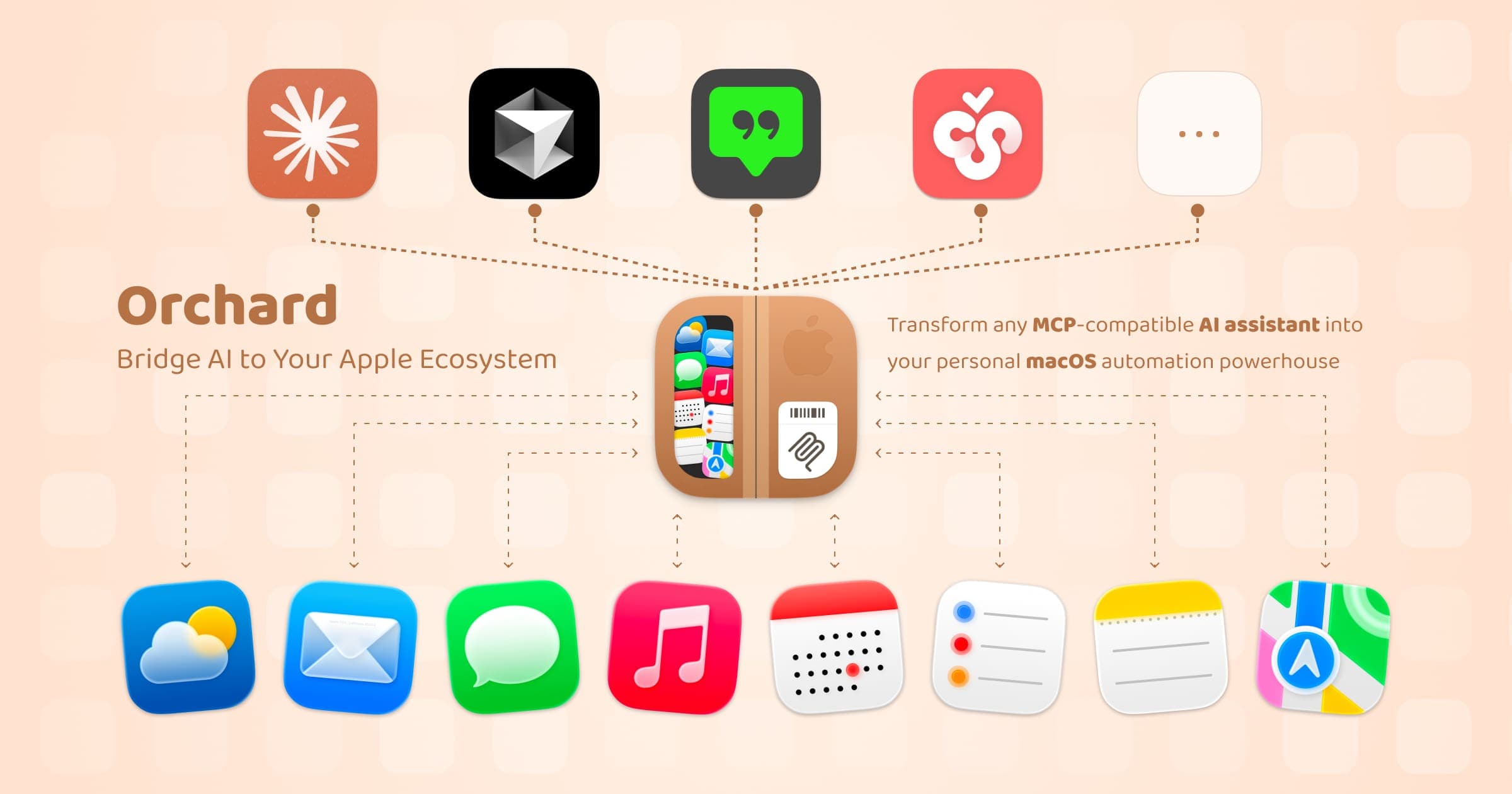
Orchard
Native macOS bridge that gives MCP-compatible AI assistants access to Calendar, Mail, Notes, Reminders, Messages, Maps, and more. Automation runs locally through Apple apps.

Origami Studio: Comprehensive Design and Prototyping Tool
Origami Studio is Meta's free design prototyping tool used internally for products like Facebook, Instagram, and WhatsApp. Its patch-based visual programming system excels at creating complex, realistic interaction prototypes — especially micro-interactions and gesture-driven interfaces.
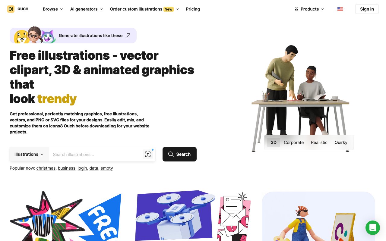
Ouch by Icons8: Free vectors and illustrations
A vast collection of free vector illustrations and icons in various styles. Features multiple illustration sets from different artists, perfect for any type of digital project.
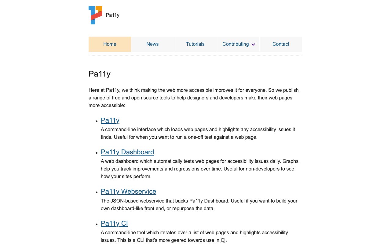
Pa11y: Automated accessibility testing
Pa11y is a command-line tool and web service that runs automated accessibility tests on web pages using HTML CodeSniffer rules. It can be integrated into development workflows and CI/CD pipelines to catch accessibility issues early, providing detailed reports and the ability to test multiple pages at scale.
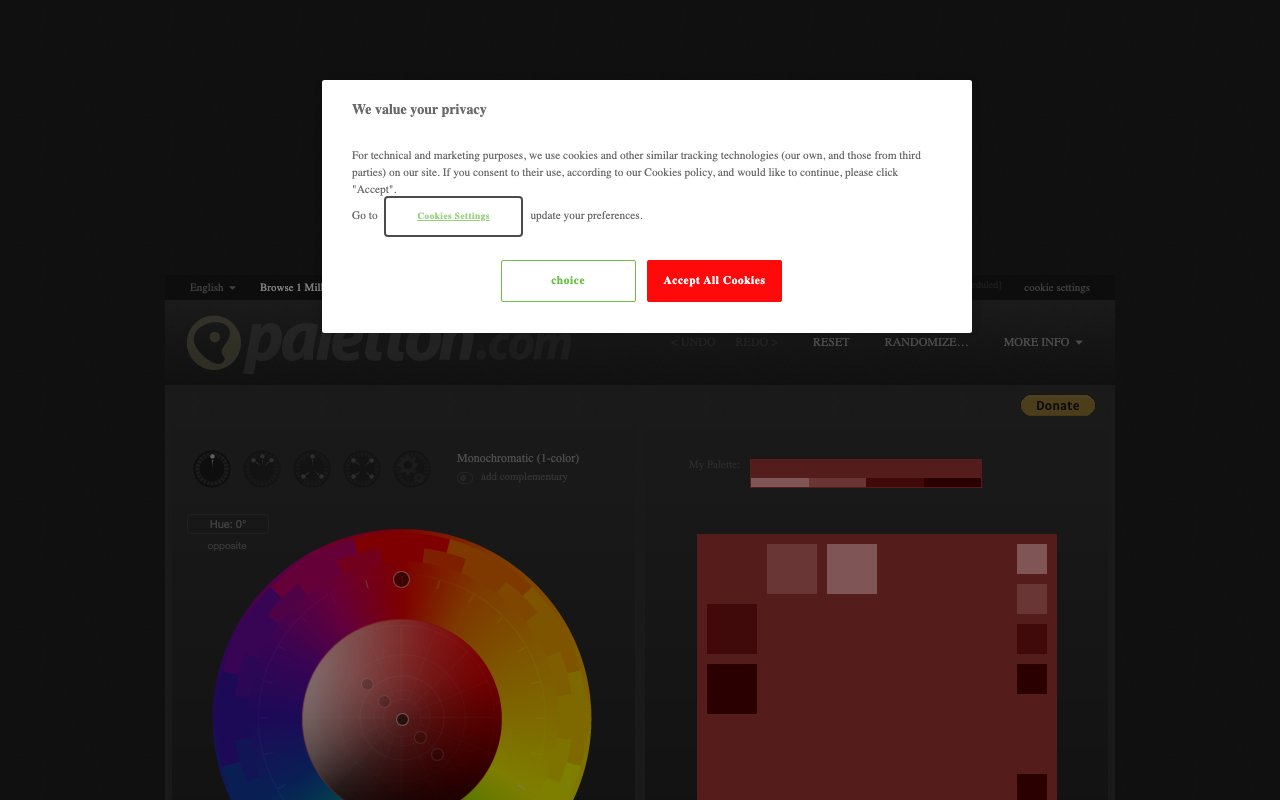
Paletton
Paletton is an advanced color scheme designer that uses color wheel relationships to generate harmonious palettes. Its visual approach lets you see how colors interact in real-time, with presets for adjacent, triad, and tetrad schemes — particularly strong for web design color systems.

Paper Shaders
Open-source WebGL shader library with image filters, mesh gradients, noise, halftone, and animated effects. Use the visual editor or install zero-dependency React and JavaScript packages.
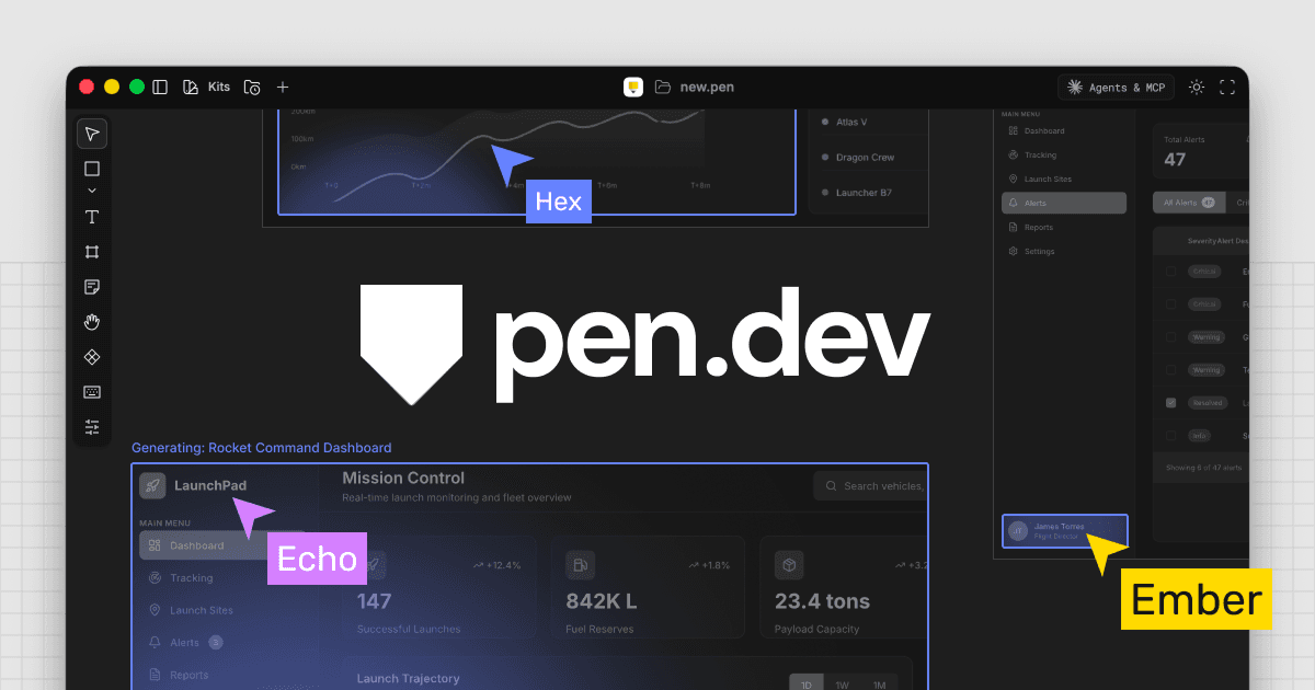
pen.dev
Vector design canvas for desktop apps and IDEs that stores open .pen files in the repo, imports Figma work, and supports bidirectional design and code changes through local MCP tools.
Pigment: Simple Color Palette Generator
Pigment by ShapeFactory generates beautiful color palettes using pigment-mixing algorithms instead of traditional math-based approaches, resulting in more natural, organic color combinations. Adjust hue and lightness with simple sliders for instant palette exploration.
Pixelarticons: Unique Line Pixel-Art Icons for Designers
Pixelarticons is an open-source icon set with a unique pixel-art line style — 480+ icons that bring a retro, playful aesthetic to your interfaces. Perfect for game-related projects, nostalgic designs, or any UI that wants a distinctive pixelated personality.

Poly Haven
Free CC0-licensed PBR textures (8K+), HDRIs (16K+), and 3D models — all photoscanned for realistic quality. No attribution required, fully free for commercial use.

pour
newFree WCAG 2.2 audit suite with browser extensions, a bookmarklet, CLI, and open-source engine. Findings include exact elements and fixes, while uncertain criteria stay in a manual-review checklist.
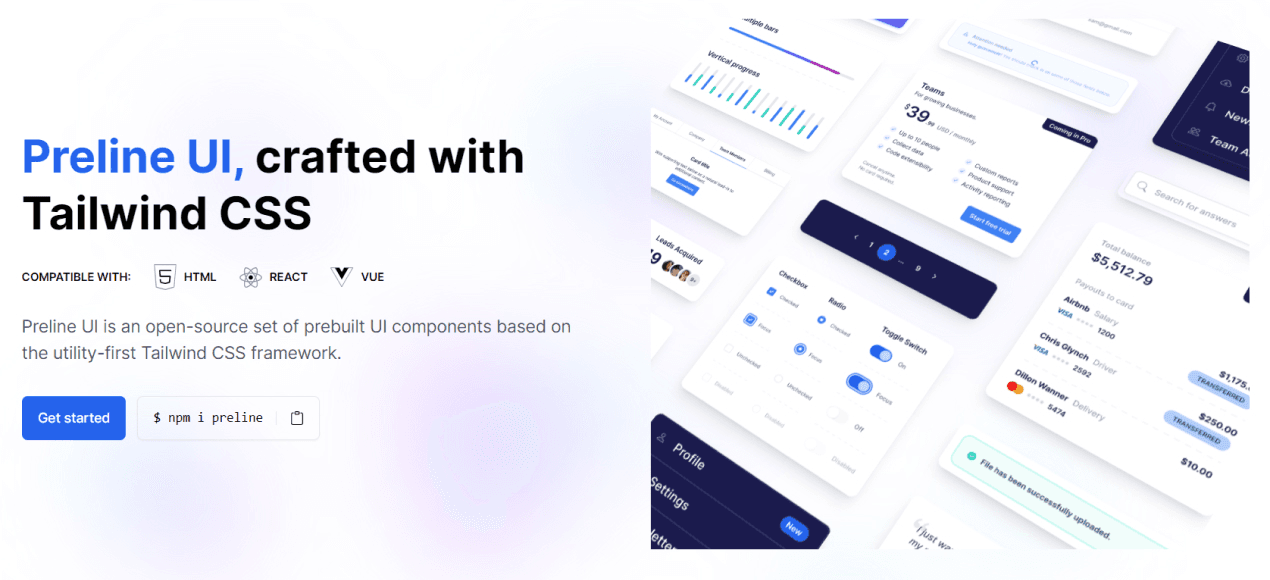
Preline UI: Free Tailwind Component Library
Comprehensive free component library with 5,000+ Tailwind CSS-based components featuring auto-layout and Figma Tokens compatibility. 100% free with extensive component coverage, perfect for Tailwind CSS projects requiring no licensing fees.
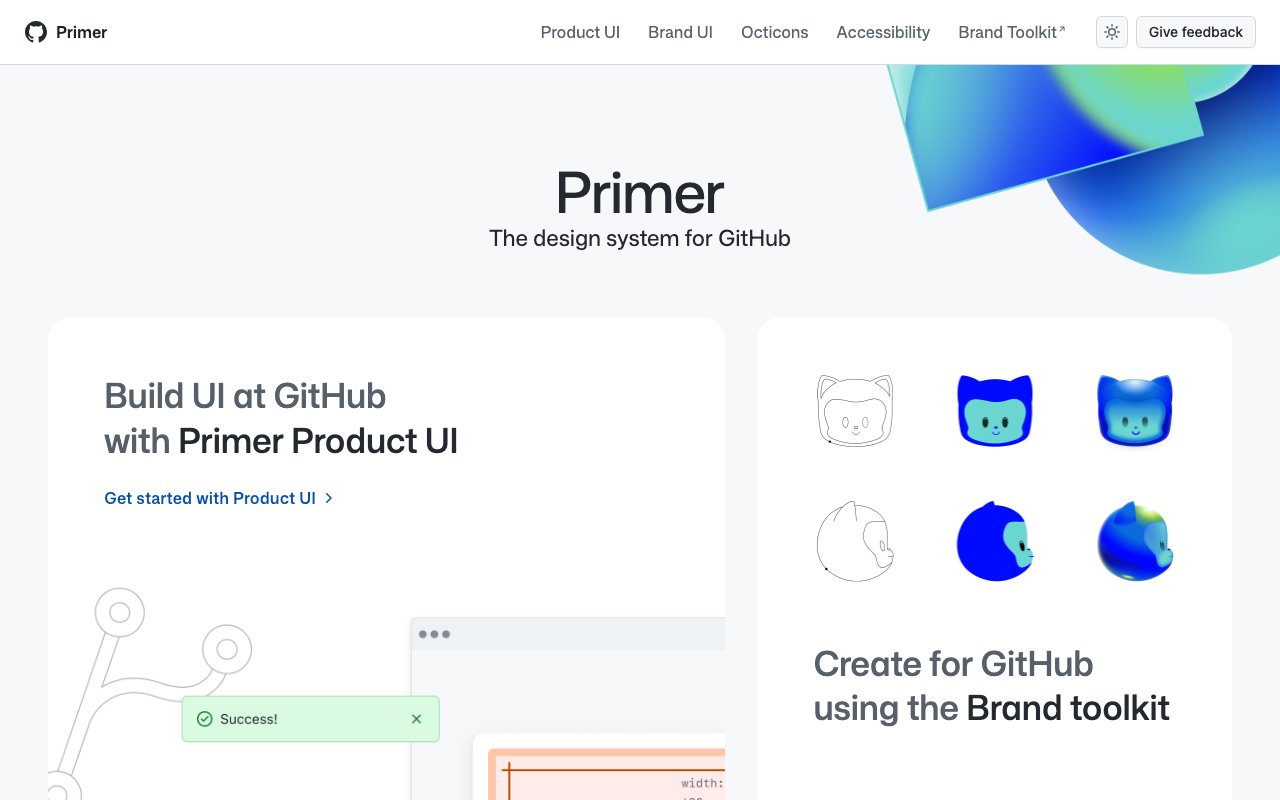
Primer Design System: GitHub's UI Framework
Primer is GitHub's open-source design system featuring React components, CSS utilities, Figma kits, and detailed documentation. Its thoughtful approach to accessibility, color modes, and responsive design makes it an excellent reference for building modern design systems.
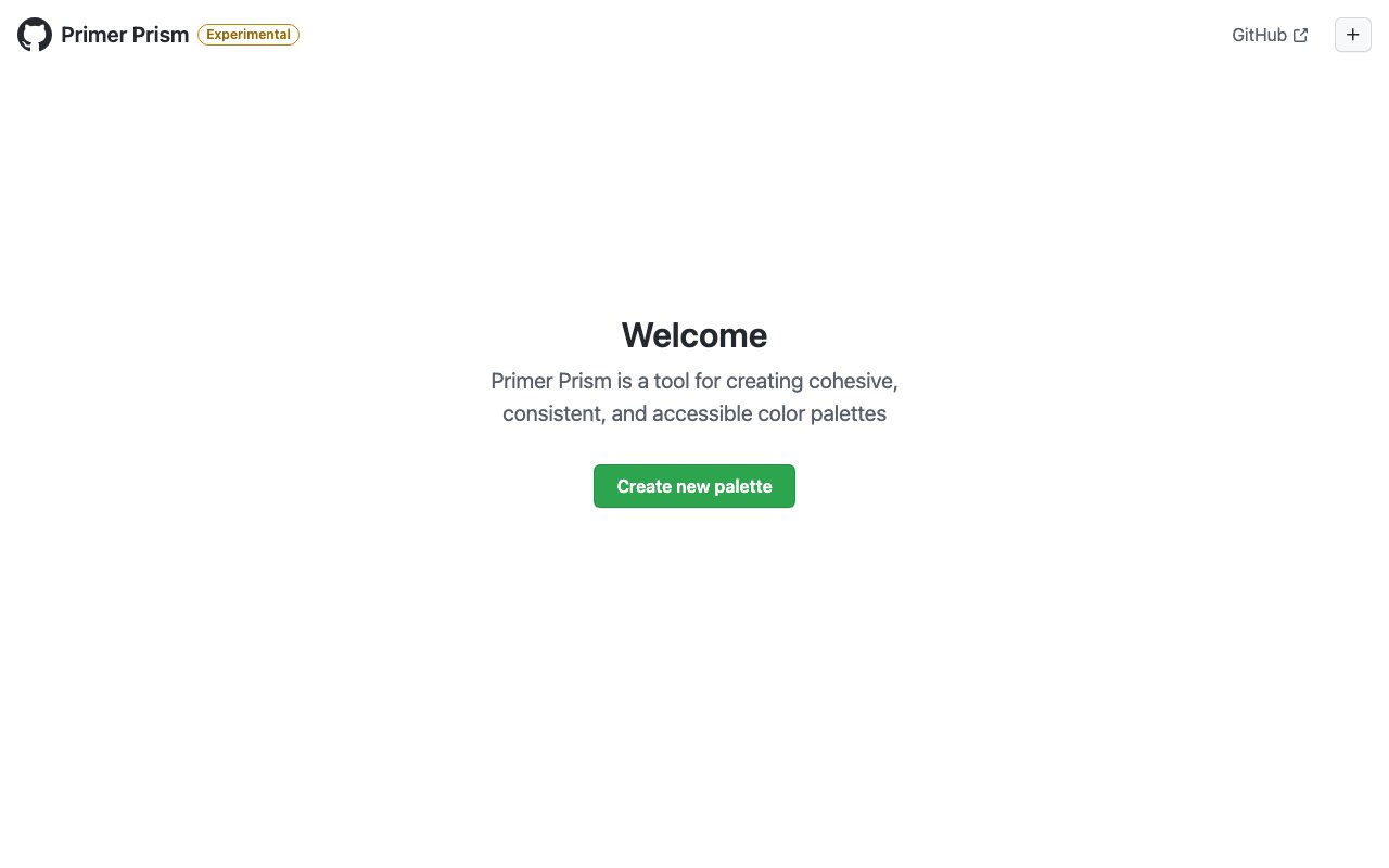
Primer Prism is a tool for creating cohesive, consistent, and accessible color palettes
Primer Prism, created by GitHub's design team, helps you build cohesive and accessible color systems from a single base color. It generates consistent color scales with built-in WCAG contrast checking — essential for design system color token creation.
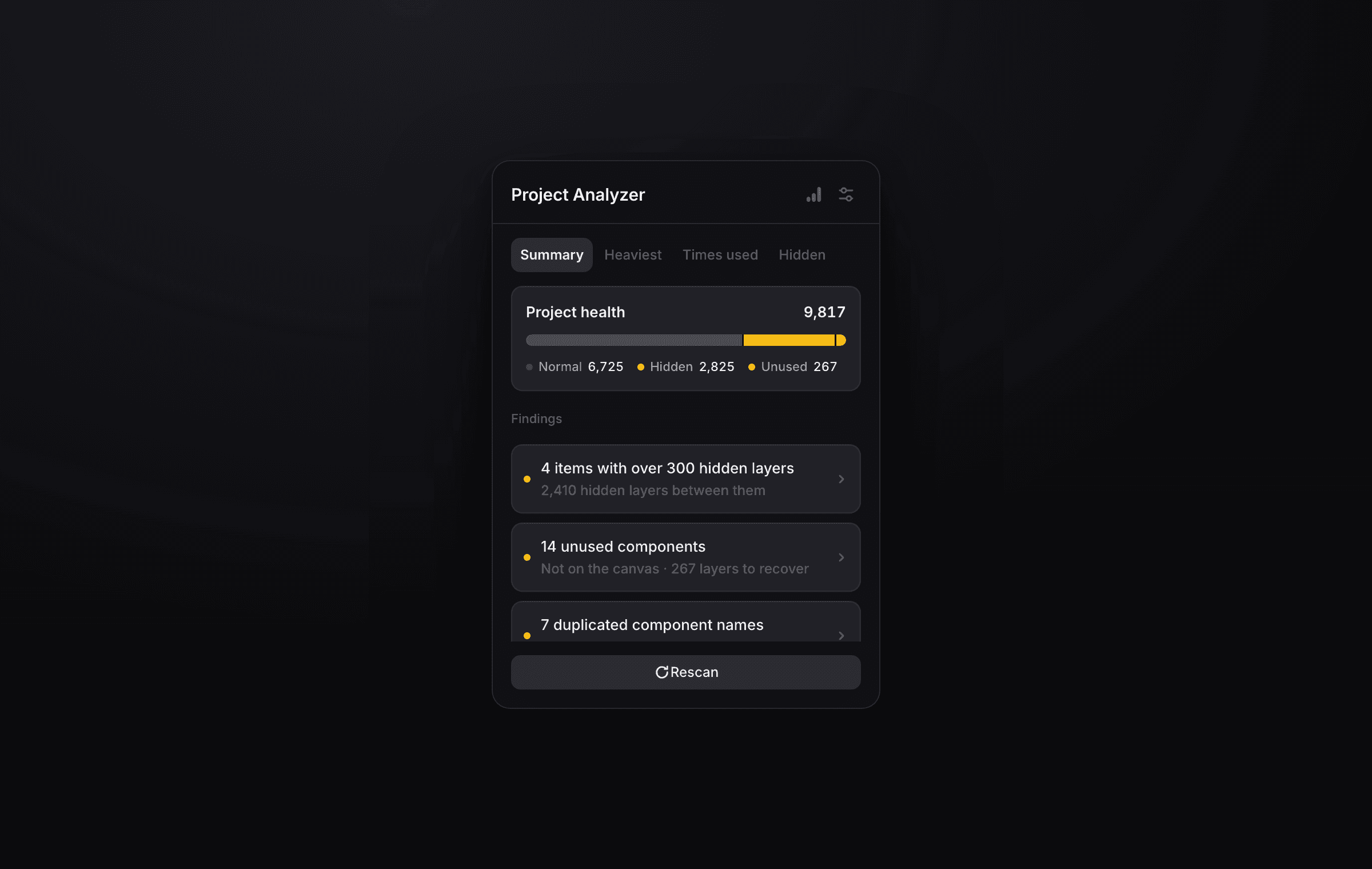
Project Analyzer
newLocal Framer project audit that finds layer-heavy pages and components, hidden and unused layers, and repeated instances, with configurable thresholds and direct links to each finding.
Propstar: Essential Figma Plugin for Streamlined Design
Propstar automatically generates visual property tables for Figma components, documenting all variants, props, and states. It creates clean, shareable component specs that help teams understand and correctly use design system components.
React Bits
Animated React component library with text effects, backgrounds, UI elements, and small creative tools. Components can be copied directly or installed through shadcn and jsrepo.

React Grab
React Grab is an interactive demo and component library showcasing advanced React interactions and animations. Praised for some of the most polished interactive demos in the React ecosystem — great for inspiration and copying proven interaction patterns.
Reactiive Demos
110+ free React Native animations that run on Expo Go. Copy-paste ready code for mobile app animations.
ReUI
966+ real-world shadcn/ui patterns and compositions. Filters, data tables, forms, and dashboards. Open source and compatible with all shadcn styles.
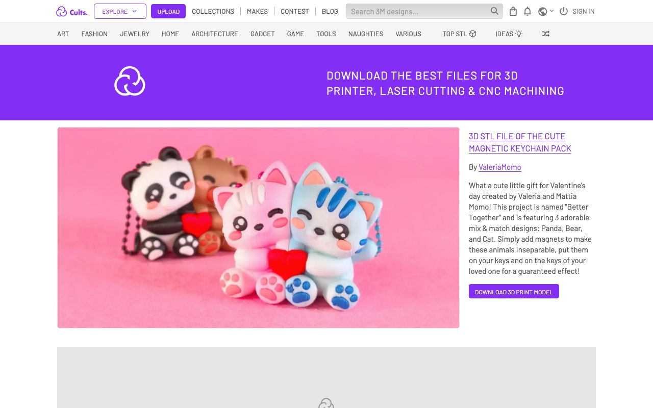
Revolutionize Your Designs with Free 3D Printer Models from Cults
Cults is a marketplace for downloading free and premium 3D printer models across categories like art, fashion, jewelry, and architecture. Designers can browse thousands of ready-to-print STL files or sell their own creations to a global community.
RIPER Protocol for Cursor
Structured workflow for AI coding: Research, Innovate, Plan, Execute, Review. Saves hours of debugging by enforcing a methodical approach.

Roots Podcast: Exploring Design Innovation
Roots is a podcast spotlighting Filipino designers and their contributions to the global design industry. Episodes feature personal stories, career journeys, and cultural perspectives that bring diversity and fresh viewpoints to design discourse.
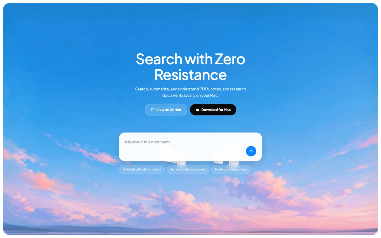
Sero
Open-source macOS app that indexes PDFs, Markdown, notes, and folders for local AI search and summaries through Ollama. Documents and retrieval stay offline on the Mac.
shadcn MCP Server
Official shadcn MCP server for browsing, searching, and installing registry components from AI assistants. Works with public, third-party, and private registries.
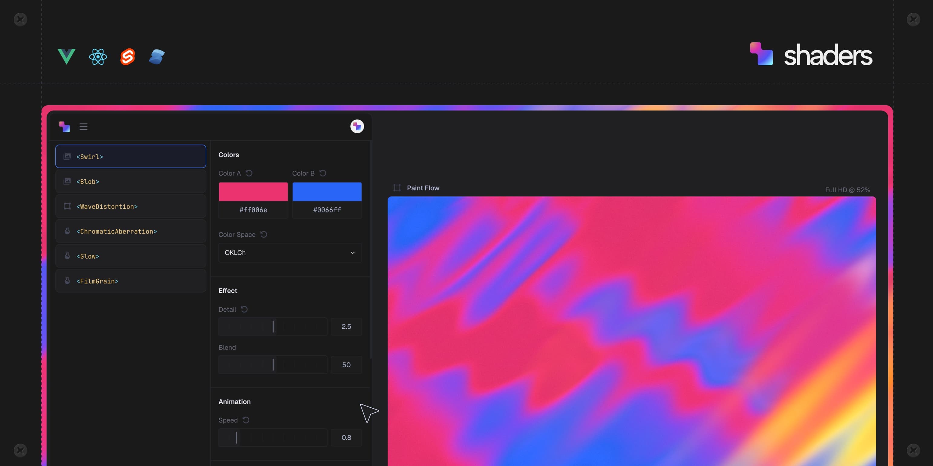
Shaders.com
Component-based WebGPU shaders for React, Vue, and Svelte. Visual editor generates production-ready shader code for landing pages, dashboards, and hero sections.
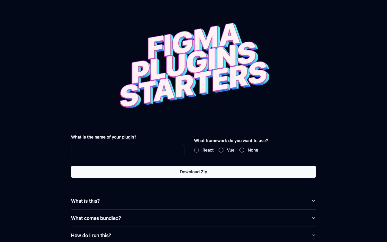
Simplify Figma Plugin Development with dotenv.dev Starters
dotenv.dev's Figma starter lets you generate a fully configured plugin project with your choice of framework (React, Vue, or vanilla), bundling, and TypeScript setup. It eliminates boilerplate setup so you can focus on building your plugin's actual functionality.
Sketch Booth Pattern Generator
Experimental pattern generator for branding work. Custom shapes and images analyzed by pixel brightness for unique flow patterns. Built with creative coding principles.
sketchyicons
newOpen-source library of hand-drawn SVG icons derived from Lucide geometry, with packages for major web frameworks and a searchable Figma plugin. Built for interfaces that need a less mechanical visual voice.
Spark Creativity with Inspire: A Designer's Dream Resource
A curated collection of animated brand guidelines and motion identity systems from top creative studios. Shows how brands extend their visual identity into motion — a growing design discipline that bridges static brand guides and dynamic digital experiences.
Square UI
Open-source shadcn/ui layouts and components. Clean, modern designs ready to use in your Next.js projects.

Stable Diffusion: Open-Source Image AI
Stable Diffusion is an open-source generative AI model offering complete control over text-to-image synthesis, inpainting, and customization via fine-tuning. Essential for designers who need unlimited creative freedom, custom model training, and integration into their own workflows without usage restrictions or costs.
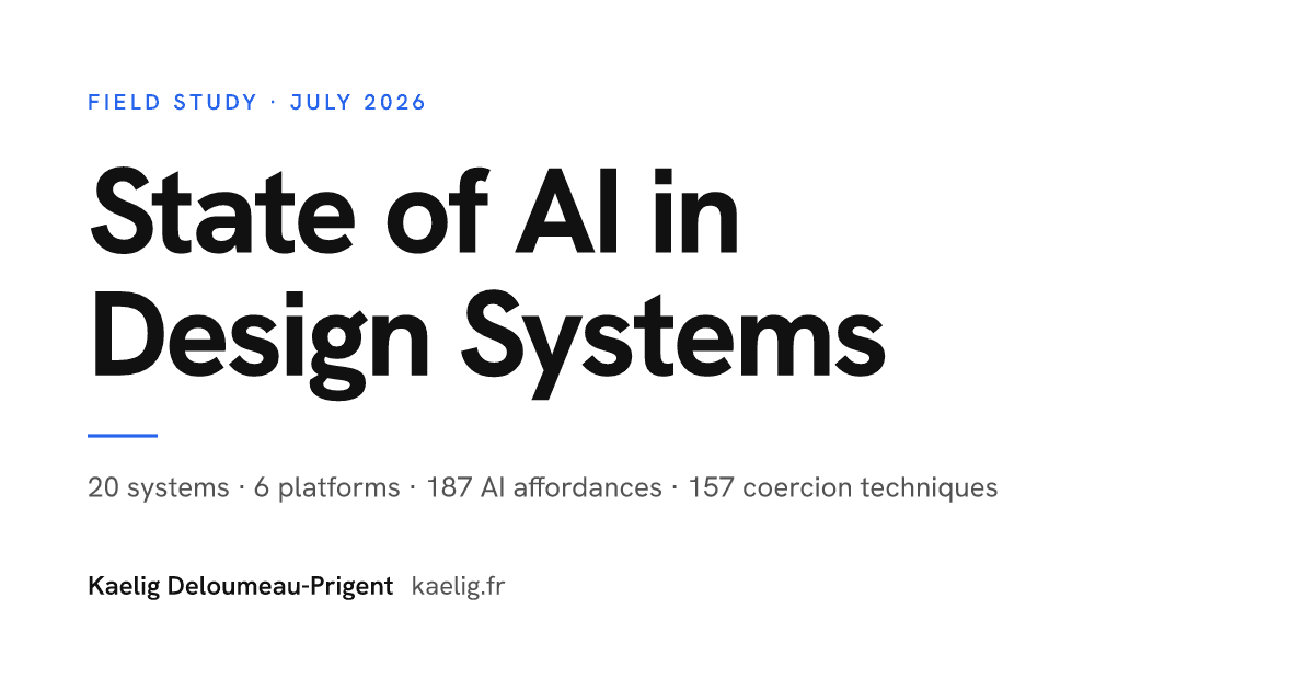
State of AI in Design Systems
newSource-linked field study of how 20 maintained design systems expose MCP servers, agent skills, llms.txt, editor rules, registries, and other machine-readable interfaces.
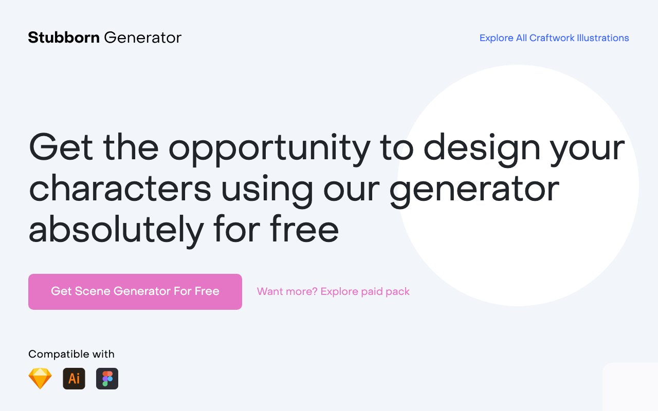
Stubborn: Character generator
A fun character generator with customizable features and expressions. Create unique, personality-filled characters perfect for storytelling, branding, and user interface design.
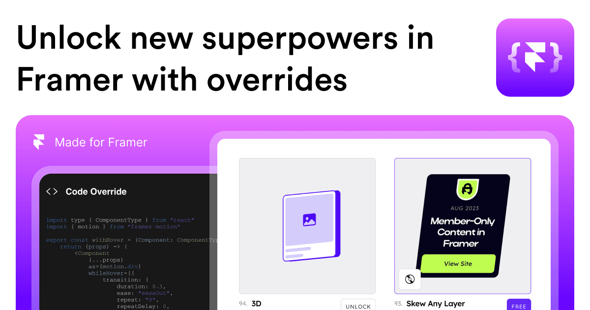
Supercharge Your Framer Projects with Framer Overrides
Framer Overrides is a collection of copy-paste code snippets that add custom interactions and behaviors to Framer projects — scroll animations, hover effects, conditional logic, and more. No deep coding knowledge required; just paste and customize.

Surviving Day Zero
newOperating-model guide for enterprise design systems covering ownership, federated governance, adoption, legacy migration, vendor controls, and metrics. Useful for teams planning the work that follows launch.
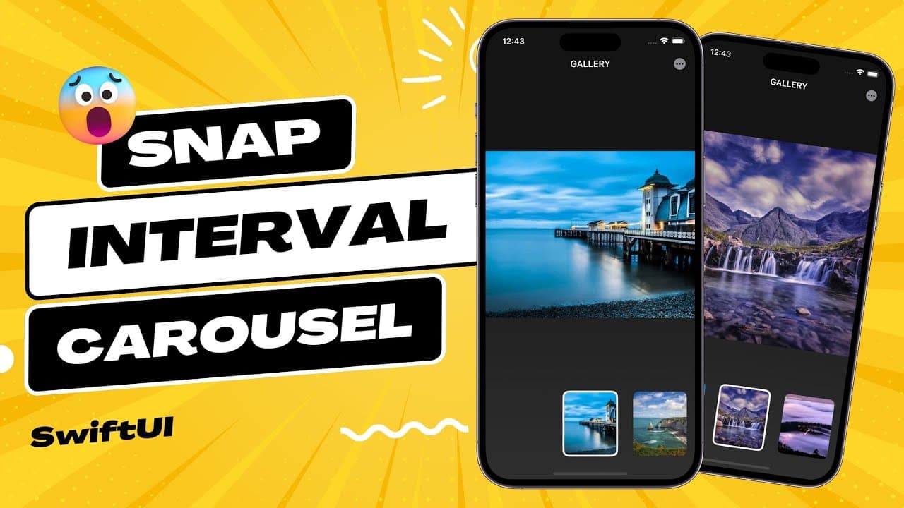
SwiftUI Snap Interval Carousel - Tutorial
A hands-on SwiftUI tutorial showing how to build a snap-interval carousel — a common mobile UI pattern where content cards snap to position as users scroll. Great for iOS designers learning to implement their own designs in SwiftUI.
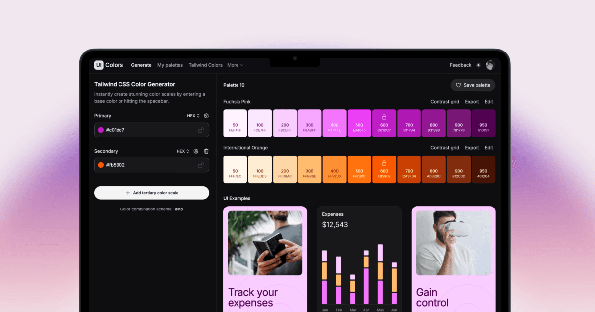
Tailwind CSS Color Generator
A specialized color generator that creates complete Tailwind CSS color scales from a single color input. It produces 50-950 shade ranges that match Tailwind's naming convention, ready to paste into your tailwind.config.js for custom brand colors.
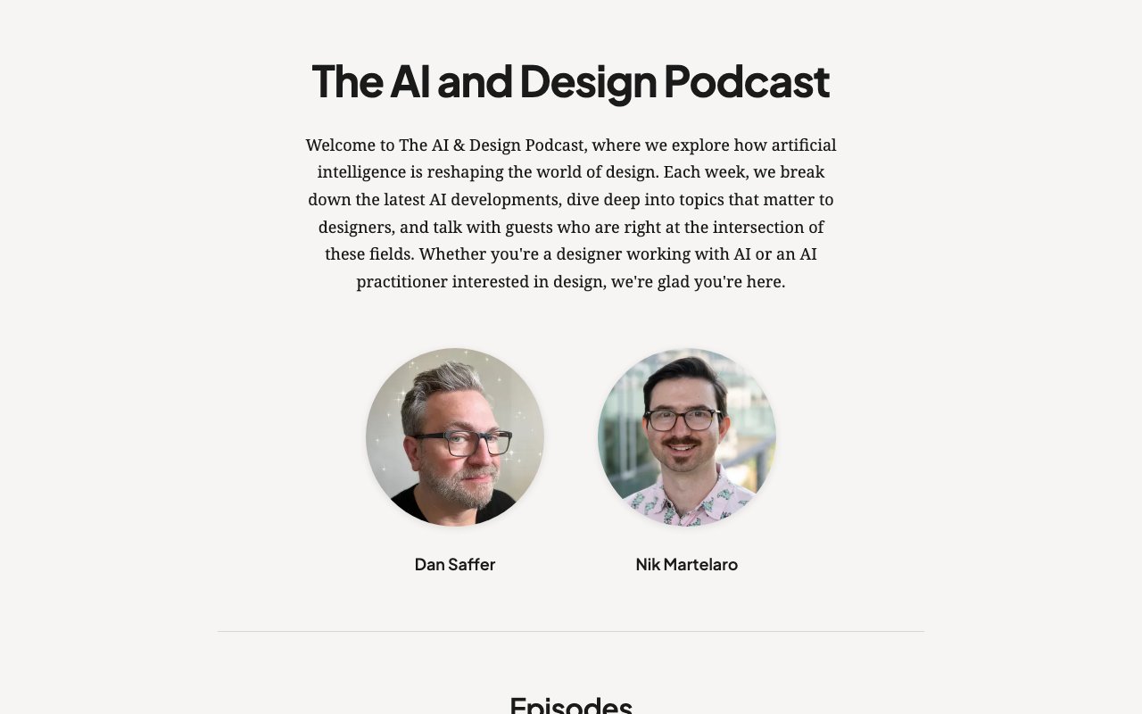
The AI and Design Podcast
Weekly podcast from interaction designer Dan Saffer and HCI researcher Nik Martelaro covering AI design tools, research, interface patterns, product shifts, and practitioner interviews.
The Art of Modern UI Design
A comprehensive overview of modern UI design trends including bento grids, neubrutalism, glassmorphism, spatial interfaces, and AI-driven personalization. Includes practical implementation tips for each trend.
The Benefits of Cognitive Inclusion in UX Research
Research report comparing usability sessions with cognitive-disabled and general-population participants, including recruitment guidance, study design, findings, and concrete testing recommendations.
The Component Gallery: UI Component Reference
The Component Gallery collects and compares UI components across real design systems — see how different companies implement buttons, modals, navigation, and more. An invaluable research tool when designing components for your own system.
The Design Better Podcast
The Design Better Podcast explores how top design teams operate, featuring interviews with design leaders about process, culture, tools, and the future of design. Practical takeaways for anyone leading or working within design organizations.
The Design Better Podcast: Expert Insights & Trends for Designers
The Design Better Podcast by InVision features conversations with design leaders about team management, design process, career growth, and organizational design maturity. Practical insights from folks who've built design teams at scale.

The Honest Designers Show: Expert Tips & Trends Podcast
The Honest Designers Show features candid conversations about the real challenges of being a designer — imposter syndrome, client management, pricing work, and staying creative. Refreshingly authentic advice from working designers.
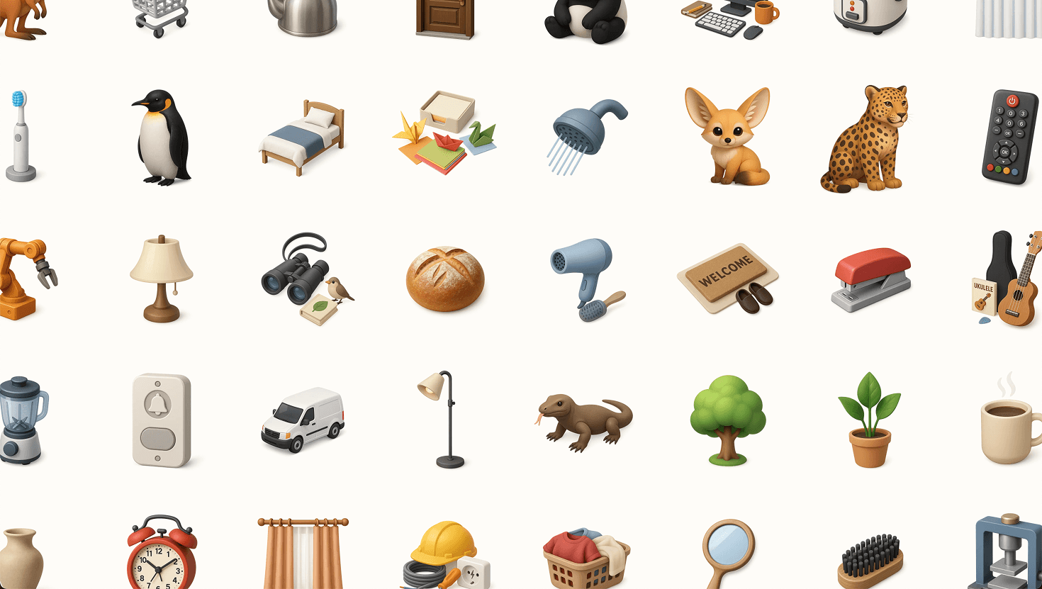
Thiings Collection
400+ AI-generated 3D skeuomorphic icons. Free to download as 1024x1024 PNGs with transparent backgrounds. Airbnb-inspired miniature diorama style.

TiXL
Open-source Windows tool for real-time motion graphics, combining node-based procedural workflows with keyframe animation. Supports audio-reactive visuals, shaders, MIDI, OSC, Spout, and video export.
ToonCrafter by Doubiiu: AI-Powered Cartoon Creation
ToonCrafter is an open-source AI model that generates smooth cartoon animations by interpolating between keyframe images. Feed it 2-4 drawings and it creates fluid animated sequences — a powerful tool for illustrators and animators exploring AI-assisted workflows.
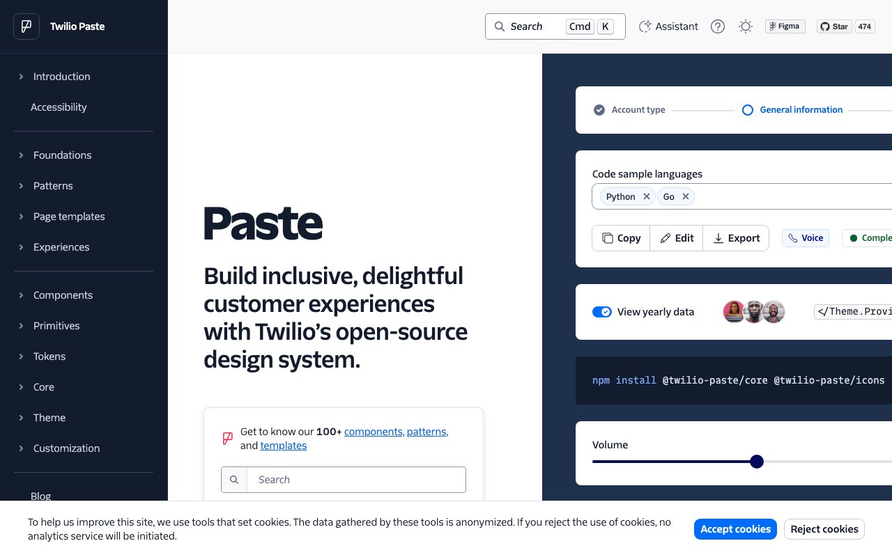
Twilio Paste: Comprehensive Design System for Customer Experiences
Paste is Twilio's design system built for creating consistent customer engagement experiences. It provides a rich set of accessible React components, design tokens, and detailed usage guidelines — one of the most thorough open-source design systems available.
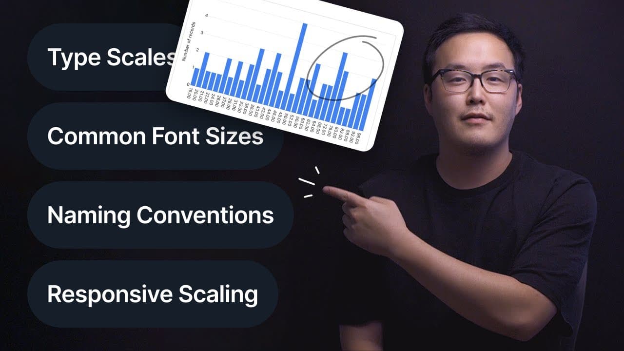
Typography: Ultimate Design System Breakdown
A detailed video breakdown of how to build a typography system within your design system — covering type scales, responsive sizing, line heights, font pairing, and token naming conventions. Practical walkthrough with real implementation examples.
UI Color Palette
UI Color Palette generates complete, balanced color palettes from a single color — creating tints, shades, and semantic color roles ready for design system use. It outputs palettes directly as Figma styles or variables, saving hours of manual color scale creation.
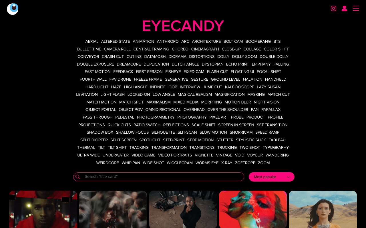
Ultimate Visual Technique Library for Designers: Enhance Creativity Here!
Eyecandy (eycndy) is a categorized library of visual design techniques — distortion, particle effects, glitch, fluid, and dozens more. Each category shows real-world examples of the technique in action, making it an incredible tool for discovering and referencing visual effects.
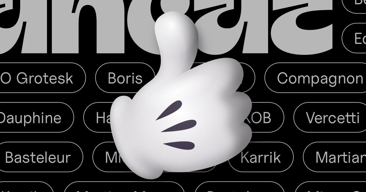
UNCUT.wtf
Curated collection of contemporary open-source typefaces from independent designers, organized by style (Sans, Serif, Mono, Display) with instant downloads and pangram previews. A hidden gem for finding quality type outside the Google Fonts mainstream.
unDraw: Open source illustrations for any idea
A constantly updated collection of beautiful SVG images that you can use completely free and without attribution. Customize the main color on-the-fly and download for use in any project.

Unlock Creativity: Free High-Quality Typefaces for Designers
Free Faces is a curated gallery of the best free typefaces available — each vetted for quality and presented with elegant specimens. It cuts through the noise of font aggregators to surface genuinely well-designed free fonts for serious design work.
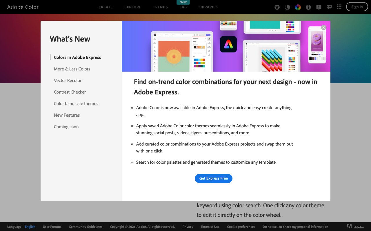
Unlock Endless Color Inspiration with Adobe's Color Tool
Adobe Color is a free web tool for creating, exploring, and saving color palettes using color theory rules like complementary, analogous, and triadic harmony. It integrates directly with Creative Cloud apps and lets you extract palettes from uploaded images.
User Defenders
User Defenders is a UX design podcast that interviews designers fighting for user experience in the real world. Each guest shares their journey, process, and hard-won lessons — great for UX designers seeking both inspiration and practical career advice.
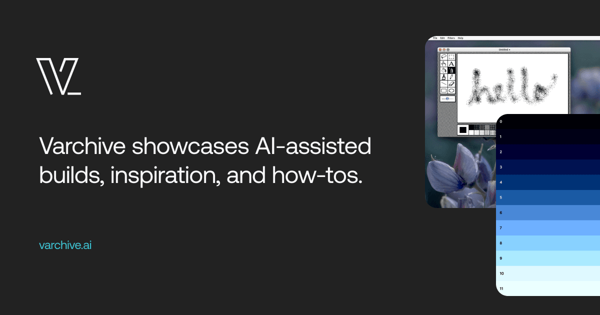
Varchive
Showcase of AI-assisted builds with inspiration and how-to guides. Curated collection of projects built with AI coding tools.
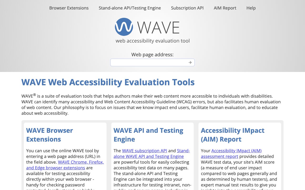
WAVE: Web accessibility evaluation tool
WAVE (Web Accessibility Evaluation Tool) provides visual feedback about the accessibility of your web content by injecting icons and indicators into your page. It helps identify accessibility errors, alerts, and structural elements, making it easy to see exactly where issues exist and understand their impact on users.
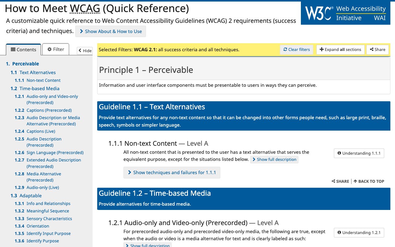
WCAG Guidelines: Official accessibility quick reference
The Web Content Accessibility Guidelines (WCAG) Quick Reference is the official, authoritative source for web accessibility standards and requirements. It provides a filterable, searchable interface to explore all accessibility guidelines, success criteria, and techniques, making it the definitive resource for understanding what makes content accessible.
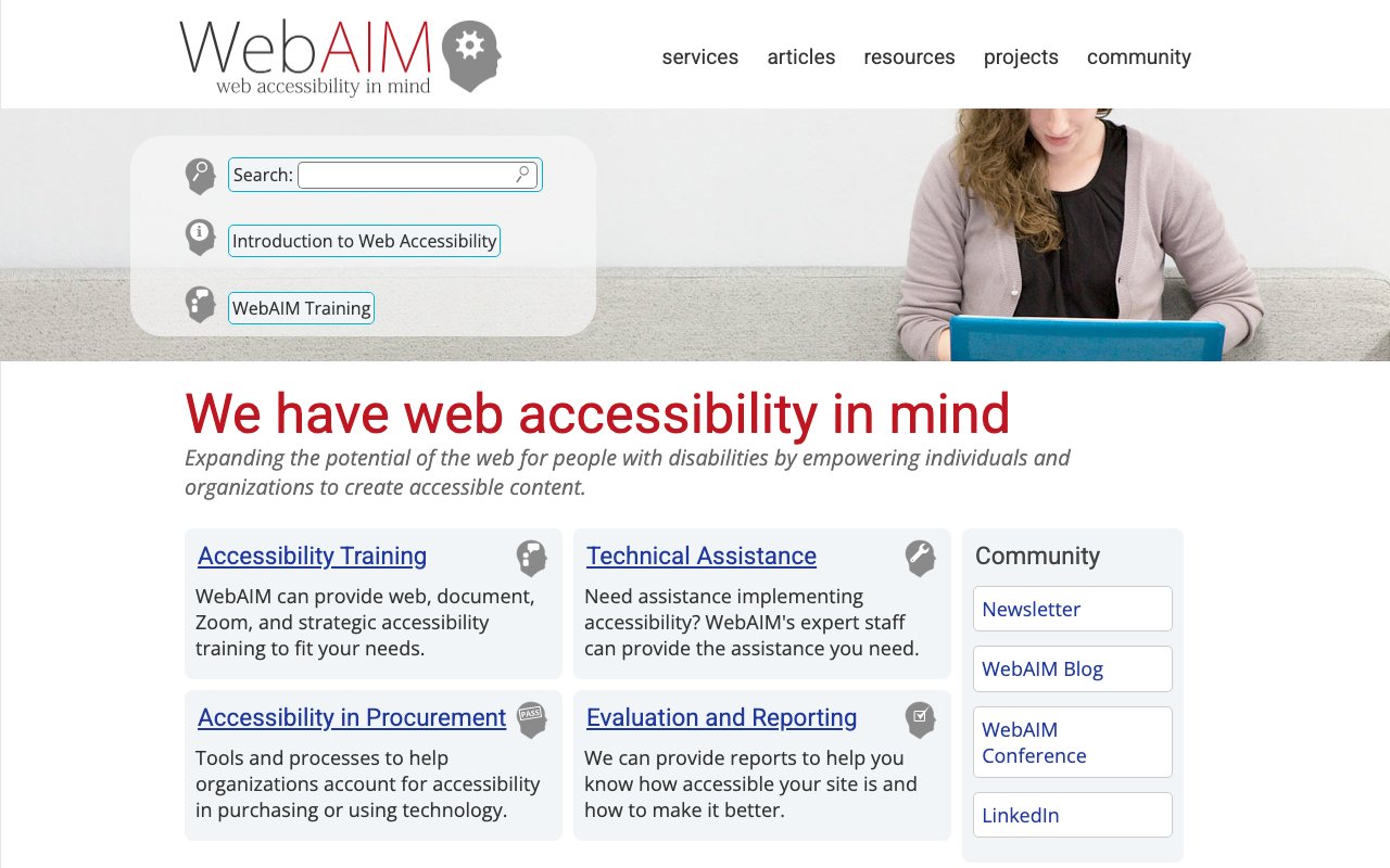
WebAIM: Web accessibility in mind
WebAIM (Web Accessibility In Mind) is a comprehensive educational resource providing in-depth articles, tutorials, and training materials on web accessibility. It offers both technical guidance and conceptual understanding of accessibility principles, making it an invaluable resource for anyone looking to build more inclusive digital experiences.
WebHaptics – Haptic feedback for the mobile web
WebHaptics brings native-style haptic feedback to mobile web experiences. Trigger vibration patterns on iOS Safari and Android to add tactile responses to taps, transitions, and interactions — no app required.
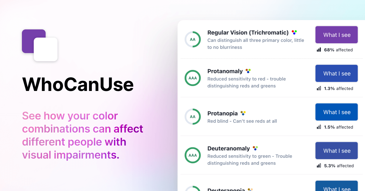
Who Can Use: Vision impact simulator
Who Can Use shows how color contrast affects people with different types of vision, including various forms of color blindness and low vision conditions. It provides a powerful visual demonstration of why accessibility matters by showing exactly who can and cannot perceive your color choices clearly.
Wireframe Podcast: Ignite Your Design Inspiration
Wireframe was Adobe's design podcast that explored the stories behind great product design. While no longer producing new episodes, its archive of conversations about design decisions in products like Airbnb, Lyft, and Headspace remains valuable listening.
Wise Design: Global Money Transfer UI Excellence
Wise's design system showcases how a global fintech company creates consistent, trustworthy interfaces across 80+ countries. A great case study in designing for internationalization, clarity in financial interfaces, and multi-platform consistency.
Workbench by Gusto: Streamlined Design System
Workbench is Gusto's open design system providing components and patterns specifically built for complex business applications — payroll, HR, and benefits interfaces. A valuable reference for teams designing dense, data-heavy admin UIs.