Search for a command to run...
Curated components resources for designers and developers.
Charts Supply provides beautiful, real-time data visualization components for Framer — line charts, bar charts, progress indicators, and more. Drop them into your Framer projects to create data-rich prototypes and dashboards that look production-ready.
Added Jan 2025
Framercrafts offers a premium library of ready-to-use Framer components — navigation bars, hero sections, feature grids, testimonials, and more. Each component is fully customizable and built to work with Framer's CMS and responsive design features.
The Figma Community's UI kit collection features hundreds of free and premium design kits — from Material Design and iOS components to custom systems and wireframe kits. A starting point for finding pre-built component libraries to accelerate your Figma projects.
Tailwind CSS-based component library with 27+ pages and responsive examples. Features seamless Tailwind integration with comprehensive documentation and code examples. Perfect for developers building with Tailwind CSS who need design-to-code consistency.
Added Feb 2026
A Framer component that applies a stunning fractal glass distortion effect to images and content. Drop it into your project for eye-catching visual effects on hero sections, backgrounds, and feature highlights — no custom code required.
Well-balanced design system with 5,500+ components featuring Auto Layout, dark mode support, and 420+ building blocks with comprehensive iconography. Ideal for mid-weight web and app designs requiring solid component coverage without overwhelming complexity.
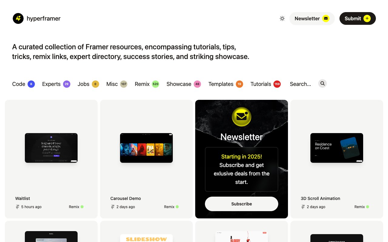
HyperFramer provides premium Framer components, animations, and interactions that go beyond what's available out of the box. Includes advanced scroll effects, custom cursors, parallax elements, and micro-interaction presets.
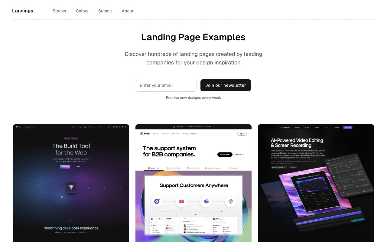
Searchable collection of landing pages from top products with component-level filtering. Find hero sections, feature grids, CTAs from the best-designed SaaS and startup sites.
Added Mar 2026
LDRS provides a collection of beautiful, lightweight loading animations as web components. Each loader is customizable via attributes (size, color, speed), zero-dependency, and works with any framework — perfect for adding polished loading states to any project.
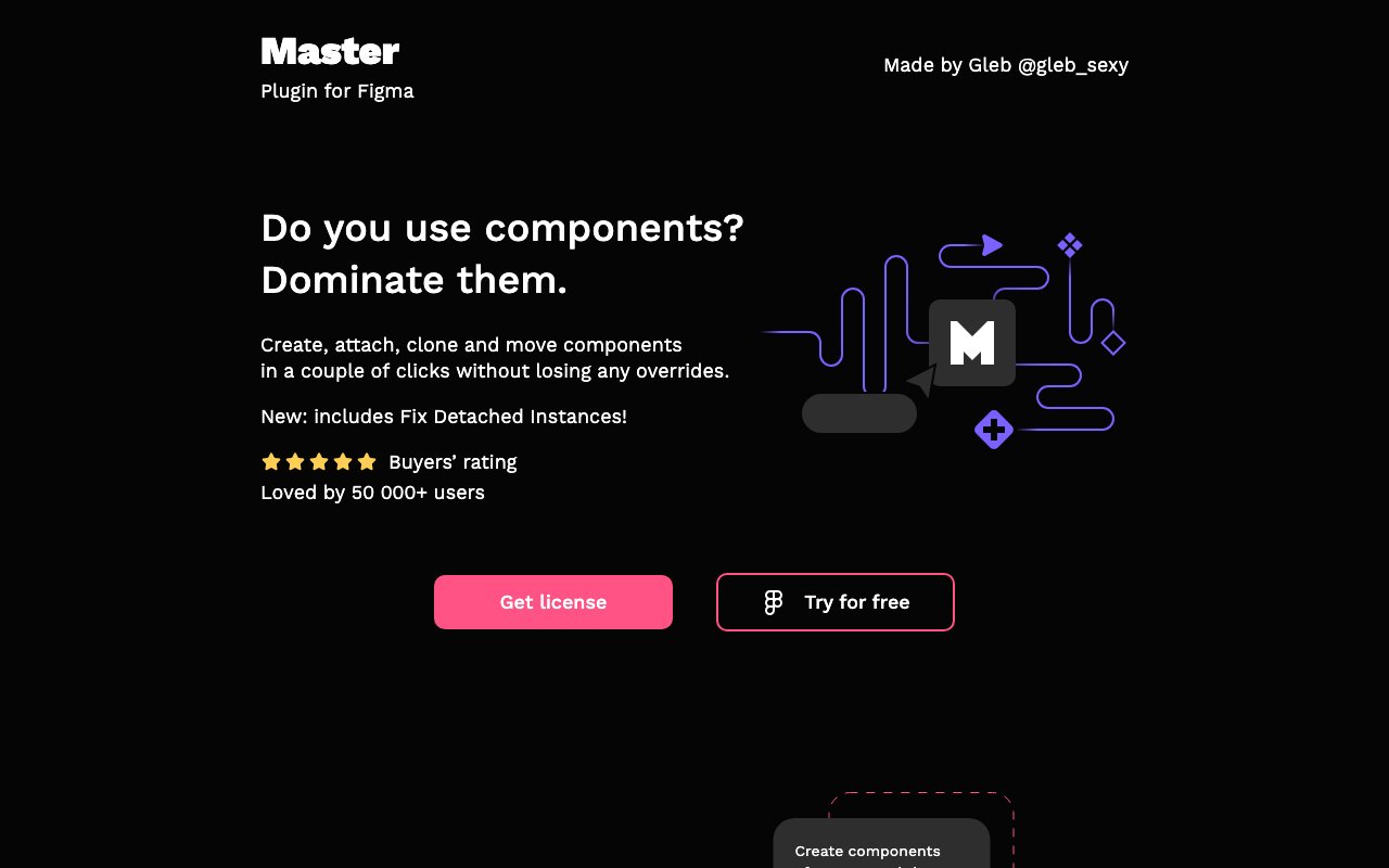
Master is a Figma plugin from Dominate Design that supercharges component management — batch edit properties, sync instances across files, and manage variants at scale. A power tool for design system maintainers working with large component libraries.
Modulor is an open-source design system providing a comprehensive set of accessible web components, design tokens, and documentation. Built for flexibility, it offers a solid foundation for teams who want a customizable starting point rather than building from scratch.
Comprehensive free component library with 5,000+ Tailwind CSS-based components featuring auto-layout and Figma Tokens compatibility. 100% free with extensive component coverage, perfect for Tailwind CSS projects requiring no licensing fees.
Propstar automatically generates visual property tables for Figma components, documenting all variants, props, and states. It creates clean, shareable component specs that help teams understand and correctly use design system components.
React Grab is an interactive demo and component library showcasing advanced React interactions and animations. Praised for some of the most polished interactive demos in the React ecosystem — great for inspiration and copying proven interaction patterns.
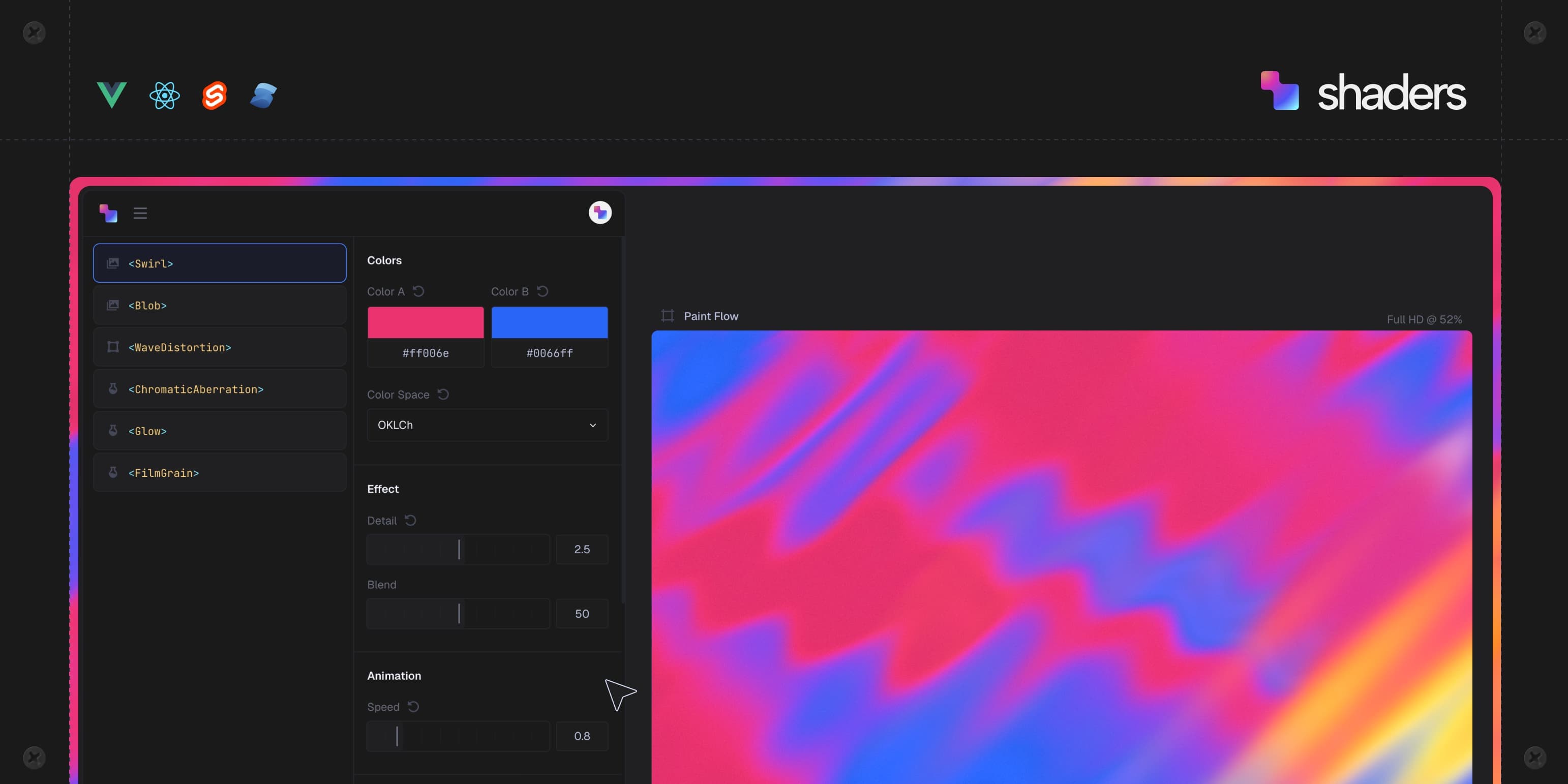
Component-based WebGPU shaders for React, Vue, and Svelte. Visual editor generates production-ready shader code for landing pages, dashboards, and hero sections.
Figma2Framer provides a component library that works seamlessly across both Figma and Framer, ensuring design consistency from mockup to published site. It bridges the gap between designing in Figma and building in Framer with matched components.
Tailwind UI is the official component library from the creators of Tailwind CSS, providing 500+ professionally designed, responsive components and templates. Each component is production-ready HTML with Tailwind classes — paste it into your project and customize.
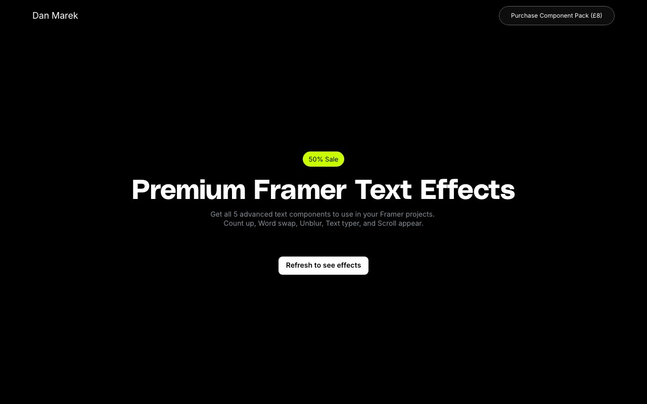
Text Supply offers premium animated text effect components for Framer — typewriter effects, gradient text, scroll-reveal text, and more. Add polished typographic animations to your Framer sites without writing custom code.
The Component Gallery collects and compares UI components across real design systems — see how different companies implement buttons, modals, navigation, and more. An invaluable research tool when designing components for your own system.
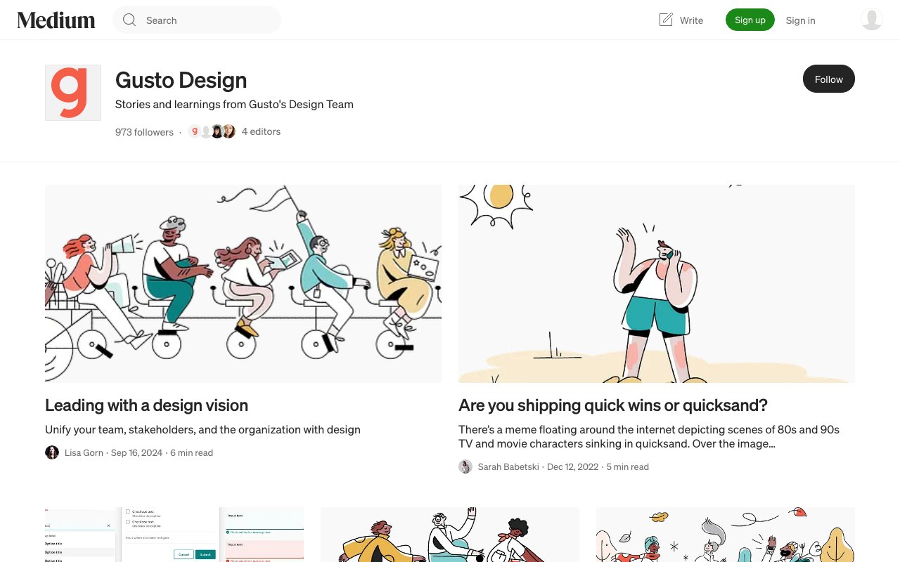
Workbench is Gusto's open design system providing components and patterns specifically built for complex business applications — payroll, HR, and benefits interfaces. A valuable reference for teams designing dense, data-heavy admin UIs.
Flowbase is the world's largest library of Webflow, Figma, and Framer components with 3,500+ ready-to-use elements — navbars, headers, content sections, dashboards, and more. Copy-paste components directly into your projects to accelerate design and development.