Search for a command to run...
Curated accessibility resources for designers and developers.
Advanced palette builder from Lyft Design using perceptually uniform color scales (HSLuv/LCH). Creates accessible, predictable color systems for design systems — the tool behind thoughtful ramp generation.
Added Mar 2026
Stark is the leading accessibility toolkit for designers, with plugins for Figma, Sketch, and Adobe XD. It includes contrast checking, vision simulation, focus order tools, alt-text annotations, and AI-powered accessibility scanning to catch issues during the design process.
Added Jan 2025
Include is a Figma plugin for adding accessibility annotations to your designs — landmarks, headings, tab order, alt text, and ARIA labels. It generates a clear annotation layer that communicates accessibility intent to developers during handoff.
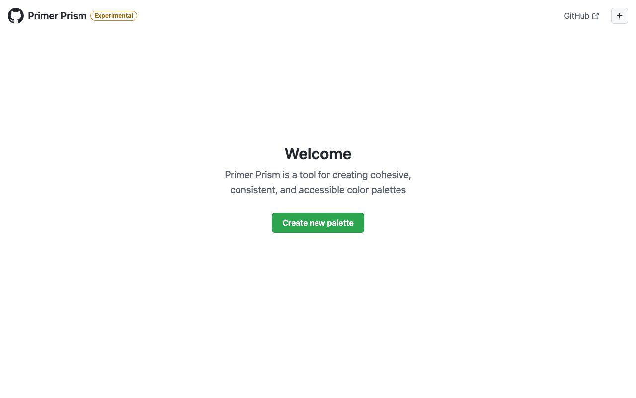
Primer Prism, created by GitHub's design team, helps you build cohesive and accessible color systems from a single base color. It generates consistent color scales with built-in WCAG contrast checking — essential for design system color token creation.
Generates accessible color combinations that meet WCAG contrast requirements. Instant random pairings with AA/AAA compliance indicators — useful for quickly finding accessible text/background combos.
Advanced palette builder with manual hue/saturation sliders supporting OKHSL/LCH color spaces, image import, contrast checks, and exports up to 24 colors. For designers who want precise control over perceptual uniformity.
Annual practitioner survey: Web Components gaining over React, AI unstalling stalled adoption, accessibility gap narrowed from 46% to 10%. Real benchmark data, no hype.
Added Apr 2026